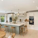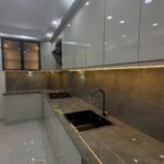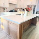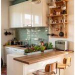
The ideas here run from a single painted island (Bold Color on the Island) or a swap to brass hardware, which fits a weekend, to Navy + Cream and Black Lowers with Dark Gray Uppers, which mean repainting the whole room.
Cream or beige uppers, for example, pair with white marble, and a gray with a slight warmth keeps veined stone from turning flat.
1. White and Gray
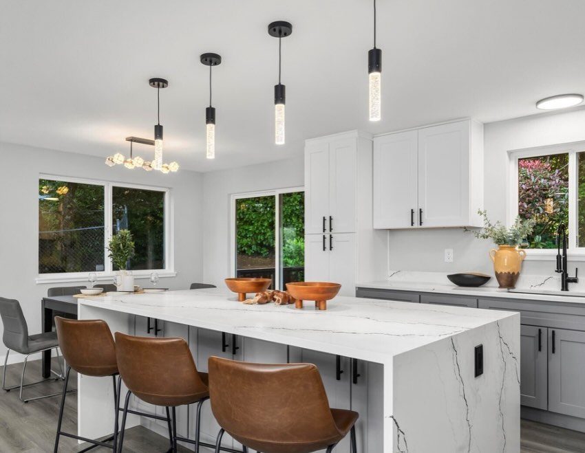
White uppers over gray lowers is the safest two-tone pairing I know, and it earns that reputation. Dark lowers hide the scuffs and splashes that show first on white doors, and white uppers stay bright and open above them.
Pick a gray with a slight warmth if your countertop is white marble or marble-look.
A cold gray next to veined stone can turn flat. Black pendants and brown leather stools, as in this kitchen, give the plain palette some contrast without another paint color.
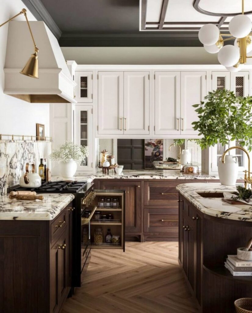
2. Dark Wood Cabinets with Soft Beige
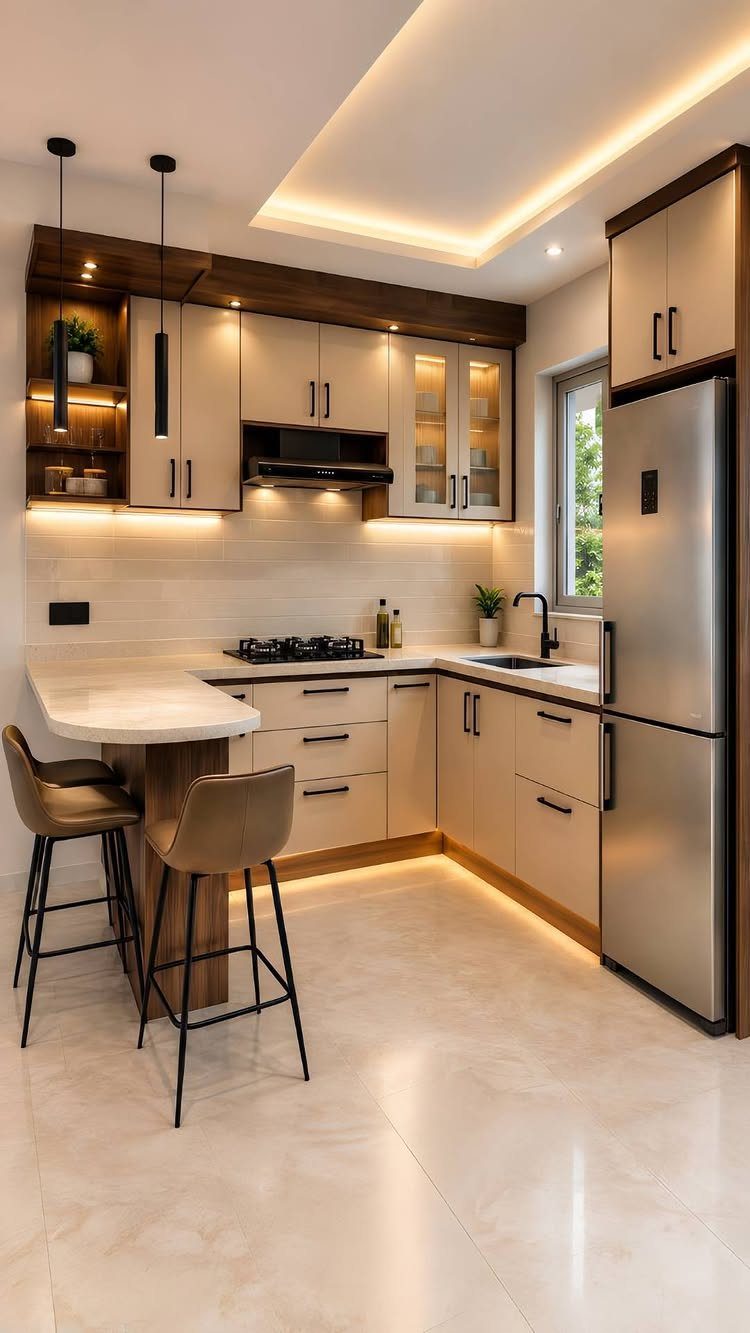
Pairing dark wood with soft beige adds weight without heaviness, since the beige calms the walls and uppers.
I would put the wood on the part you want to anchor, such as the lower run, and let beige take the rest.
White countertops bridge the two nicely.
Stainless appliances and a light floor, as here, stop the wood from swallowing the room. Hold a large wood sample next to the beige in your own light first, because beige can lean pink or yellow.
3. Navy + Cream
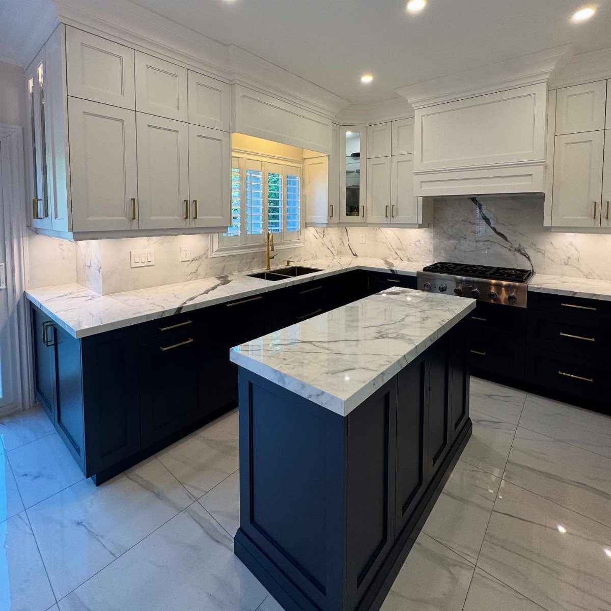
Navy lowers with cream uppers look dressed up, yet the paint list is only 2 colors. Cream is the better partner than stark white: it softens the navy and sits well beside white marble countertops.
An island in the navy, like this one, ties the lower run together.
If your kitchen is small, keep navy to the base cabinets and leave the uppers light so the room does not close in. Stainless appliances work fine against it.
4. Lighter Colors on Top and Darker Tones Below
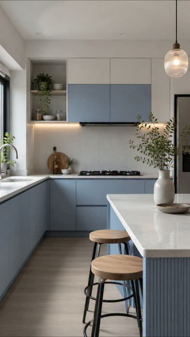
Light above, dark below is a rule of weight: the heavy color sits low, like a foundation, and the eye travels up into brightness.
Blue lowers with white uppers show it well, and a white island keeps the center of the room airy.
For a renter or a budget remodel, this is a forgiving plan, because you can paint only the bases and leave existing white uppers alone.
5. Sage Green and Cream
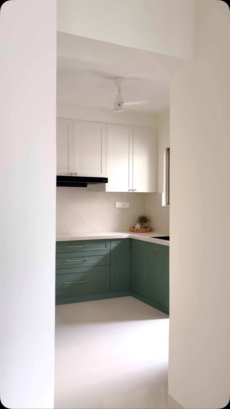
Sage green on the lowers makes a compact space feel soft and earthy with little risk, because the color is muted enough to live with for years. Cream uppers keep it gentle, and a white countertop completes a quiet palette.
I would choose a sage with a gray undertone over a minty one, which can feel dated. Test it beside your ceiling and trim color, since the green shifts with the light in a small room.
6. Natural Wood and White
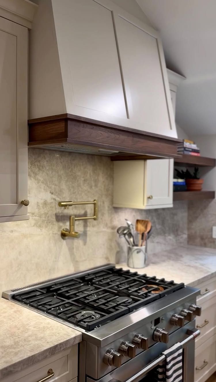
Wood trim on a white range hood is the lightest way to try two-tone. You change one feature instead of a whole wall of cabinets, and the dark wood draws the eye to the cooking area.
White cabinets, a stone backsplash and a stainless stove, as here, give the wood a calm backdrop.
If a full wood hood is beyond a weekend budget, a wood band or trim on a plain white hood gets much of the same effect.
7. Muted Hues with Neutral Upper Cabinets
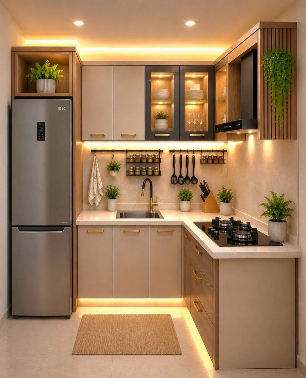
Taupe base cabinets under a lighter neutral run keep a compact kitchen quiet, and gold hardware adds just enough warmth to stop the palette from going flat. Muted colors like these forgive a lot, so they suit a first remodel.
Pick the two shades from one paint strip, a step or two apart, so they read as a pair. Under-cabinet lighting, as here, warms the taupe at night.
Tape up large samples and check them at different times of day, once in early light and once after dark, before you buy a gallon.
8. Black Lower Cabinets with Brass Hardware and Light Uppers
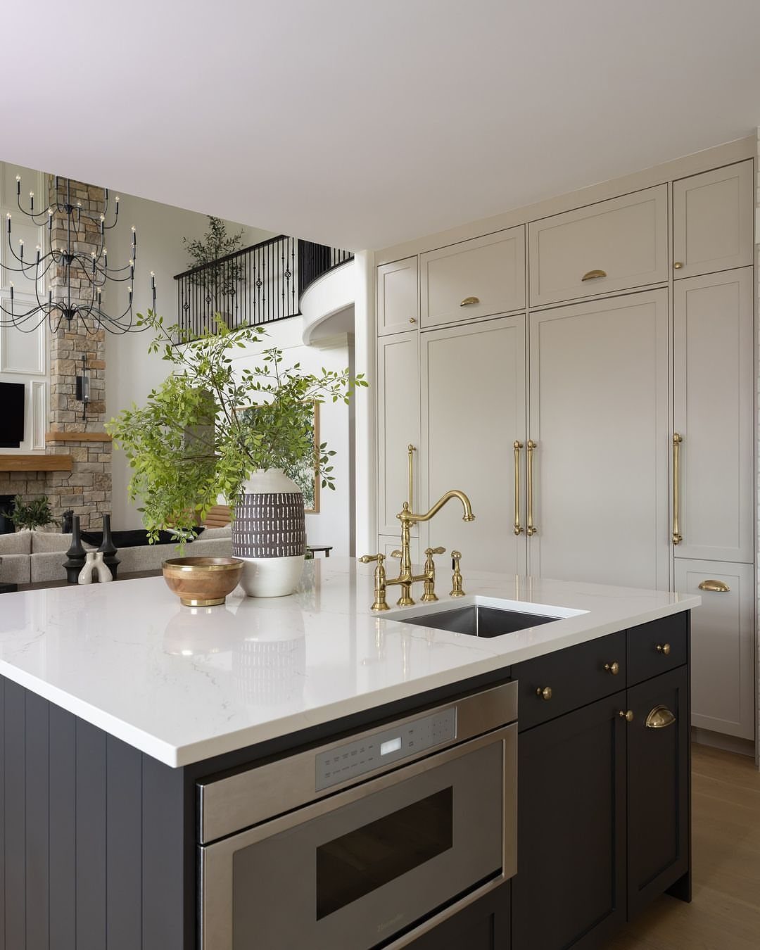
Black or near-black lowers with brass pulls make the hardware the jewelry of the room, and white uppers keep the whole look from feeling heavy.
A dark island, like this one, anchors an open-concept space where the kitchen is visible from the living area.
Brass pulls are the cheapest part of this plan, so swap them first and see how the cabinets look before you repaint anything. I would keep the countertops white or light to balance the dark base.
9. Bold Color on the Island
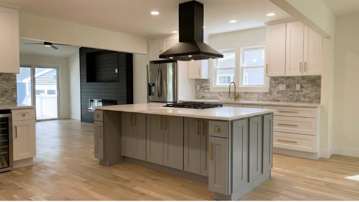
Color on the island alone is the smallest commitment in two-tone: one piece of furniture-sized cabinetry, with the perimeter left white. Gray is a calm choice, and a white countertop on top keeps it from looking like a block.
If you want more punch than gray, the same approach works with a deeper shade. Paint only the island base and nothing else changes, which suits a weekend and a modest budget.
10. Two-Tone Color Blocking
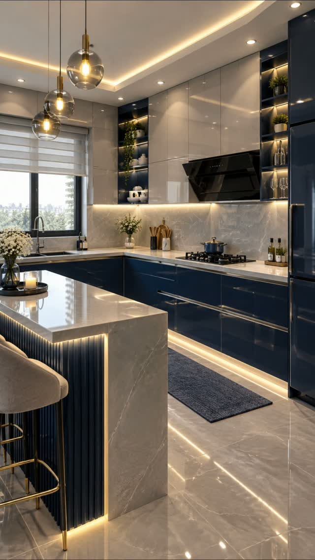
Navy lowers under glossy white uppers is color blocking at its clearest: 2 flat planes, a hard line between them, and no blending. The contrast is the statement, so a marble island and gold accents can stay simple.
Keep the dividing line clean.
Gloss shows fingerprints, so I would wipe the white doors more often.
11. Grey and Black Countertops
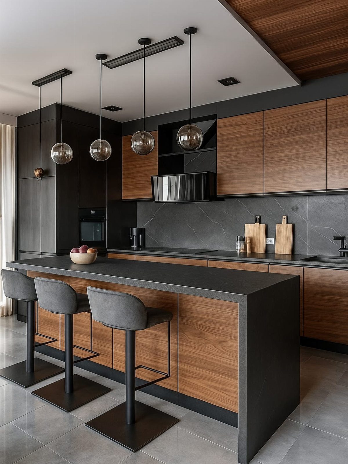
Grey or black countertops suit a Scandinavian-leaning kitchen, since they give a strong, clean line against pale or wood-toned surroundings. Here dark cabinets and wood meet grey counters, and glass pendants keep the island light.
I would pick the countertop first, then match cabinet colors to it, because stone and laminate samples are harder to change than paint. Grey stools echo the counter without adding another color.
12. Matte and Gloss Finishes
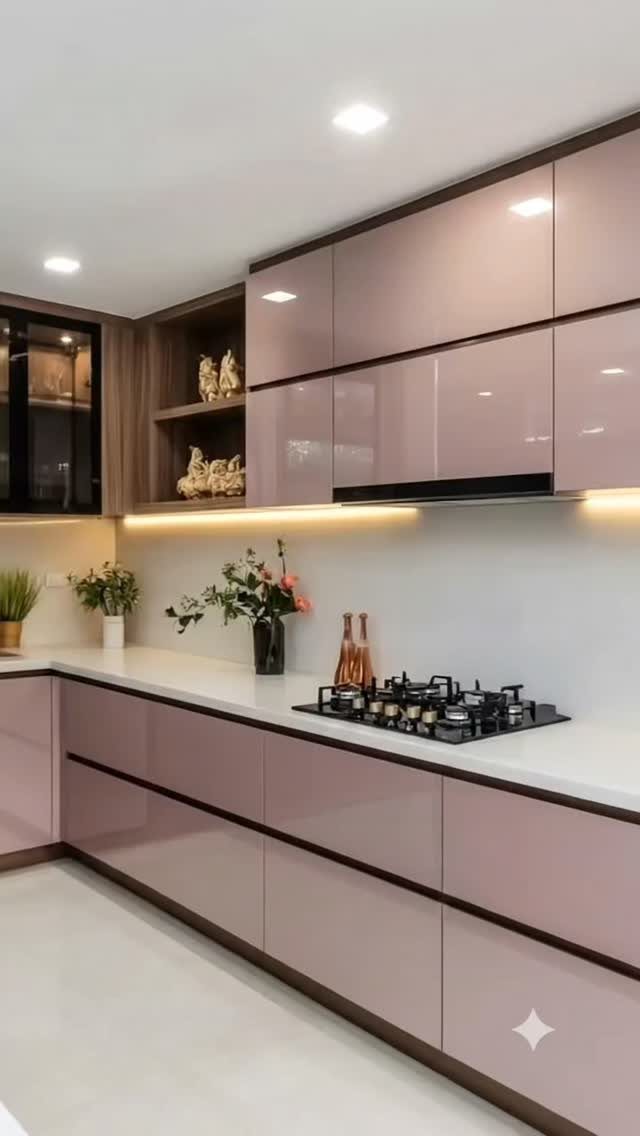
Glossy cabinets beside matte wood shelving is a two-tone built on texture as much as color. The mauve-pink doors catch light and bounce it around, while the brown open shelves absorb it and add calm.
Use gloss where you want the eye to land and matte where you want it to rest. A white countertop keeps the mix from getting busy.
Gloss shows smudges, so I would pick it for fewer, larger doors and keep it away from heavily handled drawers.
13. Sage Green and Natural Wood
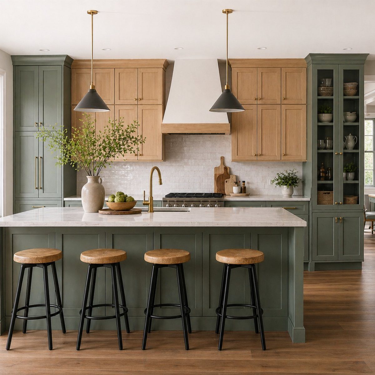
Sage lowers under light wood uppers put the heavier color at the base and the warmer, lighter material overhead. Gold hardware ties the two together, and white countertops keep the surface calm.
I would choose a wood tone close to the pale end, so the uppers stay open and don’t compete with the green.
Check a wood sample beside your sage in your own light before ordering, since green can pull the wood toward yellow.
14. Black Lowers with Dark Gray Uppers
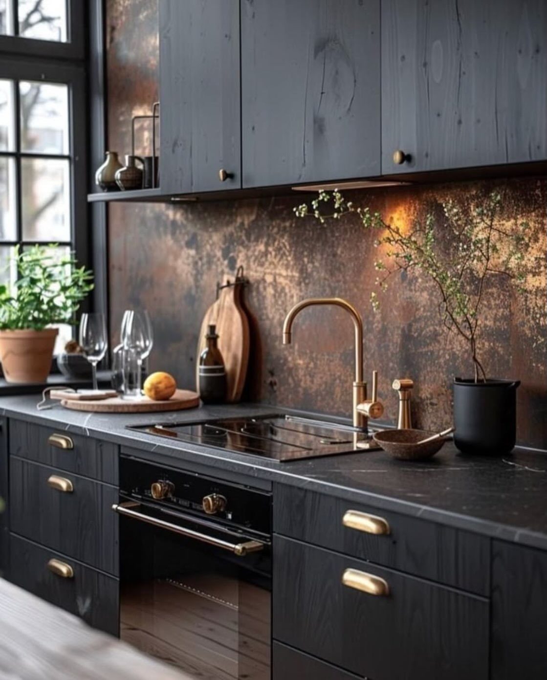
Black bases under dark gray uppers make a moody kitchen where the difference is only a shade or two, so the gold handles and faucet do the work of separating the layers.
A copper backsplash adds warmth between the 2 dark runs.
Dark on dark leaves little room for error. I would keep the metals to a tight palette and let one finish be the single shiny surface, so the hardware and faucet don’t compete with each other.
Tape a gray sample next to the black first, because the two can merge into one block.
15. Dark Grey and Warm Wood Slats
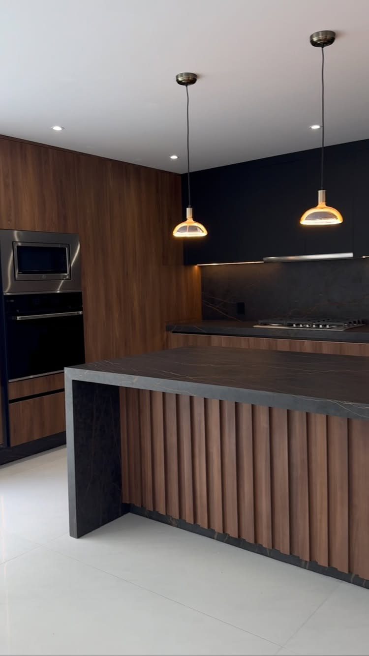
Vertical wood slats on the island base and wall give a dark grey kitchen a warm, tailored backbone. The grey stays on the uppers and countertop, while the wood runs across the surfaces you see first.
I like this best when the wood is one continuous tone, as here, so the slats read as a single feature. Pendants over the island keep the dark palette from feeling flat.
For a lighter budget, panel just the island base and leave the wall alone.
Timelessness of Two-Tone Kitchens
Two-tone cabinets last when the colors answer to the rest of the house. Start with the palette you already own: flooring, wall color, and the trim running into the next room.
Neutral tones, wood finishes, and classic Shaker-style doors are the safest raw material. A plain door profile lets the color pairing carry the design, so a color you tire of can be repainted without replacing a single door.
Contrast can be subtle or bold, and you can also vary the material or finish, such as wood against paint. For a first project I would keep the bold choice small and the neutral choice large.
Timeless is a result of restraint. 2 colors that suit your floors and walls will outlast a fashionable shade that fights them.
Though two-toned cabinets may not seem like an obvious choice, they’re actually super popular with kitchen designers.
Frequently Asked Questions
What are some good contrast colors for kitchen cabinets?
For a first try, pair white uppers with gray lowers; if you want something a little dressier from just 2 cans of paint, put navy below and cream above.
Natural wood against white or sage also works well. Keep the darker, heavier color low and the lighter one overhead so the room stays open.
Are two toned cabinets timeless?
Yes, as long as the colors suit the rest of the house, including your floors, wall color and trim. Plain Shaker doors, soft neutrals and natural wood finishes make the most lasting foundation.
Flat-front-simple doors leave the colors to do the talking, and if you grow tired of one shade, a quart of paint fixes it without buying new doors.
What color cabinets does Joanna Gaines use?
She often reaches for soft neutrals and natural wood tones. You can get a similar look with cream or beige cabinets next to a wood finish, such as dark wood lowers under soft beige uppers.