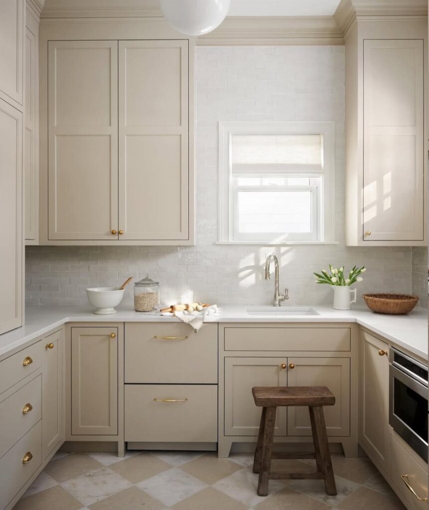
The ideas here run from black countertops to light marble, but the choice mostly turns on one fact: the undertone of what already stays in your kitchen, meaning the floor, the appliances and the countertops.
Tape a sample of White Dove, Alabaster or Pointing beside them and look in daylight before you buy a gallon.
1. Off-White Cabinets with Black Countertops
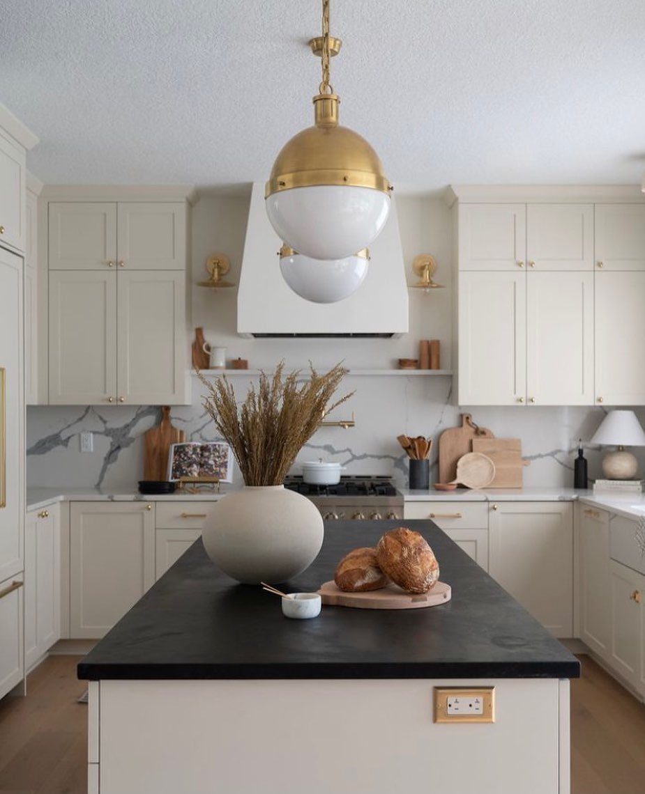
Black against off-white is the highest-contrast pairing you can make in a kitchen, and a single black surface is enough to do it.
An island top is the smart place for it, because it anchors the room without darkening every wall of cabinets.
Keep the perimeter countertops and backsplash light, as in this kitchen, so the black reads as one deliberate choice. Gold pendants pick up the warmth in the off-white, which keeps the black from feeling cold.
I would pick a honed or matte black over a glossy one. Fingerprints and crumbs show on dark surfaces, and a matte finish hides more of them.
2. Cohesive Color Schemes
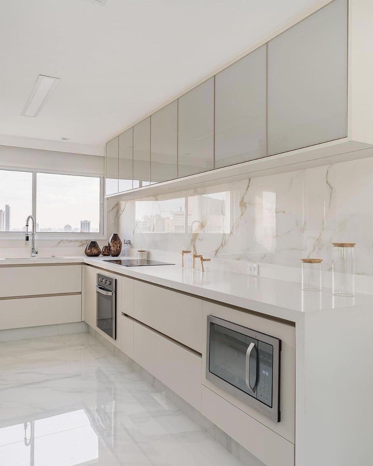
Off-white cabinets look their best when the countertops, backsplash and floor share the same cool or warm undertone. Here, white marble counters and matching polished marble flooring keep the whole room in one family, so nothing competes.
Before buying anything, tape a cabinet door sample next to each stone or tile sample and look at them together in daylight. Undertones that seem close in a store often clash at home.
If the budget only covers one marble surface, put it on the counters and choose a plainer floor in the same tone.
3. Lighting Effects
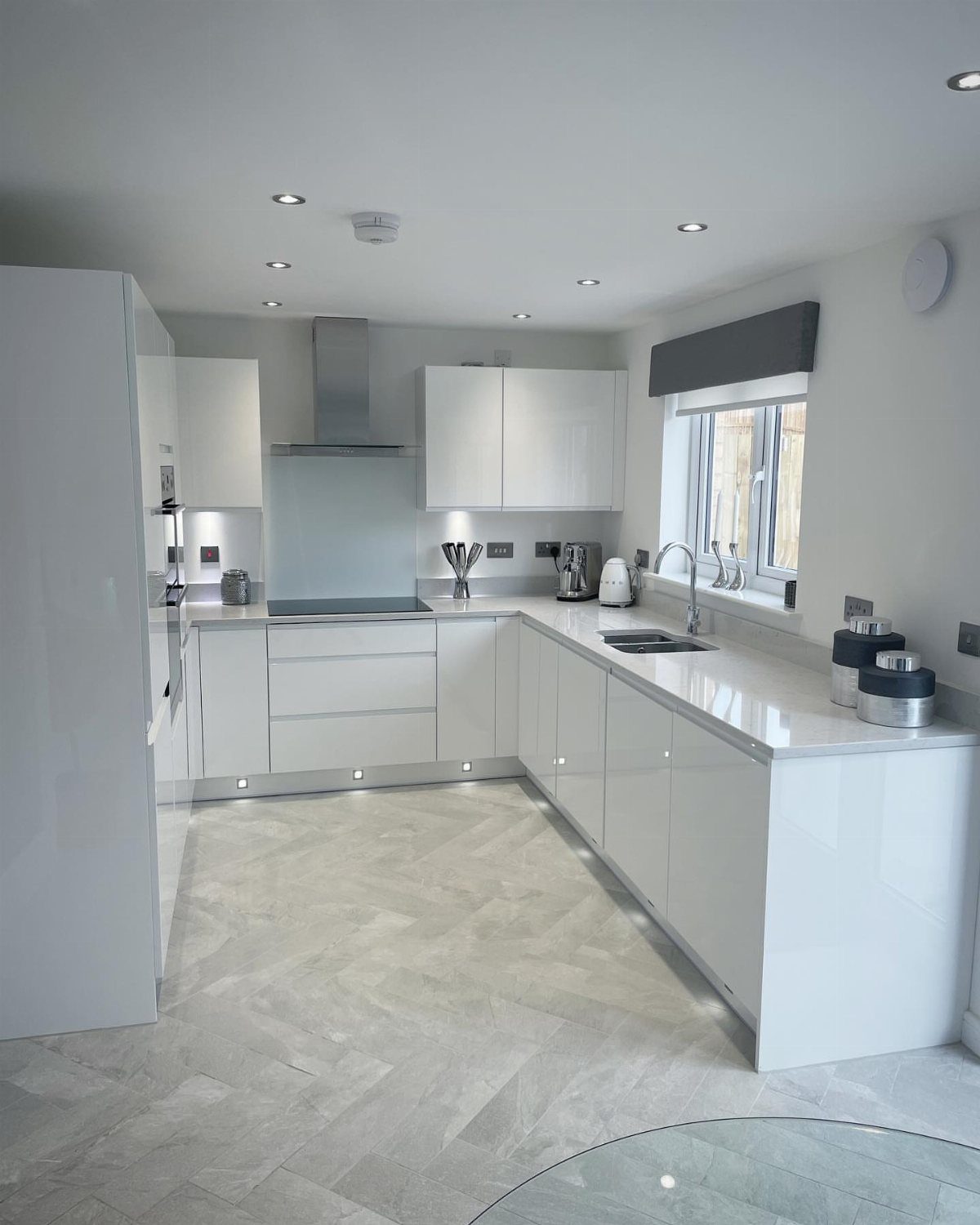
Glossy off-white cabinets change color depending on what lights them, so the bulbs deserve as much thought as the paint.
Recessed ceiling lights, under-cabinet strips and a glow at the base each hit the gloss differently, and together they keep the finish from looking flat.
Buy one bulb temperature across all of them. Mixing warm and cool bulbs makes the same cabinet look 2 different whites.
Under-cabinet LED strips are the easiest weekend upgrade here, and they also light the counter where you actually work.
4. Off-White Shaker Kitchen Cabinets
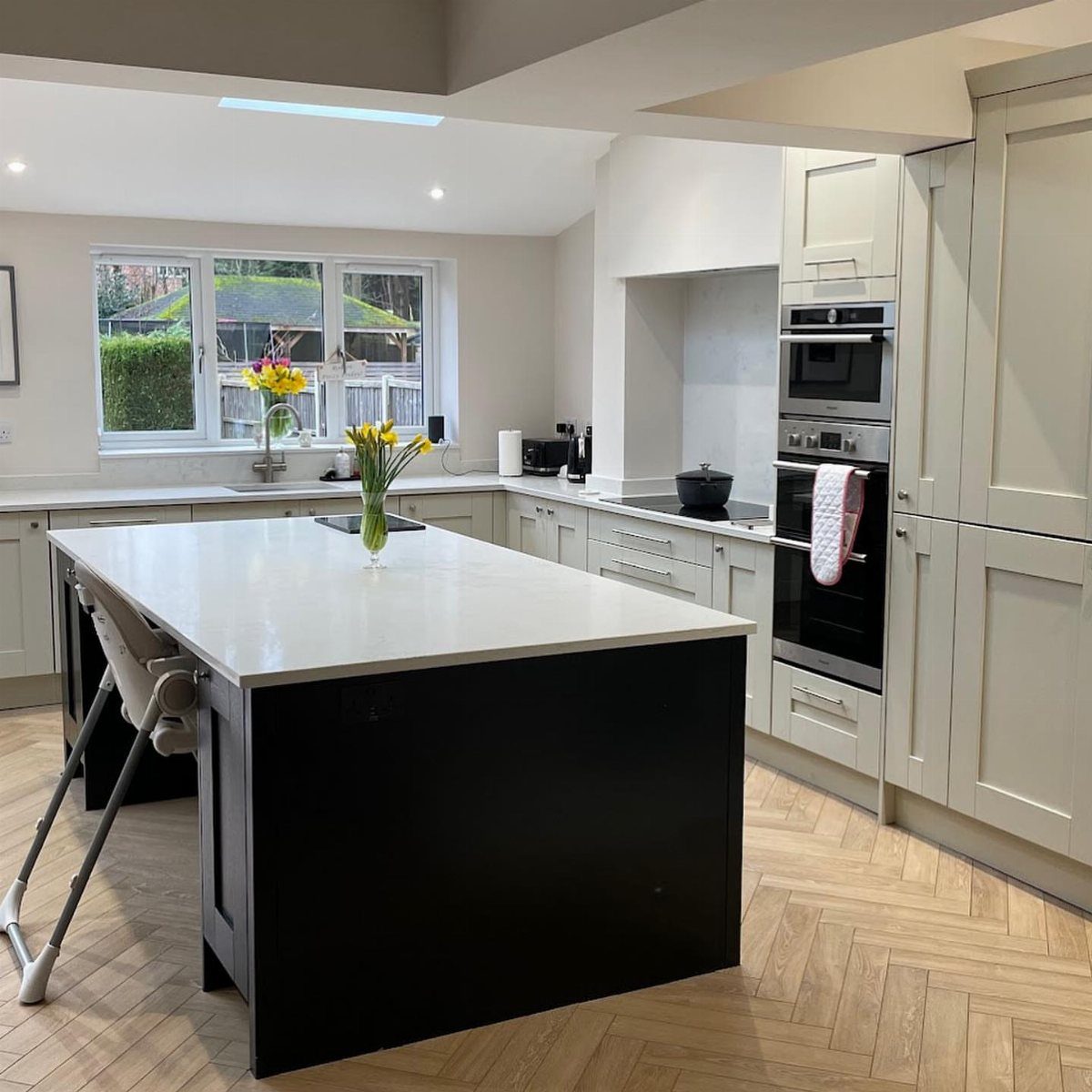
Shaker doors, with their simple recessed center panel and square frame, are the safest style I know for off-white. They suit traditional and modern rooms alike, so the cabinets will not date the kitchen when other finishes change.
A black island gives the plain Shaker door some drama, and it keeps the cabinet color the calm part of the room. Herringbone wood floors add warmth underneath.
If you are painting existing doors, shaker profiles are forgiving: the flat frame is easy to brush and roll cleanly.
5. Flat-Panel Off-White Cabinets
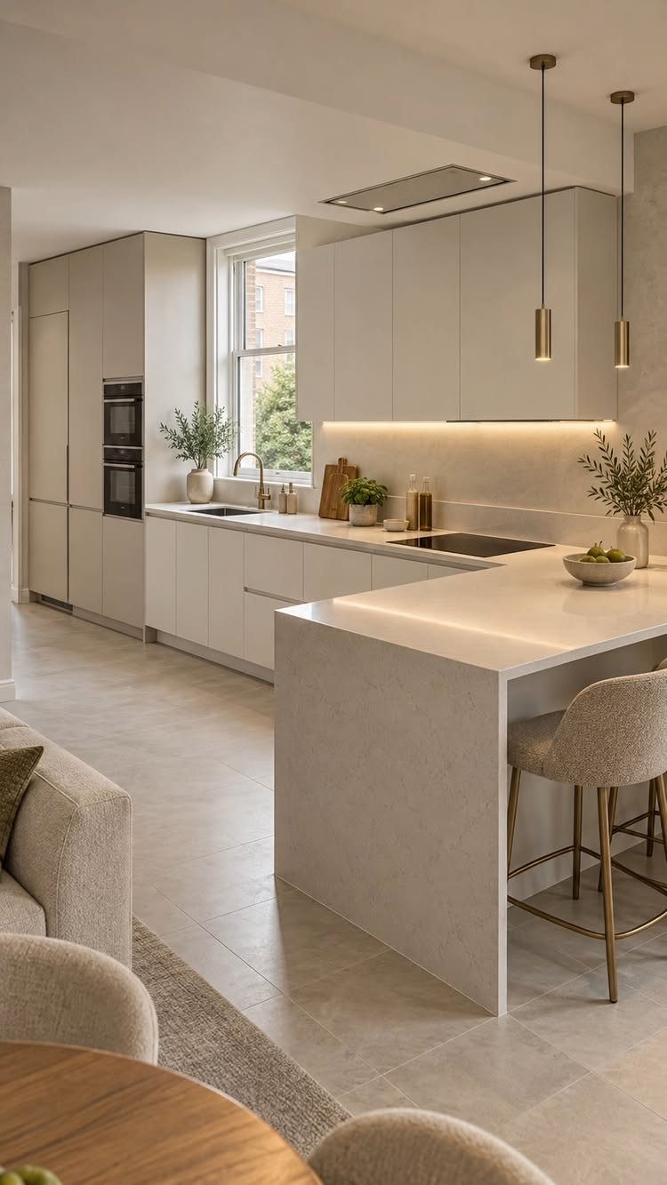
Flat-panel doors have no frame and no profile, so the off-white color does all the work. That makes the finish choice matter: a matte or satin slab looks calm, and every seam and gap shows, so alignment counts.
Carrying the same off-white onto a waterfall island, as here, makes the whole room read as one clean mass. Gold pendants and a gold faucet give it a focal point, and light grey tile keeps the floor quiet.
Slab doors are also simple to wipe down, since there are no grooves to catch grease.
6. Two-Tone with Natural Wood
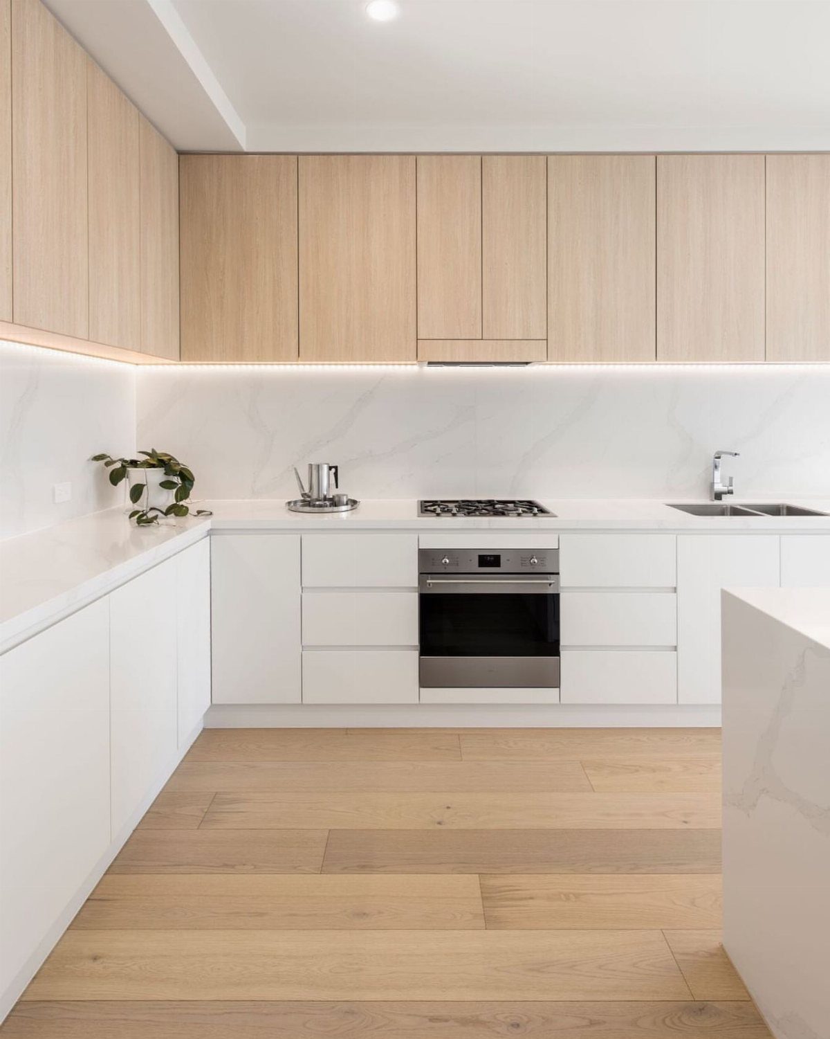
Light wood uppers over off-white lowers split the room into 2 weights: the pale base grounds it, and the wood lifts the eye upward. I prefer this to dark wood on top, which closes in a small kitchen.
White marble counters bridge the 2 tones, so the wood and paint look related. Light wood floors, as here, repeat the upper cabinets and tie the room together.
Check that the wood’s undertone suits your off-white. Yellow-leaning oak next to a gray-leaning white can look mismatched.
7. Off-White Cabinets with Gold Hardware
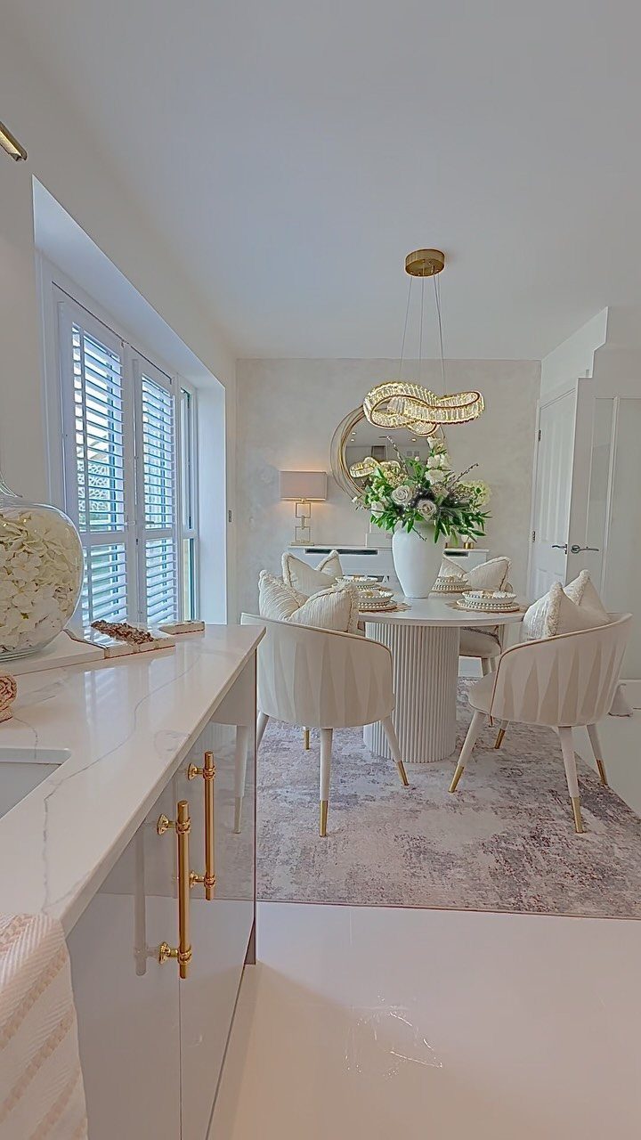
Gold hardware turns plain off-white doors into the detail people notice first, and a handful of pulls is a cheap way to do it. Swapping handles takes an afternoon with a screwdriver, and new doors would cost many times more.
Choose one gold finish and repeat it, as the chandelier does here, so the metal reads as a plan rather than an accident.
A brushed or soft gold looks warmer against cream than a bright mirror-polished one, and I prefer it.
Before drilling, measure the distance between the existing screw holes so the new pulls fit without patching.
8. Off-White Cabinets with Light Marble
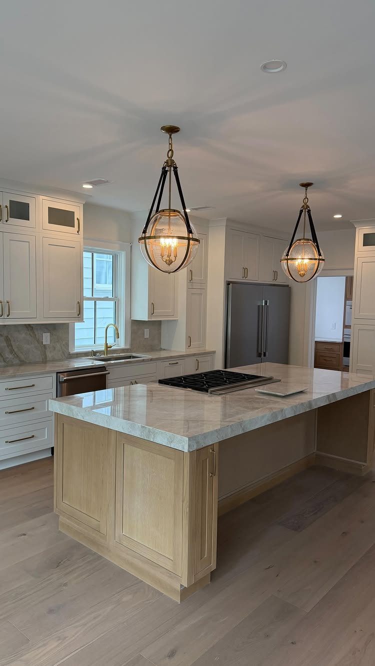
A marble island against off-white cabinets keeps the whole kitchen in pale tones, so the veining becomes the only pattern in the room. Light wood floors, as here, add warmth that stops all that pale stone from feeling cold.
Marble is the priciest countertop material you can pick for this look, so I would put it on the island alone and use a plainer light countertop around the edges.
Ask for a sample and set it against your cabinet door in daylight before ordering.
Hanging pendants over the island are an easy add-on, and they give the stone a spot of light to catch.
Choosing Between Whites
Pure white reads crisp and clean, but in a kitchen with little daylight or warm bulbs it can look stark or clinical.
Off-white is softer and more forgiving, and it hides the small color shifts that happen as the light changes through the day.
Look at what already stays in the room: the flooring, the appliances, the countertop.
If those lean cool, a pure white may sit better beside them. If they lean warm, off-white usually wins.
Paint a large sample board and tape it up for a few days. Check it in morning light, afternoon light and under your evening bulbs while the sample is still on the wall.
Designing with Off-White
Bright white often reads harsh or flat next to natural materials, which is exactly what soft creamy tones avoid.
3 shades worth testing are Benjamin Moore White Dove, Sherwin-Williams Alabaster and Farrow & Ball Pointing. Buy sample pots of all three, since each leans a little differently once it’s on your own doors.
I’d choose the lightest shade that still looks creamy next to your counters. Lighter tones also help a small room feel larger and airier, which matters most in a kitchen with limited square footage.
Color Coordination
Walls should either match the cabinet color or sit clearly darker. Cabinets that are darker than the walls tend to look off, so I match the wall color to the cabinets or go clearly darker on the walls.
If you go darker, aim for at least 20 LRV points below the cabinets, and check the number on the back of the paint chip.
Keep the wall color in the warm, muted neutral range.
Cool colors, or shades close to the cabinets in depth, push the cream toward yellow. Some people like that look, so test it first and decide with the sample in front of you.
Frequently Asked Questions
Which is better for kitchen cabinets, White Dove or Alabaster?
Both are good creamy off-whites, so the choice comes down to how warm you want the room and what undertone your counters and floor carry. Warm flooring, appliances and countertops usually make off-white the better match.
Should I choose pure white or off-white kitchen cabinets?
Off-white is the safer pick for most kitchens.
Pure white can look stark or clinical in a room with little daylight or warm bulbs, while off-white is softer and hides the color shifts that happen as light changes through the day.
When the flooring, appliances and countertop all run cool, pure white will likely sit better next to them.