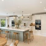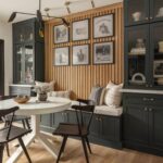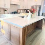
How much light the room gets and how much dark color you’re willing to commit to will decide which of these blues works, from Light Blue Cabinets to Dark Night.
The shades here run from Lavender-Blue Kitchen Cabinets and Blustery Sky, which bounce light around a small room, to Naval and Dark Night, which nearly disappear after sundown.
If you’re nervous about going deep, paint only the island, as in the navy island with white cabinets, and leave the rest alone.
A sunny kitchen can carry a full run of Naval or Dark Night, while a dim one does better with Light Blue Cabinets or a Navy Blue Island with White Cabinets.
1. Naval
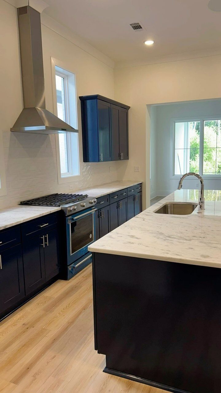
Navy is the blue I trust most for a kitchen that has to last past one trend cycle. It reads almost neutral, close to black in low light, and it lets white marble and light wood floors do the brightening.
Keep the counters pale, as they are here, so the cabinets get the weight without the room closing in.
A blue appliance like an oven is a bold extra; I’d treat it as optional and stay with stainless if you want to keep things calm.
2. Van Deusen Blue
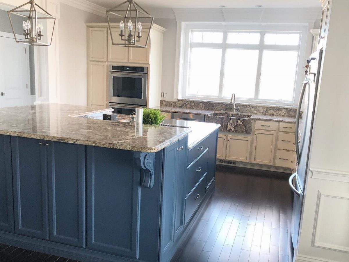
A deep blue with gray undertones behaves more like a neutral than a color, which is why it suits an island so well. Against cream perimeter cabinets it gives the room an anchor without turning the whole kitchen dark.
I like this split for budget projects: paint only the island and leave the existing cabinets alone. Granite on top handles the visual weight, so keep the surrounding walls soft and let the island stand alone.
3. Light Blue Cabinets
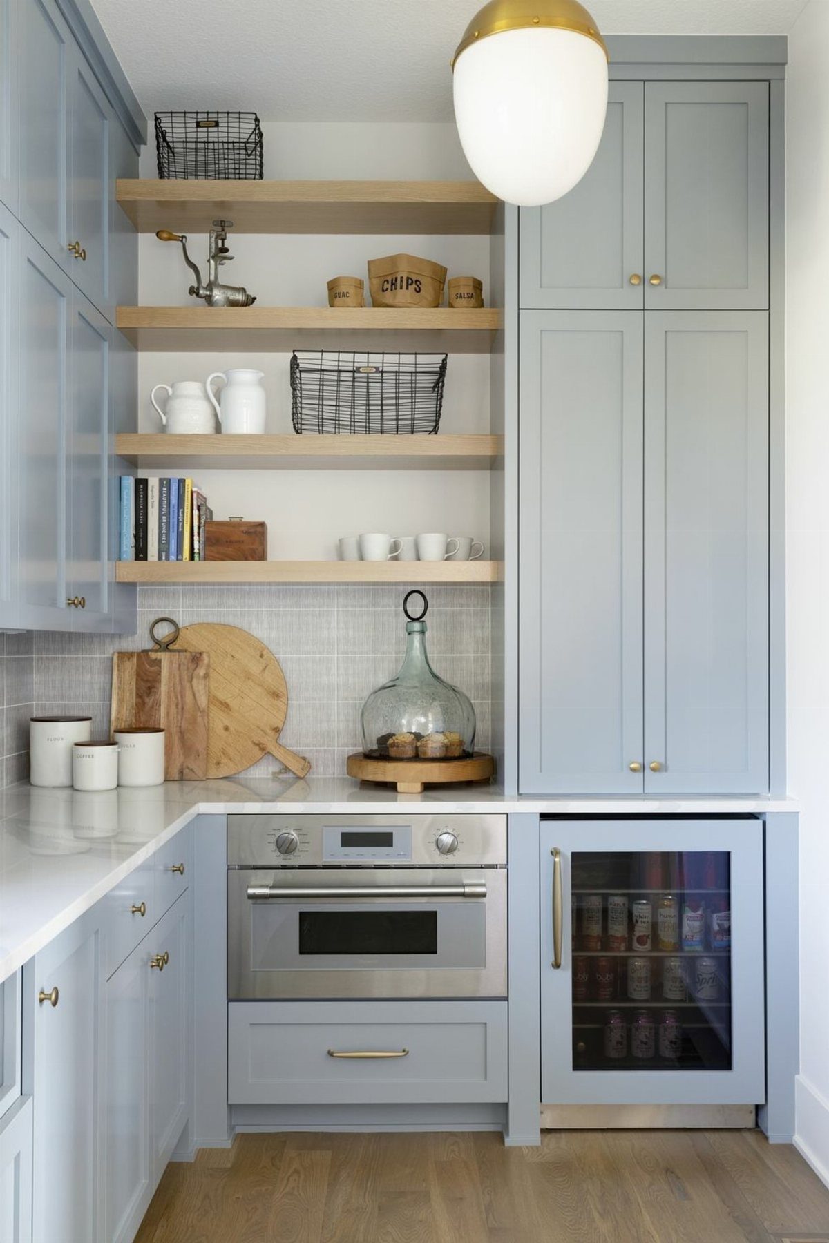
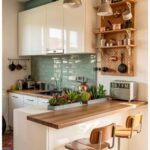
Light blue cabinets pair well with open wood shelves, and I’d copy that combination before anything else. The wood warms a cool color so the room doesn’t feel chilly.
For a rental or when space is tight, this is a forgiving way to bring in color, since pale shades bounce light around.
Pick a shade with a little gray in it if you worry about it looking nursery-sweet. Open shelves also give you a place for pretty containers, but they need regular tidying.
4. Gentleman’s Gray
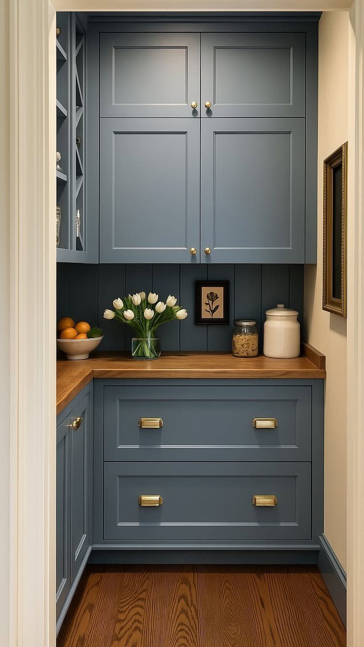
Gray-blue sits between formal and friendly, and gold hardware tips it toward dressy. A wooden countertop softens that, which is the pairing I’d choose.
Natural wood tones or metallic finishes bring out a calm, serene mood in this shade, according to the person who made this kitchen.
Hardware is the cheapest way to try it: swapping pulls is a one-evening job. Add a paneled wall behind, as here, if you want the traditional feel to go further.
5. Two-tone Blue Cabinets
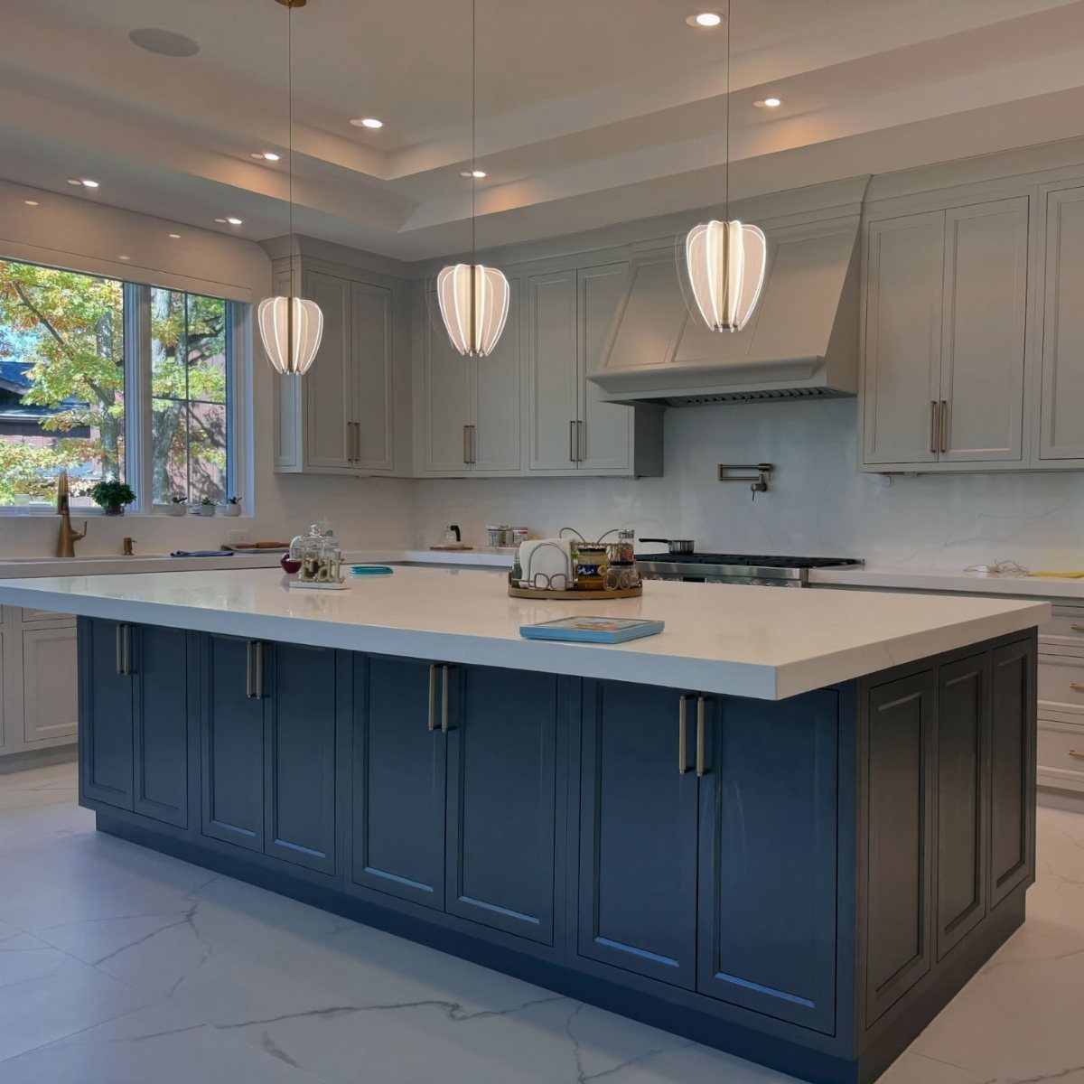
Splitting the colors, with a navy island and light gray perimeter cabinets, gets you contrast without painting every surface dark. White countertops tie the two together.
This is my pick for anyone nervous about committing to dark blue, since the island is the only big dose. If your budget is tight, paint just that one piece and keep the gray you already own.
6. Blue Cabinets with Wood Accents
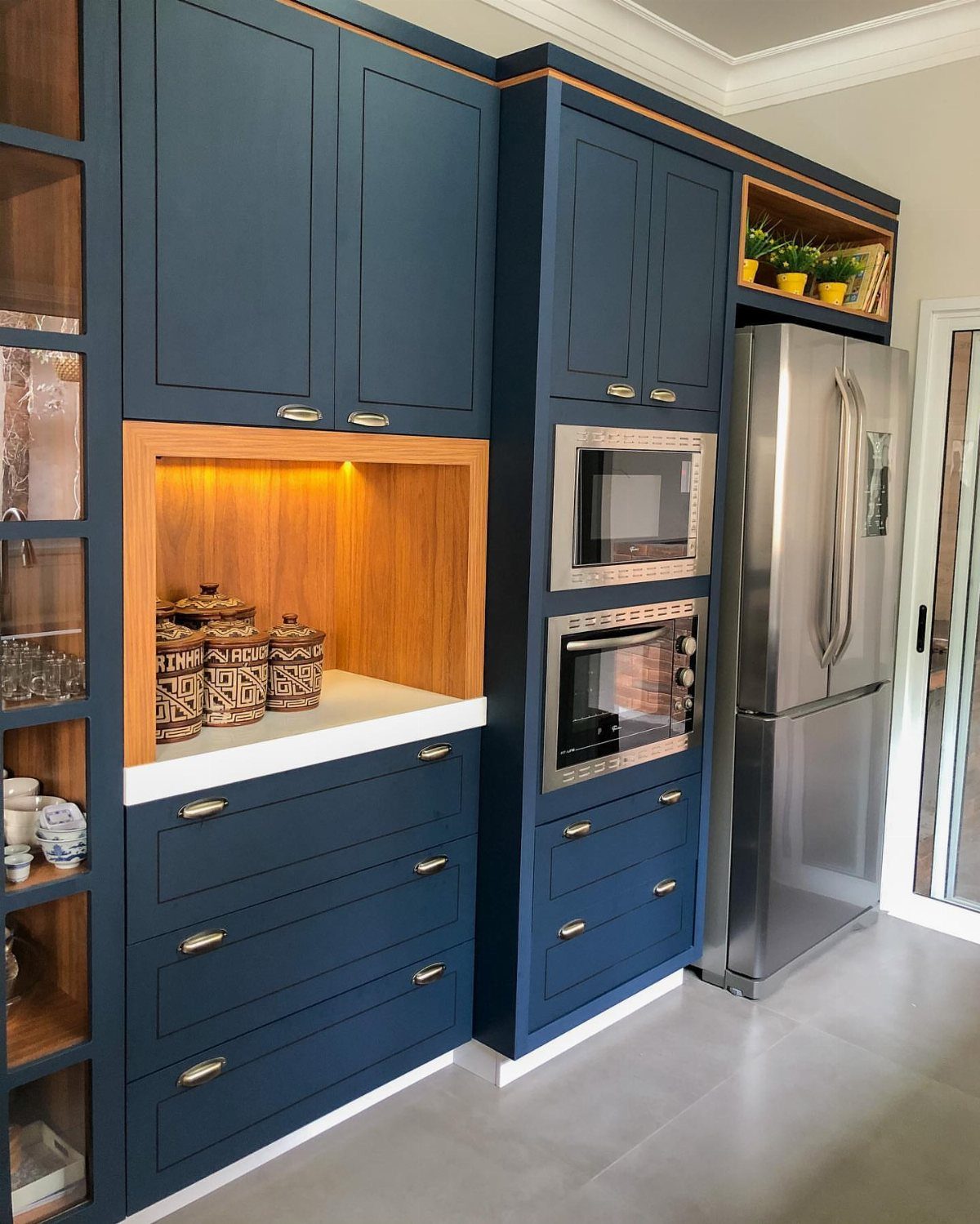
Wood against dark blue is a pairing that almost never goes wrong. The warmth of the grain cuts the coolness of the paint, and a wood-lined alcove gives a deep color somewhere to rest.
You can borrow this without a remodel: add a wood shelf, a butcher block counter, or wood stool seats.
Stainless appliances sit neatly beside it. My advice is to choose one wood tone and repeat it, so the kitchen feels planned rather than piled up.
7. Behr French Colony
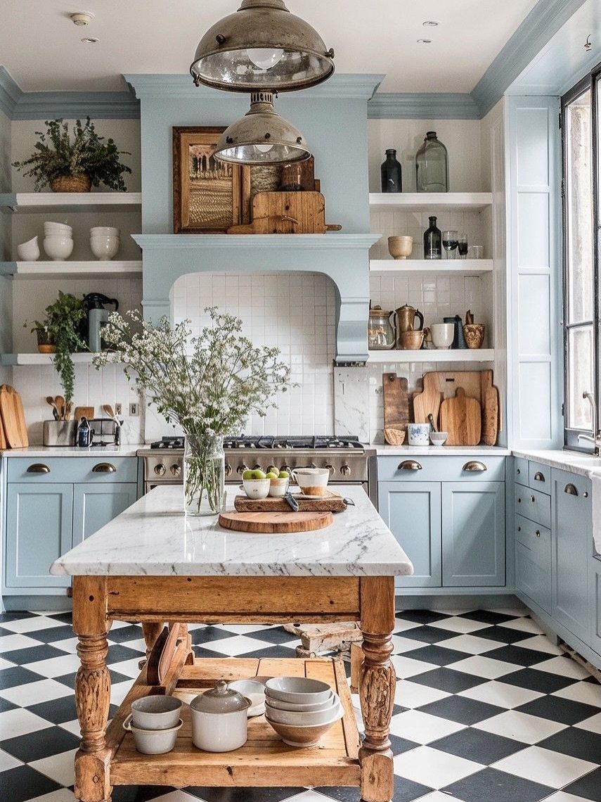
Light blue cabinets with a checkered black-and-white floor is a combination I’d copy even if French style isn’t your thing. The floor gives a soft color a strong graphic base, so the room reads fresh instead of sweet.
A marble-top island in wood keeps the blue from carrying everything.
If you rent, peel-and-stick checkered tiles are the budget route to the same look. Leave a shelf or two open, and keep what sits on them to a few matching pieces.
8. Deep Blue-Green Cabinets
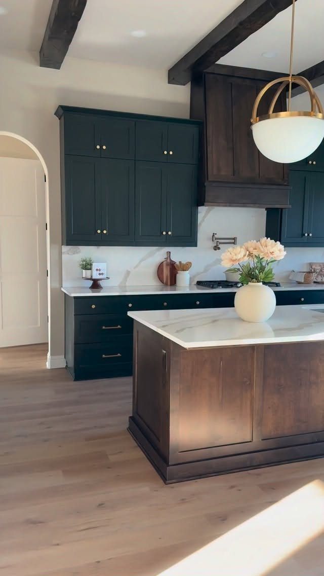
Blue-green settles the blue-or-green argument by refusing to pick a side. Painted on both uppers and lowers, it turns the cabinets into the room’s main color.
Pair it with white countertops and light wood floors, as here, so the depth stays in balance.
A dark wood island or range hood adds a second heavy tone next to deep blue-green cabinets; that works, though I’d stop at one or two such pieces.
Tape a sample to the wall and check it at breakfast and again under lamps after dark before you buy a gallon, since this shade shifts toward blue or green as the light changes.
9. Stiffkey Blue
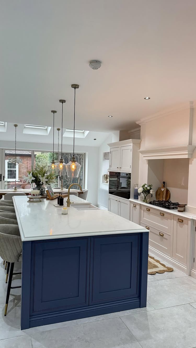
A bold blue island against white perimeter cabinets gives the kitchen one clear focal point. Because the rest stays white, the color can go dark and dramatic without making the room feel small.
White marble on top keeps it crisp, and gold hardware adds warmth.
Pendant lights hung over the island repeat that glow. For a weekend project, paint only the island and swap its pulls, which keeps cost and effort low.
Key to her strategy was contrasting all that period fanciness with electrifying hits of blue—Sacks’s favorite color. In the kitchen, Yves Klein Blue upper and lower kitchen cabinets stand out against a white exposed-brick wall.
10. Blustery Sky
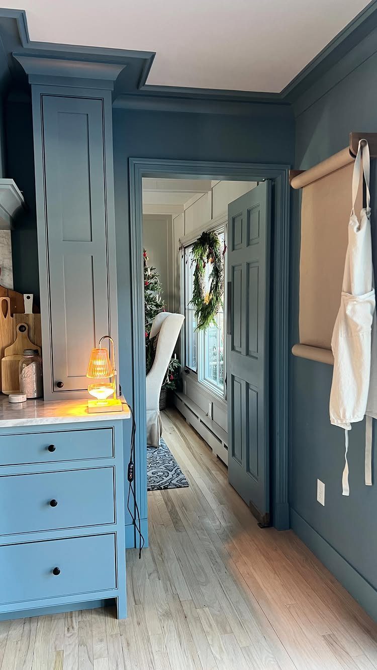
Medium blue-gray is the easy middle: darker than a pastel, softer than navy. Painting the walls to match the cabinets, as here, wraps the room in one calm tone.
Pair a soft sky blue with white countertops and light wood flooring, because the lighter surfaces keep the color from feeling flat.
I’d choose this shade for a kitchen that gets ordinary daylight, where navy might sulk. It also tolerates mixed decor, from wreaths to hanging aprons, without fighting anything.
11. Dark Night
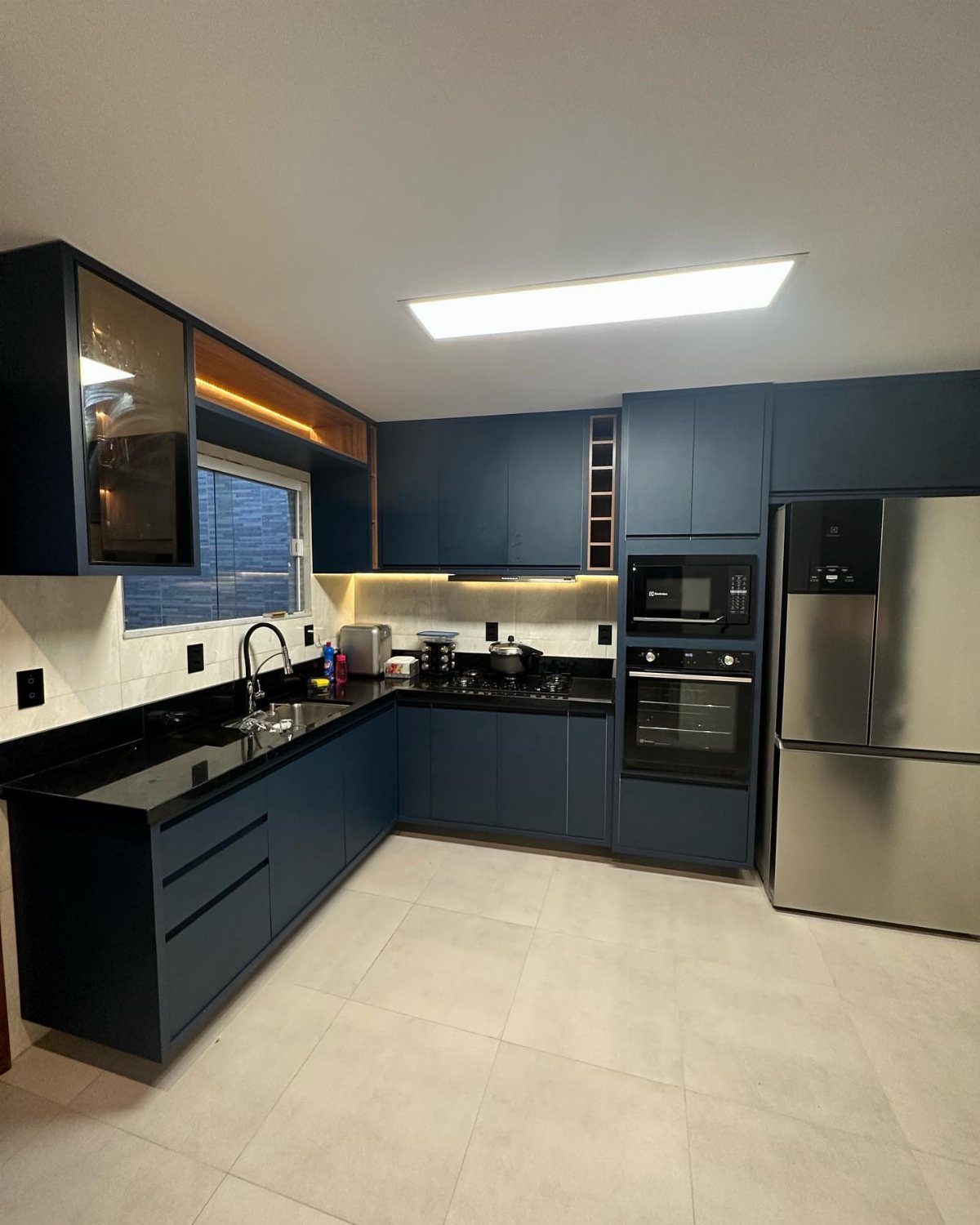
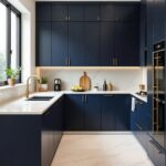
Deep, moody blue turns cabinets into a backdrop that nearly disappears at night. Black countertops push the effect further, and I like that commitment.
Stainless steel appliances sit well against it, and a built-in oven and microwave keep the lines tidy.
The cost is light: a dark kitchen with dark counters absorbs it, so add good under-cabinet lighting. If you want less drama, switch the counters to a pale stone and keep the blue.
12. Blue Cabinets with Blue-and-White Decor
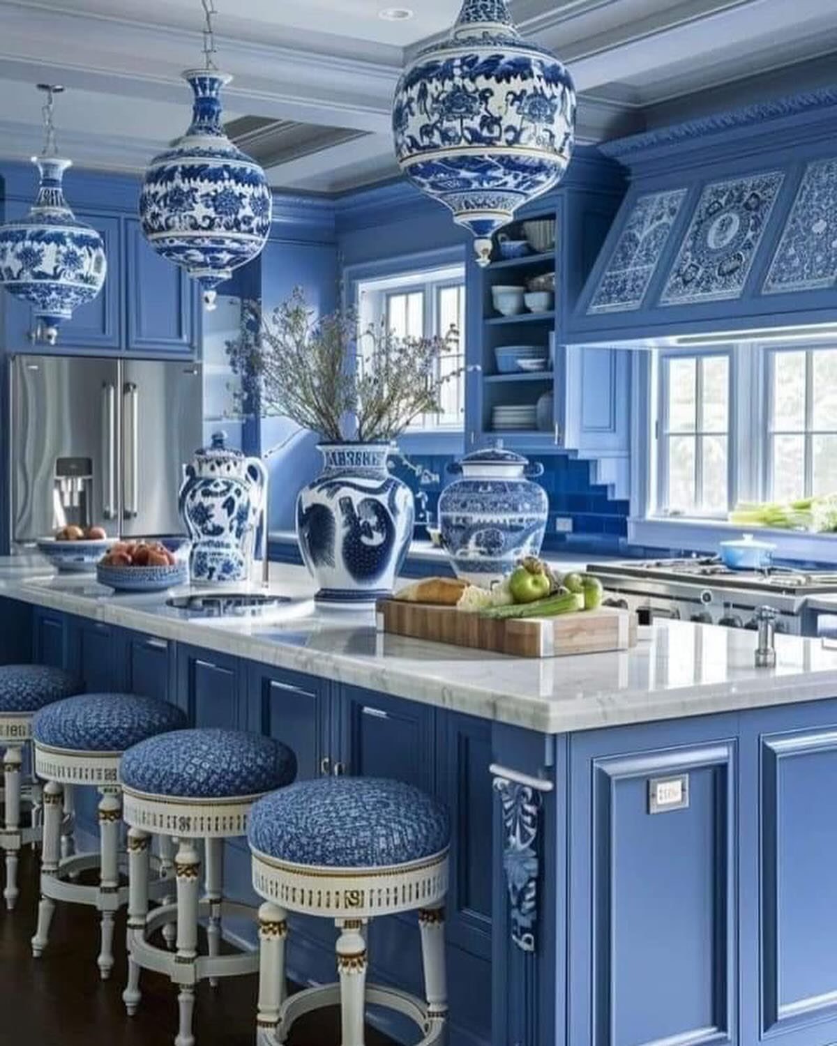
Blue-and-white porcelain is the detail that makes deep blue cabinets feel intentional. White marble countertops give it the clean ground it needs.
Patterned bar stools and porcelain pendants repeat the theme, but I’d buy one or two statement pieces first.
Large vases are the cheapest way to try the look, and you can swap them out without touching the cabinets. Keep the pattern to a single blue so it doesn’t compete with the paint.
13. Dark Blue Cabinets with Gold Hardware
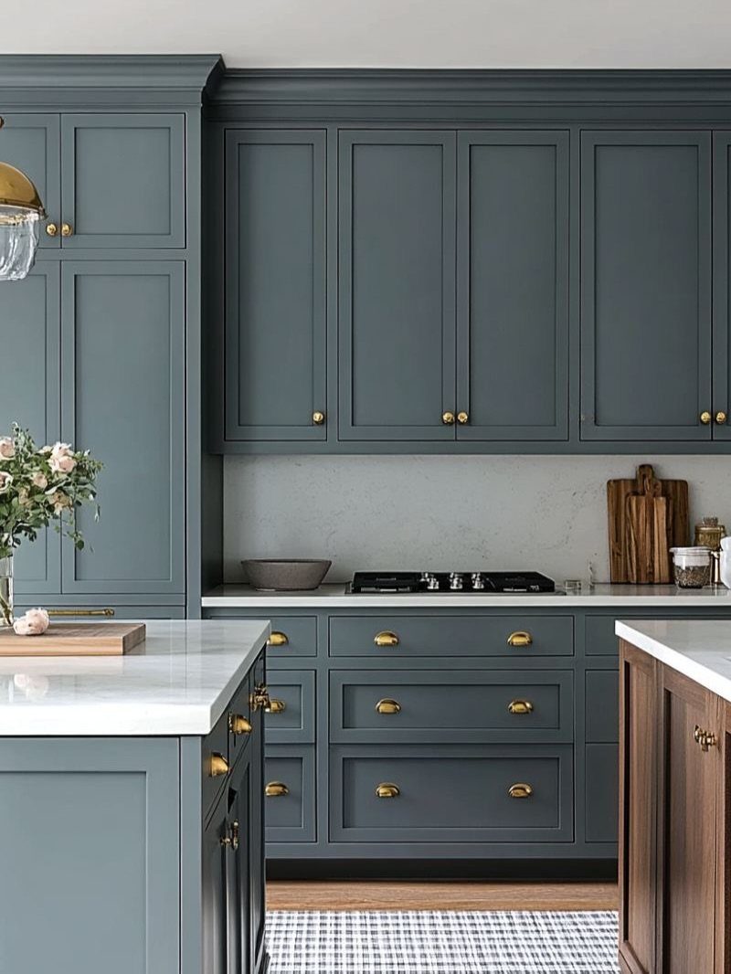
Gold knobs and pulls are what make dark blue shaker doors look finished instead of merely painted. The warm metal picks up against the deep color, and white countertops keep the contrast clean.
Hardware is the cheap part of this idea, so start there.
Pick one gold tone for every knob and pull so nothing looks mismatched. A black stovetop sits quietly beside it, and a wooden cutting board adds a touch of warmth on the counter.
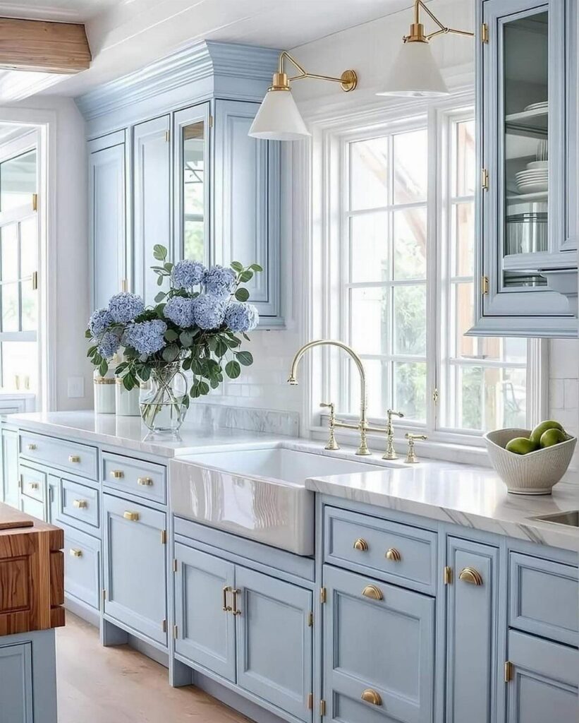
14. Lavender-Blue Kitchen Cabinets
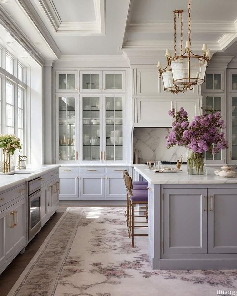
Lavender-blue is a pale blue pushed slightly toward purple, and it reads softer and more unusual than a plain sky shade. White marble countertops keep it light, and a gold chandelier gives it a touch of glamour.
Test the paint before committing, because the lavender shows up differently by the hour.
Tape a sample up and look at it in daylight and under lamps. A vase of purple flowers, as here, is an easy way to echo the undertone without repainting anything.
15. Navy Blue Island with White Cabinets
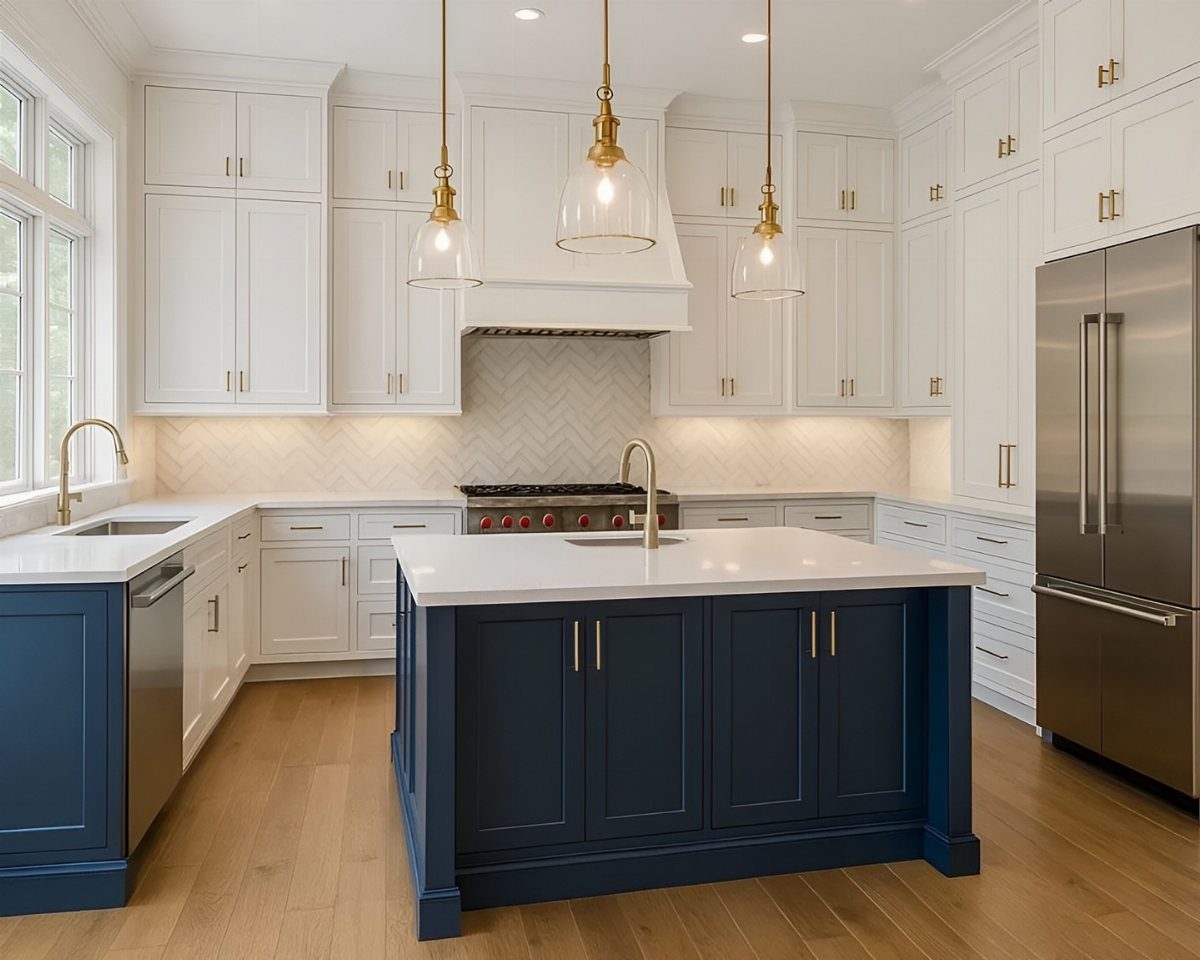
Navy on the island alone, with white cabinets all around, is the version of dark blue I’d hand to a cautious first-timer.
Because white covers the perimeter, the light stays high, and the island can carry the one deep navy note without weighing anything down.
3 gold pendants overhead tie the metal to the blue, and stainless appliances stay out of the way.
A white countertop on the island keeps the navy from feeling heavy. Painting only the island is a small job, and you can leave the white cabinets exactly as they are.
Choosing the Right Blue
Judge a blue by the light in your own kitchen, not by the chip in the store.
Think in layers so the blue doesn’t overwhelm the room. Too much of one color can tire your eyes, so give it a partner in the counters, walls, or floor.
If you have a lot of cabinets, try white on top and blue on the bottom. It’s a simple way to keep the color from taking over.
Paint brands like Sherwin-Williams, Benjamin Moore, and Behr all offer good blues, so pick by how the shade looks in your room.
Pairing Colors
Match the metal to the blue. Navy goes well with brushed brass, while dusty, lighter blues work with nickel, brushed brass, or matte black, so you have more room to choose.
Soft blues pair well with light gray for a calm, balanced look.
Blue reads cool, so a butcher block counter or oak-toned floor in a light to medium finish brings the warmth back and keeps the room from feeling chilly.
If the room feels flat, mix the blue with white or a warm neutral first, then add black or brass hardware for contrast.
Timeless Appeal
Deep shades like navy tend to outlast trends, while some blues are tied to a moment. If resale or long-term living matters, I’d lean toward navy, deep blue, or a muted tone over anything very bright.
Blue also acts like a neutral, so you can change accent colors or accessories later without redoing the cabinets. That makes it a safer bet than it first appears.
Its calming effect suits a room where you spend so much time. Pair it with white or wood and the combination stays classic across traditional, modern, and eclectic styles.
Frequently Asked Questions
What is the most popular blue color for kitchen cabinets?
Navy is the safest pick, and Hale Navy and Naval are two of the names that come up most.
Navy is the safe pick: it behaves like a neutral, and in dim light it can pass for black, which is why it outlasts most color trends.
What is the trendy blue color for 2026?
2 camps are trending: deep navies and lighter dusty blues.
A deep navy is often described as almost black with a personality, while dusty, cottage-style blues are soft without turning into baby blue. If you want a middle ground, a medium blue-gray sits between the two.
Are blue kitchen cabinets still in style?
Yes, blue cabinets remain a timeless and stylish option, especially deeper shades like navy or a muted tone.
Because blue sits so easily with other colors, swapping the towels, stools, or wall art later is enough to change the mood without touching the paint.
What kitchen cabinet colors will look outdated in 2026?
Very bright, trend-tied colors are the ones most likely to date, while classic blues should hold up. Pairing the blue with white or wood keeps it looking current as accents change.