Ideas here run from open shelving and textured backsplash that you can install yourself to a statement range hood or mirrored panels that take professional help.
Renters can start with two-tone paint, a chalkboard wall and a freestanding island cart, while owners can commit to a farmhouse sink, slatted wood details or concealed appliances.
1. Open Shelving
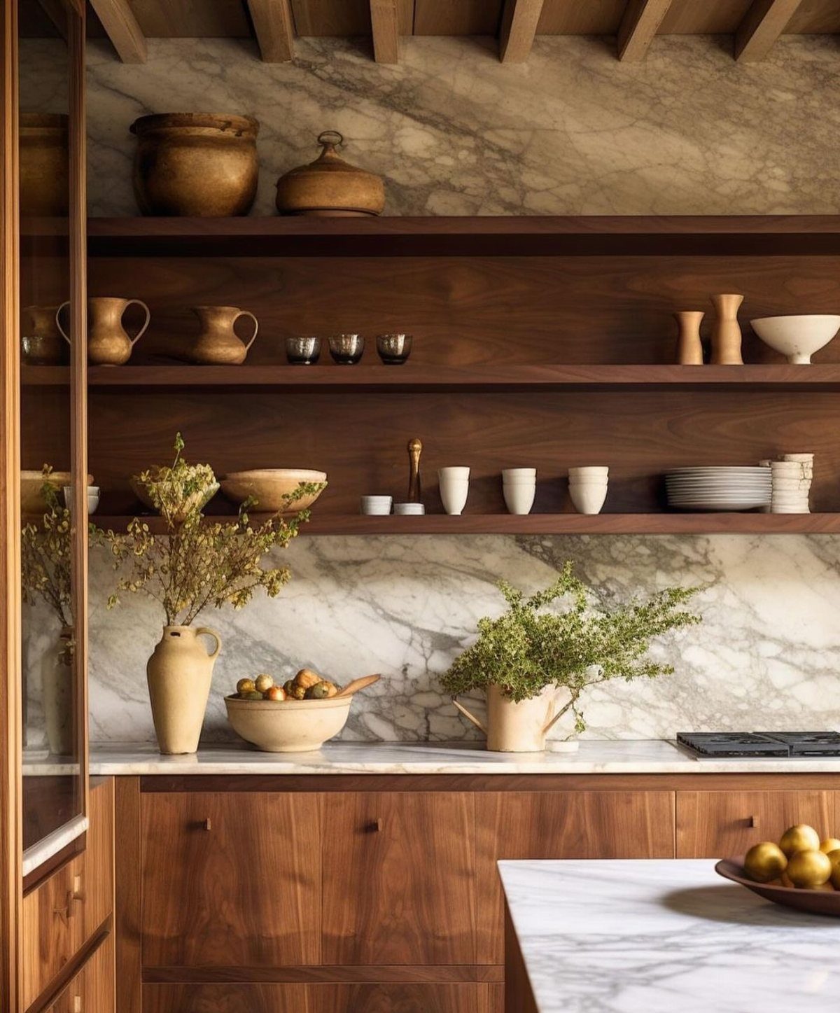
Dark wood shelves against marble give pottery and bowls something to stand out against, so I would keep the objects to a few shapes in related tones.
Everyday bowls and plates are the best fit, since they earn their spot by being used and stay within arm’s reach.
Leave gaps between the pieces. A shelf packed edge to edge looks like storage; one with space around each stack looks chosen.
2. Textured Backsplash
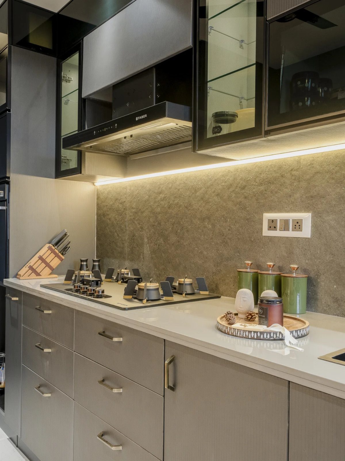
A textured stone backsplash adds depth to a grey kitchen, especially when it runs behind the range where the eye lands first.
I like it most with a small light source close by, because under-cabinet lighting skims the surface and makes every ridge cast a tiny shadow.
Keep the cabinets flat and simple so the wall does the talking. For a renter or a weekend budget, a textured peel-and-stick tile is the cheaper way to get a similar look.
3. Two-tone Cabinets
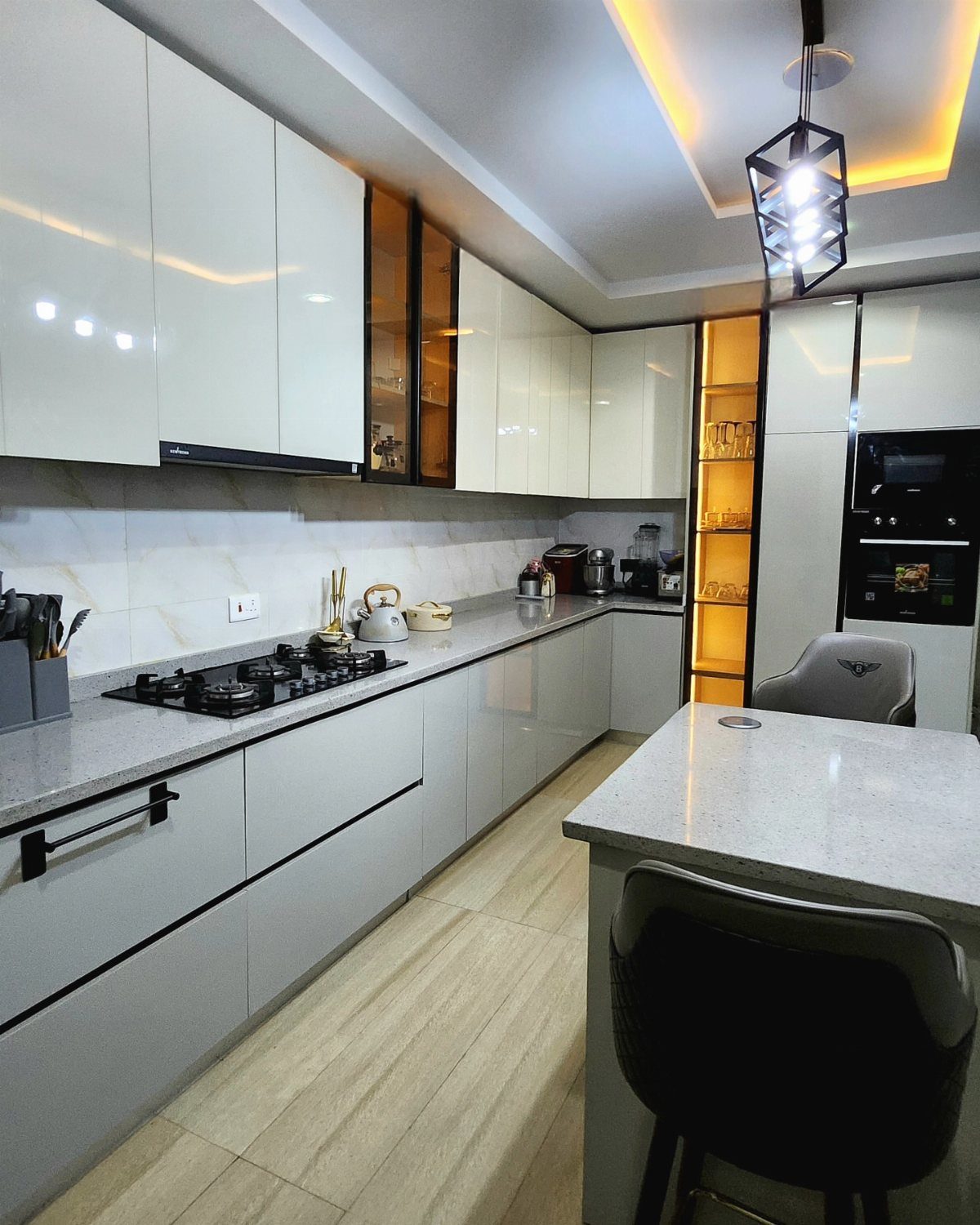
White uppers over grey lowers is the easiest two-tone pairing to live with: the light color keeps the walls open, and the darker base hides scuffs near the floor. A white countertop ties the two together.
Paint is the budget route. Use a cabinet-grade enamel on the lowers and leave the uppers alone, or repaint them white, and you have the whole effect for a weekend of work.
If the island matches the lowers, the room feels planned rather than pieced together.
4. Statement Range Hood
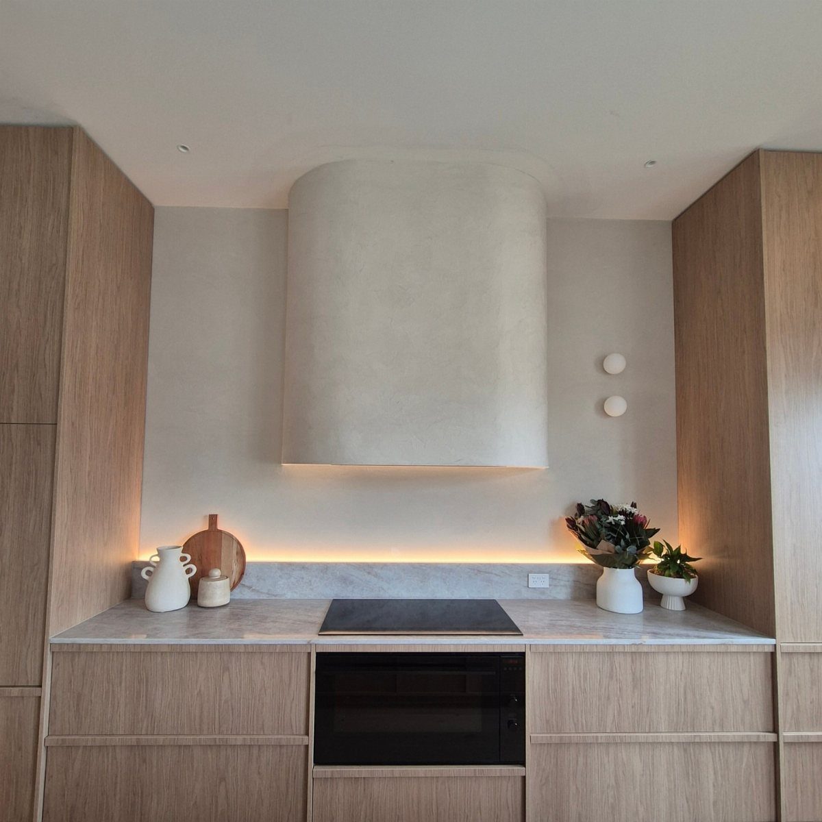
A curved plaster hood turns the ventilation box into the one soft shape in a room of straight lines. Against light wood cabinets and minimal decor, it needs nothing around it to hold attention.
Custom plaster is a bigger job and a bigger bill than most weekend projects can carry.
If that is out of reach, I would pick a plain hood and paint it a warm light shade to match the walls, which gets you the quiet look without the build.
5. Open Concept Design
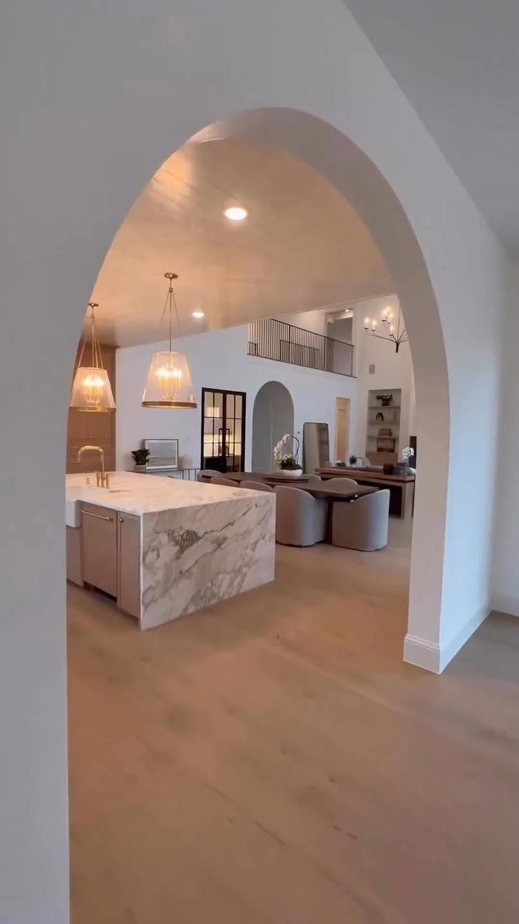
Removing the wall between cooking and eating is the big move, but an arched opening like this one shows a gentler version: the rooms read as one, yet each keeps its own edge.
An island with different material or color helps mark the boundary between kitchen and dining space in an open layout. Carry the same light wood floor through both zones and the space feels larger than its square footage.
Renters can borrow the idea by keeping sightlines clear and the floor color consistent.
6. Appliances Concealed Behind Cabinetry
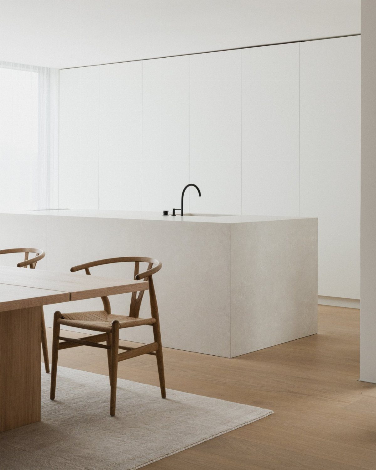
Handleless white doors across a full wall hide the appliances and leave the island as the only thing the eye lands on. A black faucet against the pale stone is the single sharp accent, and I would not add another.
Flat fronts show fingerprints and smudges, so plan on wiping them down often. Anyone renting can get close with a matching panel on the fridge and push-latch hardware.
7. Mirrored Panels
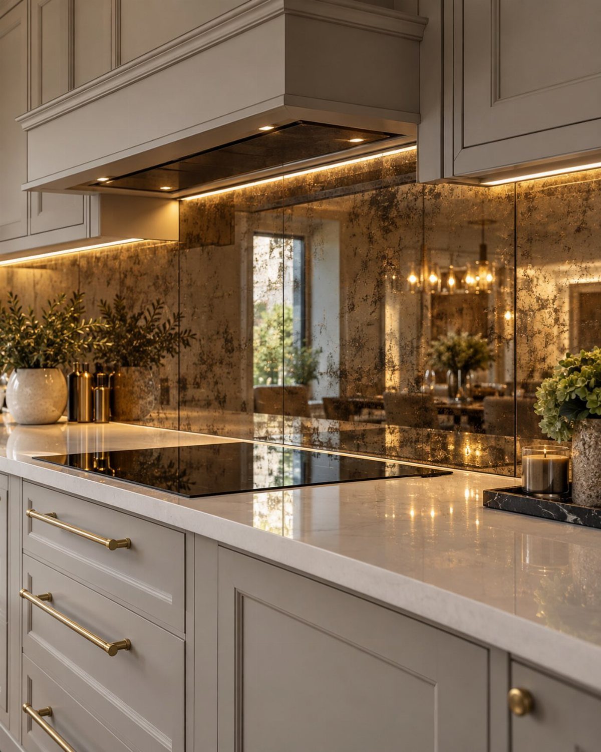
An antique mirrored backsplash bounces light back across the counter, so a kitchen with grey cabinets and white marble feels wider and brighter than it measures. The aged finish softens the glare that a clean mirror throws.
Keep it to the wall behind the cooktop or sink, and let the gold handles supply the only warm metal. Fingerprints and splashes show on glass, so wipe it often.
Mirror costs more than paint or tile, and a custom cut takes a pro, so I would price it before falling for it.
8. Wood, Metal, and Stone
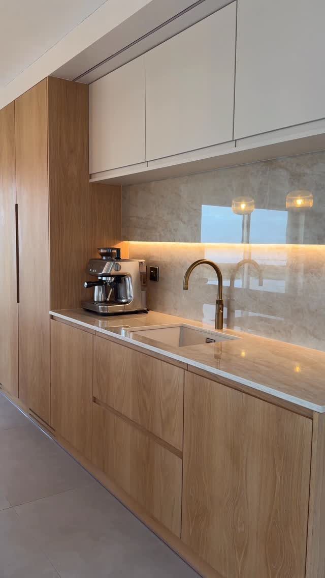
Light wood, a gold faucet and marble-look stone make a good trio because each material does a different job: wood warms, stone cools, and metal adds one bright point.
Give each material a clear territory. Wood on the lower cabinets, stone on the counter and backsplash, and a single metal finish for the faucet, with white uppers keeping the whole thing calm.
I would hold the metal to one finish. Mixing gold with silver on the espresso machine is fine, since appliances read as neutral, but adding more fixtures in gold starts to look busy.
9. Under-cabinet Lighting
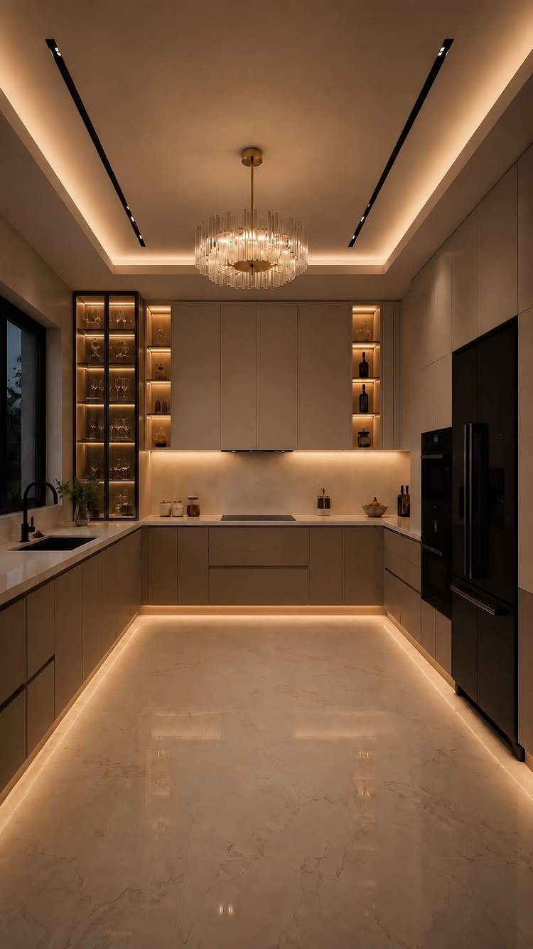
Strip lights tucked under the upper cabinets put light right on the counter, where overhead fixtures leave your own shadow. A second strip along the base adds a soft glow at night that works as a nightlight.
For a renter or a weekend budget, stick-on LED strips with a plug-in adapter are the easy route, no wiring needed. Hide the strip behind the cabinet’s front lip so you see the glow, not the bulbs.
Choose a warm white tone to flatter beige cabinets.
10. Freestanding Island
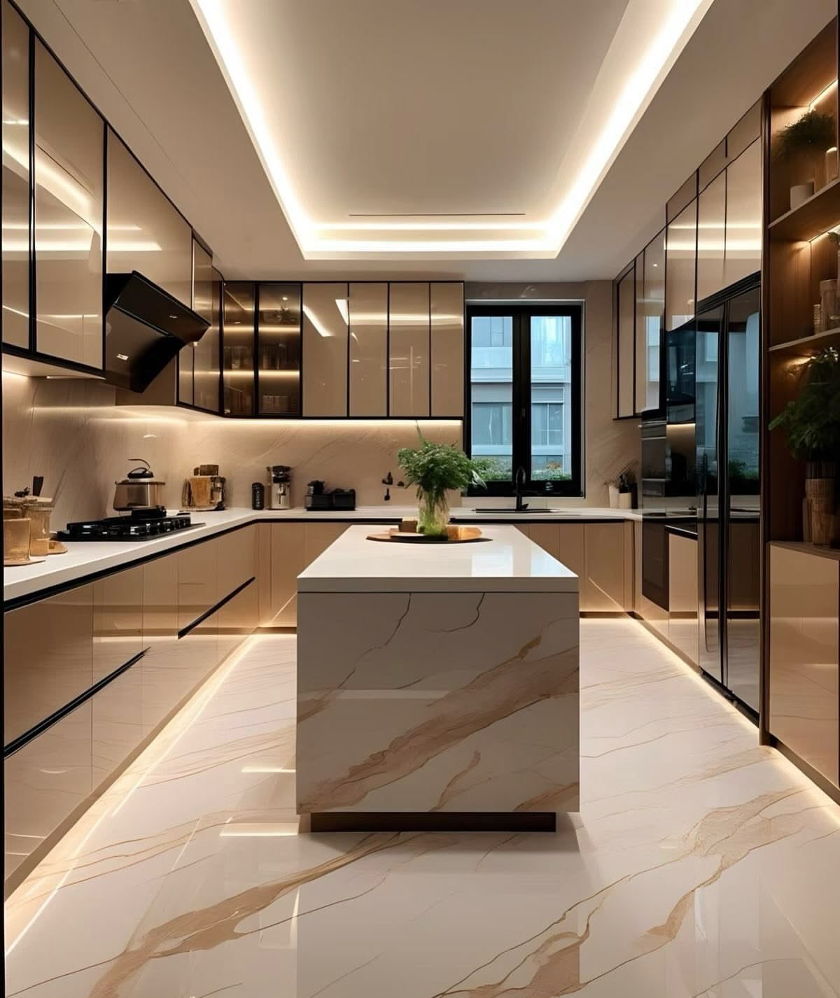
A freestanding island is a piece of furniture on the kitchen floor, which makes it the easiest island to add or change later. In a glossy beige kitchen, a marble-patterned top gives it presence without a built-in’s cost.
Leave enough clear floor on every side to open doors and walk past without turning sideways. If the room can’t spare that, skip the island and use a narrow cart instead.
Pick a top you can wipe down daily, since this is where everything lands.
11. Farmhouse Sink
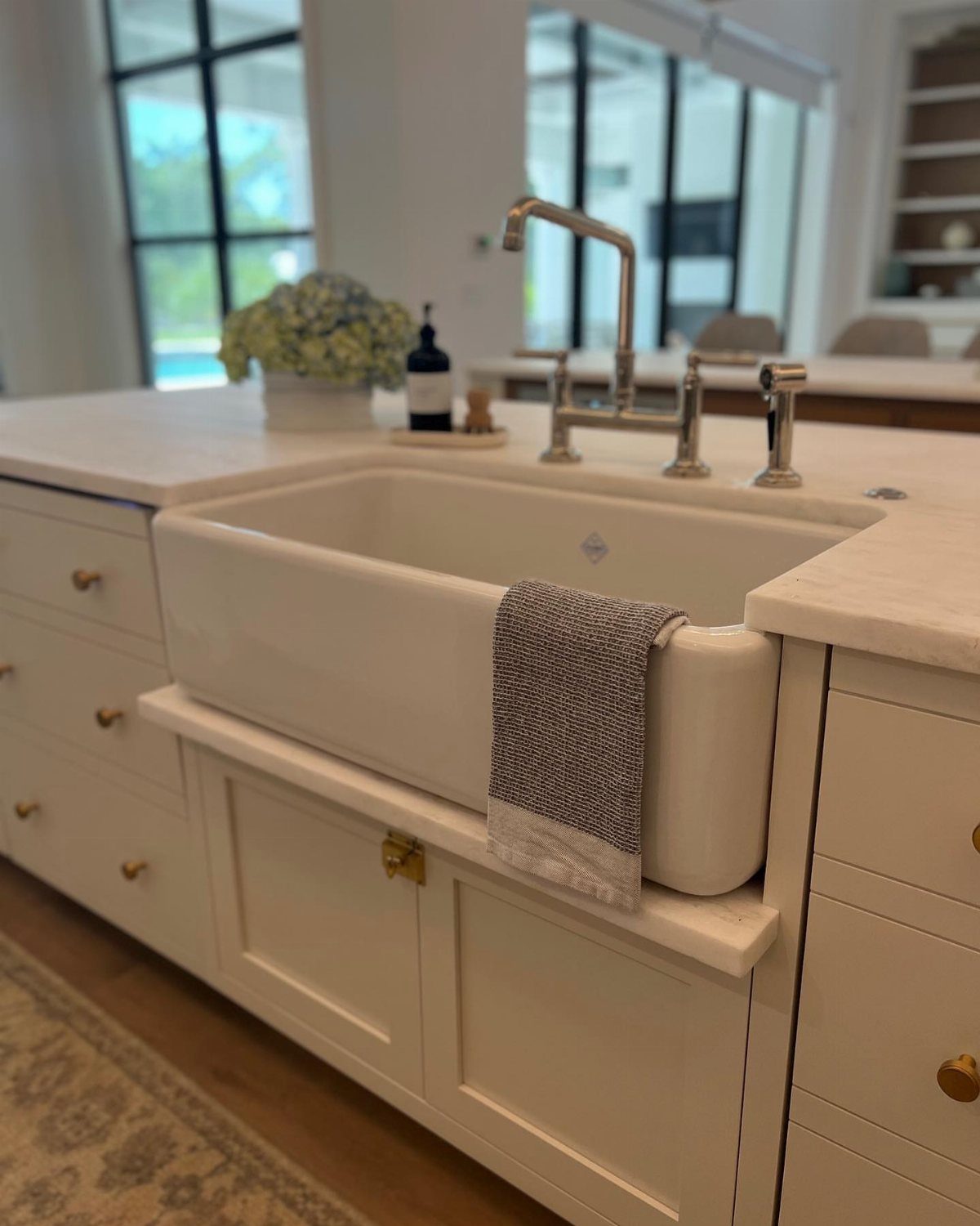
An apron-front sink shows its full face, so the white basin becomes part of the island’s look instead of hiding under the counter edge.
Mixing gold cabinet hardware with a silver faucet reads as practical rather than fussy, as long as you keep each metal to one job and repeat it elsewhere in the room.
A deep front-facing basin holds big pots and keeps you from leaning over a counter lip while you wash. Swapping one in means cutting the cabinet to fit, so check the cabinet’s size before buying.
I would hang a plain towel over the edge of the apron front and leave the rest of the sink area bare, so the deep basin stays the focus.
12. Chalkboard Wall
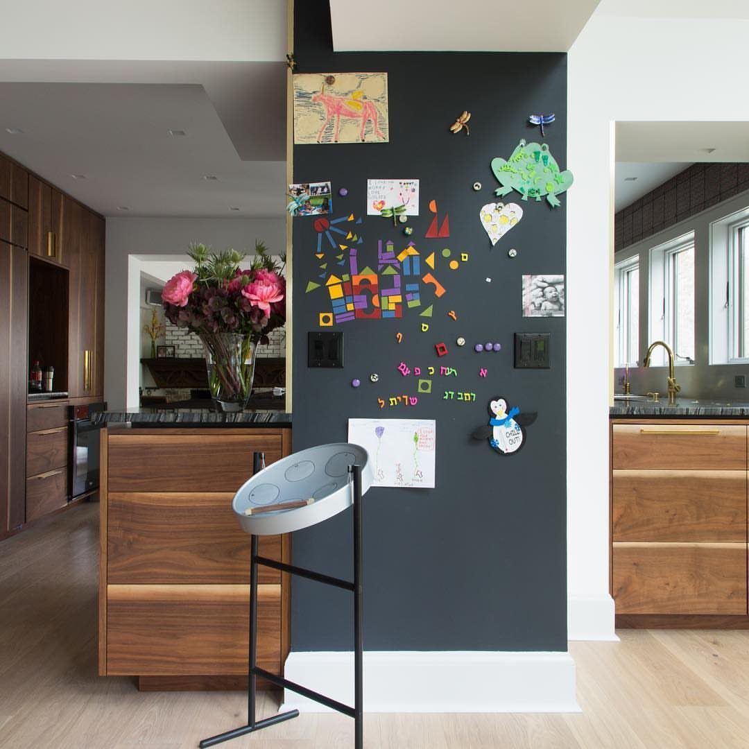
A dark grey chalkboard wall gives a kitchen a place for lists, menus and kids’ drawings, and it gives a plain wall real character.
Chalkboard paint is the budget route: roll it on a wall section, let it cure, then rub chalk across the surface and wipe before first use.
Magnets only hold on magnetic paint, so decide which one you want before you buy.
I would keep it to one wall away from the stove, because chalk dust and cooking splatter don’t mix.
13. All-white Modern Aesthetic
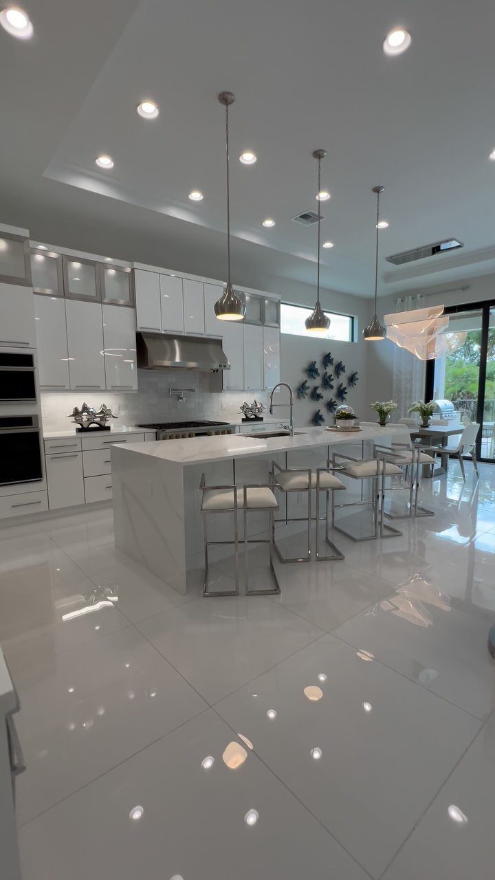
Glossy white cabinets, a marble island and polished floor tiles all bounce light around, so an all-white kitchen reads bigger than its footprint. Silver stools and pendants keep the metal cool and match the palette.
Gloss shows every fingerprint and drip, so wipe the fronts often. A white kitchen also gets its depth from texture and finish, so I would vary the sheen a little: glossy doors, a veined stone top, a matte wall.
Renters can borrow the look with white paint and a few cool-toned fixtures.
14. Deep Burgundy Cabinetry
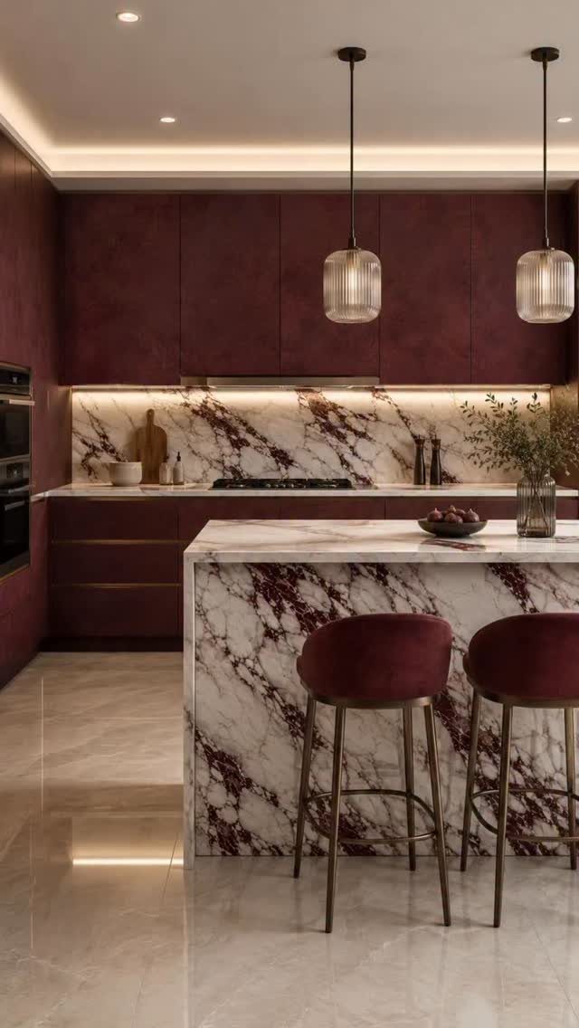
Burgundy cabinets turn a kitchen from safe to memorable, and purple-veined marble is what makes the color feel planned. The stone picks up the cabinet shade, so the two read as one palette instead of a clash.
Velvet barstools in the same wine tone add softness against all that hard surface. I would stop there and keep the pendants plain, here ribbed glass, so the color stays the star.
A cabinet-grade enamel in deep burgundy on the lowers alone gets you most of the effect.
15. Slatted Wood Island Detail
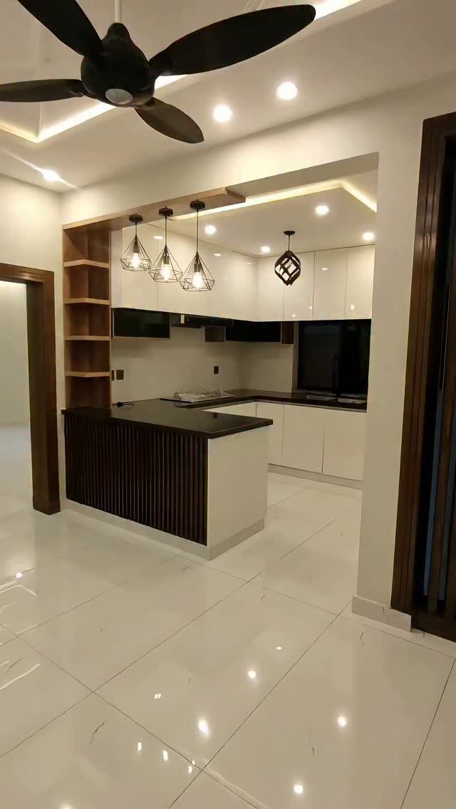
Slats of dark wood wrapped around an island give a flat white kitchen a strong middle.
Against white cabinetry, the dark base and dark countertop make the island the one heavy object in the room, which is exactly what you want from it.
Keep everything else quiet: plain cabinet fronts, simple pendants, no second pattern. Vertical slats also break up a big blank side that would otherwise look like a box.
For a weekend build, I would furring-strip or trim slats onto an existing island, then stain them to match the top.
16. Oversized Woven Pendant Lighting
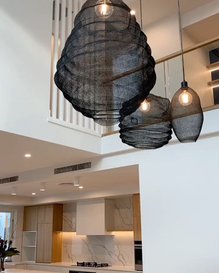
Three oversized black woven pendants hung in a row bring texture overhead, and against light wood cabinets and a white marble backsplash the dark weave stands out without crowding the wall.
Big shades do the work of art, so I would skip any other statement piece nearby.
Pick shades large enough to look deliberate; 3 small ones would feel timid here. Keep the spacing even and the heights matched.
A plug-in swag pendant is the renter-friendly route, since it needs no wiring.
17. Dedicated Coffee Station Cart
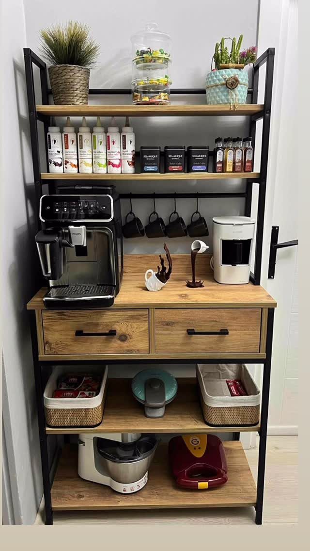
A tiered wood and metal shelf makes a coffee bar anywhere there is a bare wall, no cabinet work needed.
Put the espresso machine and pod machine on the sturdy middle tiers, mugs where you can grab them, and baskets below for pods, filters and syrups.
Keep the water source and an outlet close, since both machines need them. Group tools by use so the morning routine takes no hunting.
I like a cart this open because it is easy to move, and it costs far less than a built-in. Wipe the shelf every few days, as coffee splashes show on pale walls.
Choosing Materials Wisely
Counters and backsplash take the most abuse in a kitchen, so pick surfaces that survive a quick wipe with a damp cloth. If a material needs special cleaners or careful handling, I would pass on it for these 2 spots.
Fabric matters too. Performance fabric on stools handles spills and crumbs, which makes it a smart pick for seating at the counter.
Wallpaper near a stove or sink needs a vinyl-coated roll rated scrubbable or washable, since plain paper stains at the first grease splatter. A plain paper will stain and peel the first time grease hits it.
Incorporating Personal Style
Start with what the kitchen already has. Original cabinets or an older backsplash with some character can set the tone, and keeping them costs less than replacing them.
Save the personality for a few small spots like a pendant light, cabinet pulls, or one shelf of things you love, and keep everything else quiet.
I find restraint works better than filling every surface, because a kitchen with one or two things to notice feels collected rather than crowded.
A soft color palette helps hold it together. Choose two or three tones you love, repeat them, and let the rest stay quiet.
Maximizing Space
In a small kitchen, think about what can leave the counter. An appliance garage built into the cabinetry hides the toaster and blender, and it frees the work surface for prep.
Moving the refrigerator can also open up a tight layout, though that is a bigger job than most weekends allow.
Day to day it handles chopping, then turns into a serving table for guests or a spot where kids can do homework.
I would choose one piece that does two or three of those jobs over several single-purpose pieces that eat floor space.
Frequently Asked Questions
What is the best interior design for a kitchen?
The best kitchen design is one you can clean easily, that has a few personal touches, and that keeps the rest quiet.
Choose counters and a backsplash you can clean in one pass, then let a light fixture, hardware, or a single open shelf carry the style. Two or three repeated tones hold it together better than filling every surface.
What is the 3-5-7 rule in decorating interior design?
The rule suggests using 3 colors, 5 textures, and 7 different materials.
In a kitchen I treat it as a loose guide rather than a quota. A palette of two or three quiet colors usually reads better than a kitchen that tries to include every decorating principle at once.
What is the 3 kitchen rule?
It is a layout rule about efficiency and workflow, meaning the kitchen should be arranged so moving between tasks is easy.
You need clearance on all sides of an island to open appliances and move through the space without colliding with someone else. When the floor plan is tight, a rolling cart gives you flexibility without blocking traffic.