The colors here run from white and greige that nearly disappear into the walls to emerald, terracotta and matte black that anchor everything around them.
Sage, dusty rose, greige and charcoal all shift with the bulbs and the countertop beside them, so brush a sample quart onto 2 doors and check it in the morning and again at night.
1. White Kitchen Cabinets
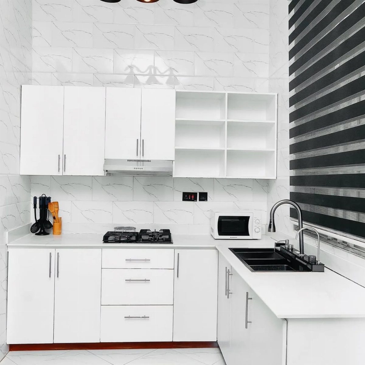
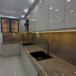
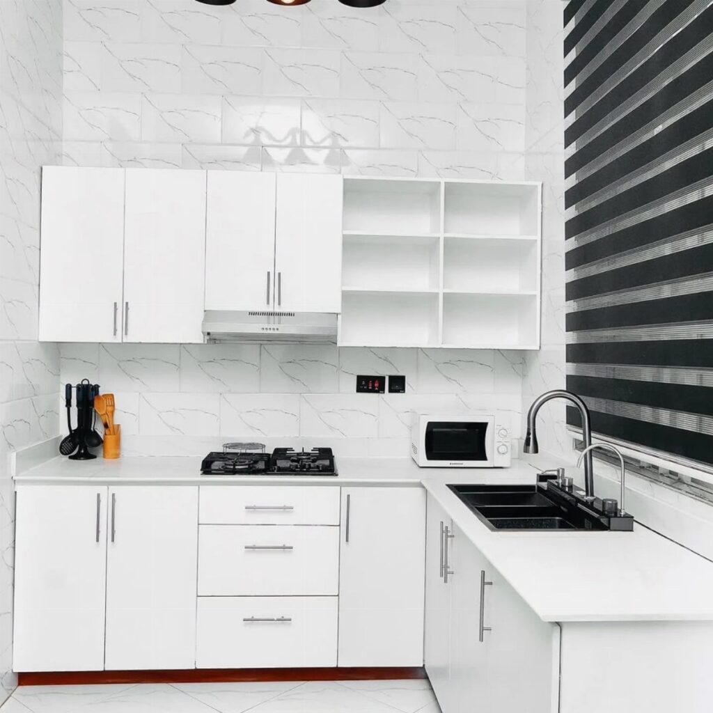
White cabinets against a patterned white backsplash keep a kitchen reading clean and open, and the black stovetop, sink and small details give the eye somewhere to land. That contrast is what stops an all-white room from going flat.
If the backsplash carries the pattern, keep the cabinet doors plain. Shaker or slab fronts let the tile do the talking.
Choose a white with a slight warmth if the room gets little daylight; a stark one can look cold. Paint a sample on a door and check it morning and evening.
2. Navy Blue Kitchen Color Scheme
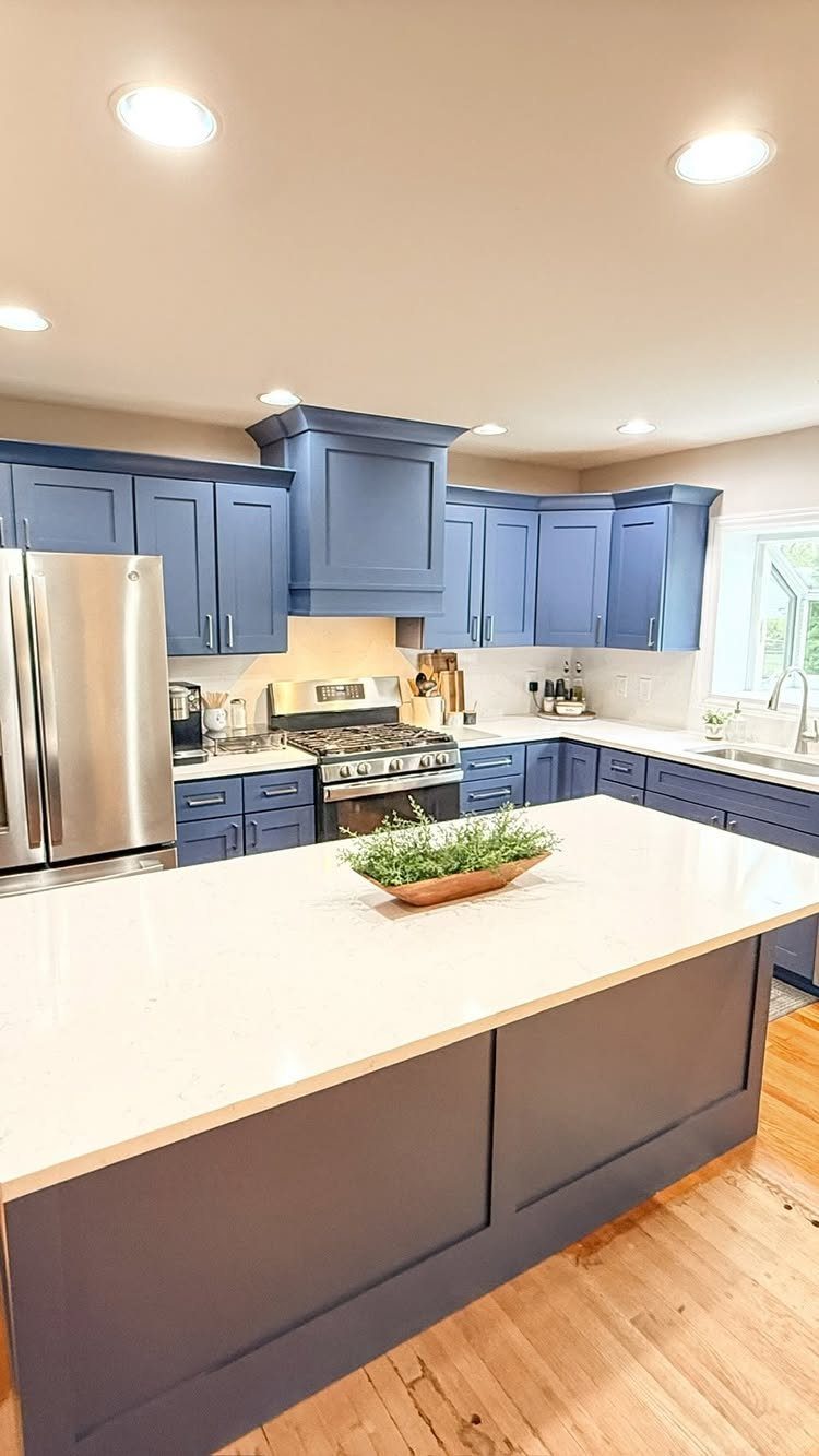
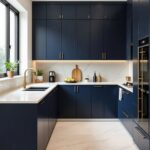
Navy cabinets give a kitchen weight without the heaviness of black, and white countertops keep that depth from closing in the room. A large island is the best place to use the color if you’re nervous about committing everywhere.
Stainless steel appliances sit comfortably next to navy, so there’s no need to replace them.
I’d paint the island first and live with it for a few weeks. Navy shows dust and fingerprints, so pick a satin or semi-gloss finish that wipes clean.
3. Two-Tone Cabinet Color Ideas
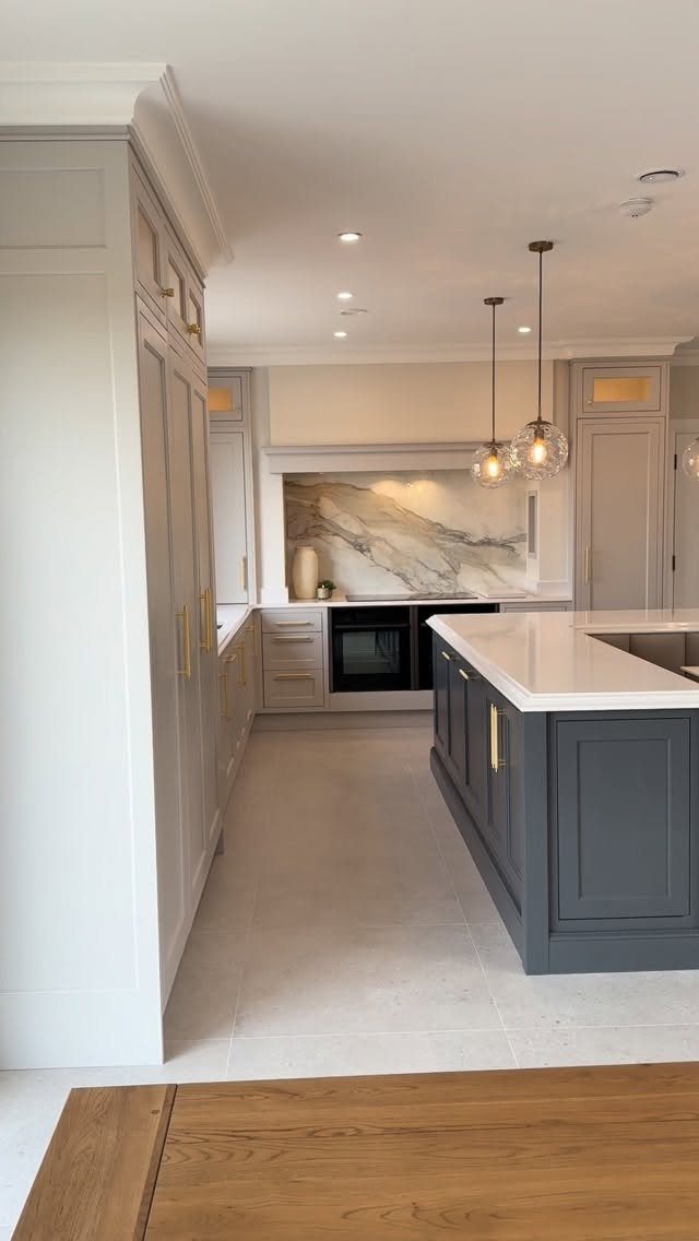
Light gray along the walls with a darker charcoal island splits the kitchen into 2 jobs: the perimeter stays quiet, and the island becomes the anchor.
A white countertop on the island lightens a dark base and keeps it from reading as a block.
Gold hardware ties both grays together, so use one finish on every door and drawer.
For seating, the creator of this kitchen used 50 mm quartz on the island, a thick slab that reads substantial. Keep the darker color to one element, or the two-tone effect gets lost.
4. Neutral Palette Cabinet Color Ideas
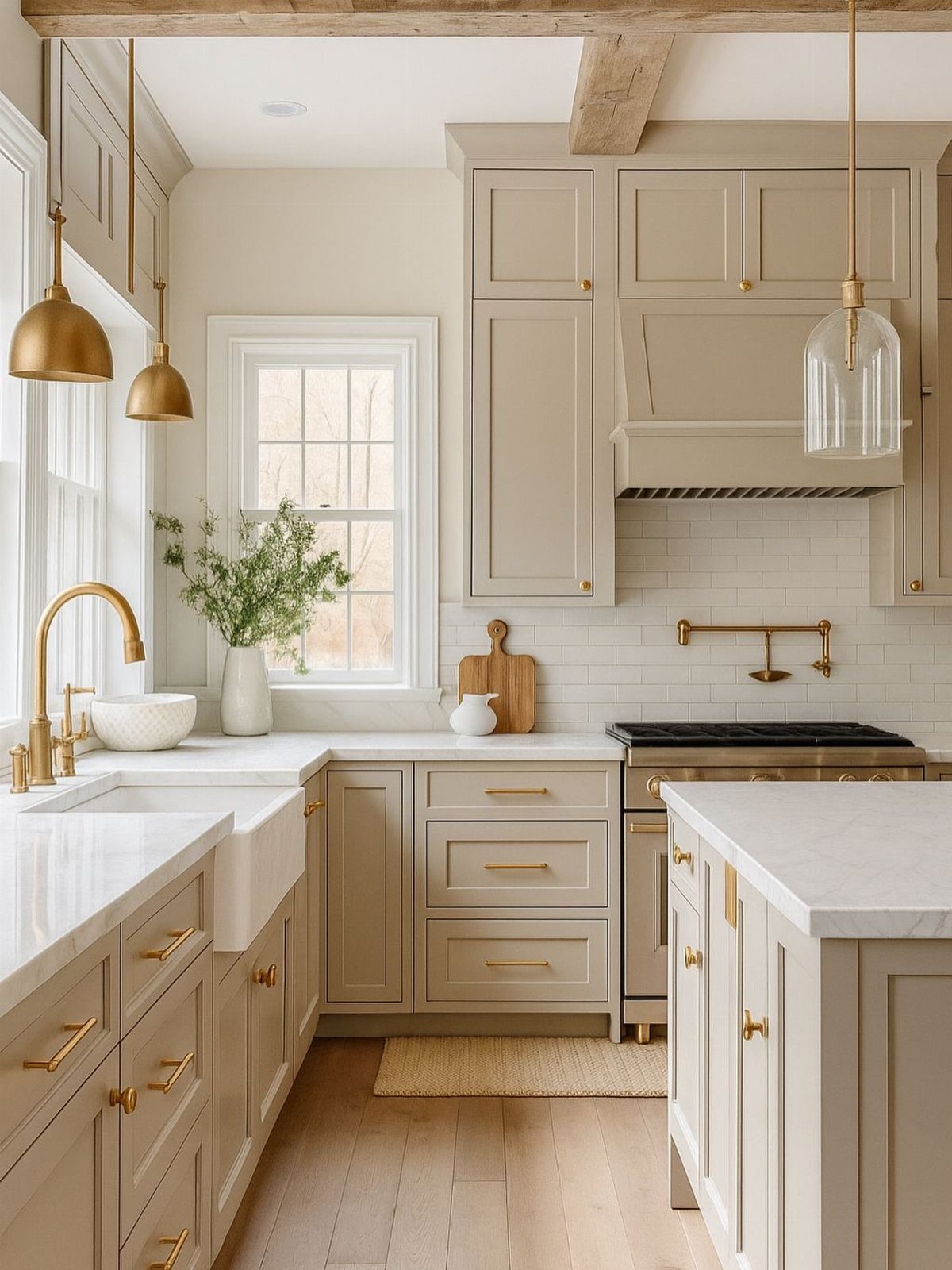
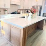
Beige cabinets are the easy answer when you want a kitchen that feels calm and never dates.
Light wood floors suit this scheme well, since everything stays in the same soft family. If your floors are darker, add contrast with the hardware or a deeper backsplash.
Beige can drift yellow or pink under certain bulbs, so brush a sample on the door and look at it in your own lighting first.
5. Sage Green Kitchen Cabinets
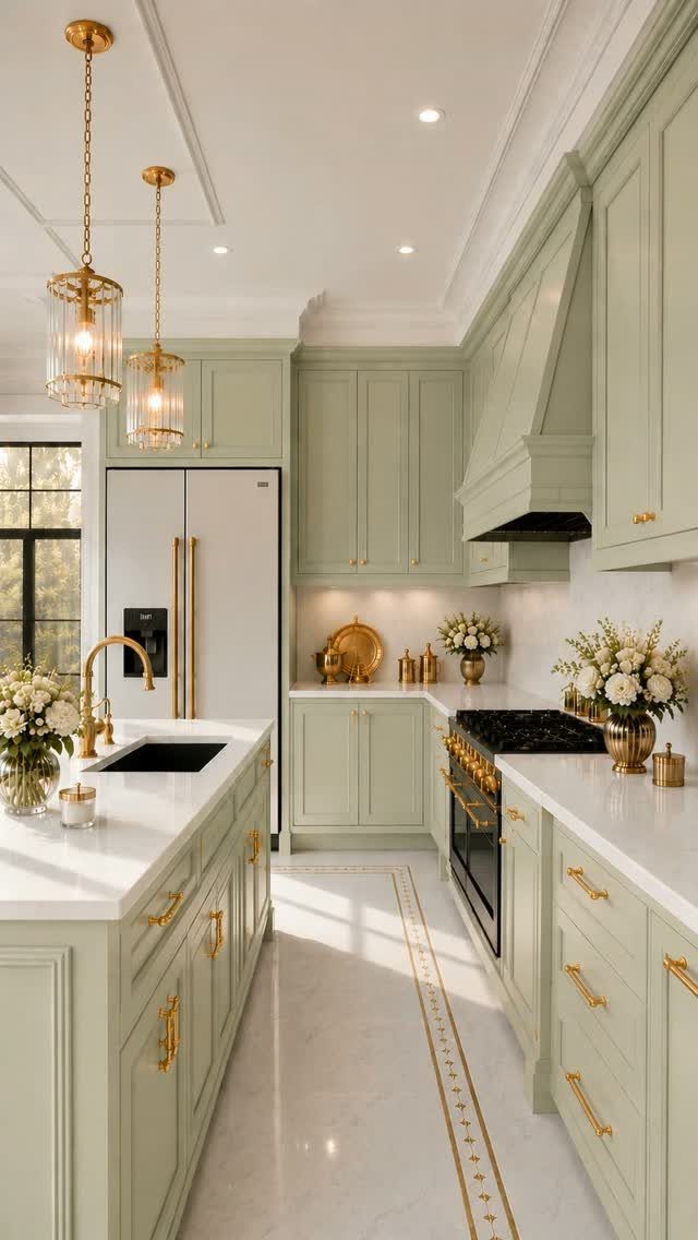
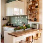
Sage green cabinets bring a muted, earthy color into a kitchen that still feels soft. Pair sage cabinets with white countertops and gold pulls, and the green stays calm and easy to live with.
Gold pendant lights repeat the hardware, which makes the scheme feel planned. I like that pairing better than black hardware here, because gold warms the gray in the green.
Sage changes a lot with light, so buy a sample quart and brush it on 2 doors before painting everything. The creator of this kitchen showed the same room in 4 palettes, which is a smart way to compare.
6. Dusty Rose Cabinets with Marble Countertops
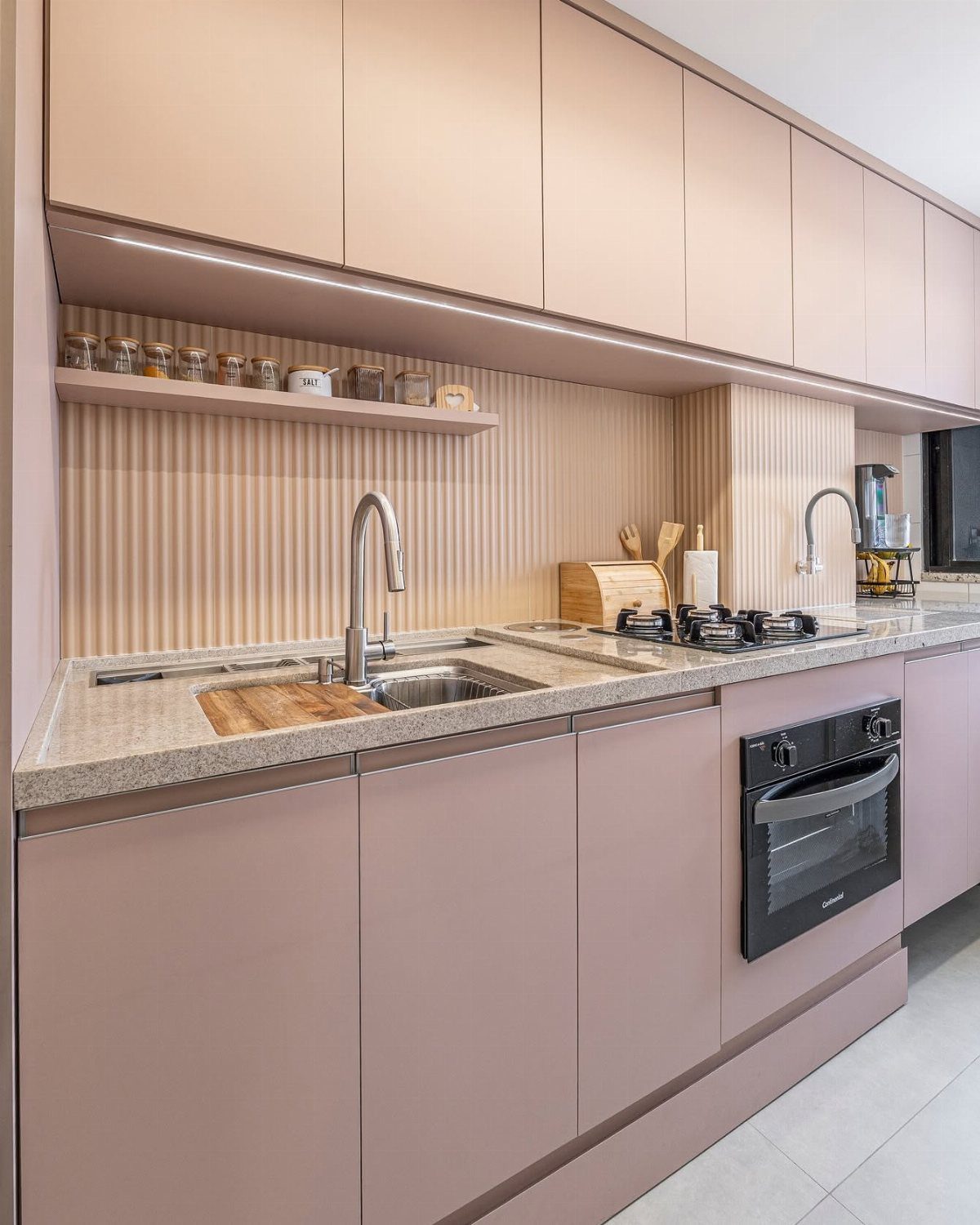
Dusty rose is a bold step for cabinets, but the muted tone keeps it closer to a neutral than to pink. A light speckled stone countertop lets the color lead without competing.
Black appliances, an oven for example, give dusty rose the contrast it needs to read as grown-up instead of sugary. Keep walls simple and let a shelf of spice jars supply extra color.
Check a sample beside your countertop before painting. Rose can turn peachy next to warm stone.
Not only does this kitchen’s dusty pink cabinets make for a warm and inviting layout, but the soft tone "reflects natural light beautifully, allowing it to bounce throughout the space and create the illusion of added square footage," says designer Shaolin Low of Studio Shaolin.
7. Emerald Green Kitchen Cabinets
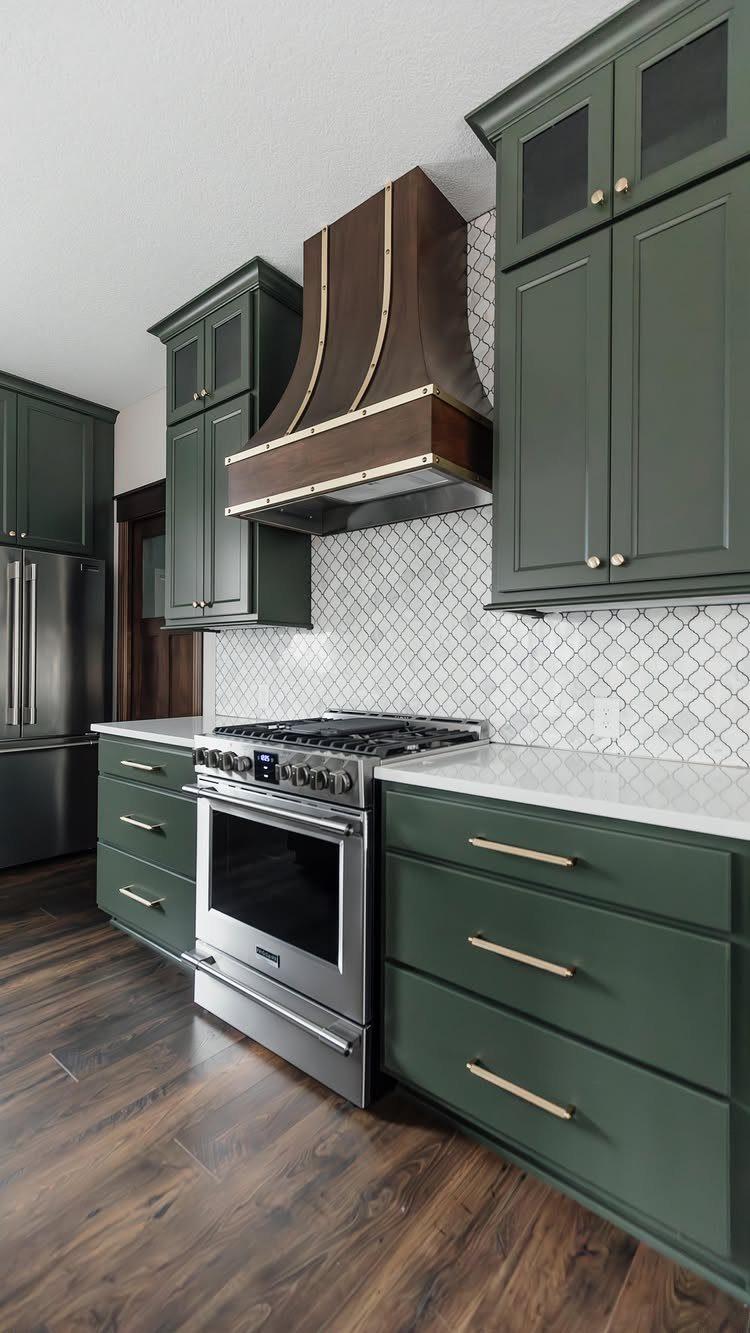
Emerald cabinets bring drama without needing much else in the room.
Dark wood floors make this a heavy-looking scheme, so I’d keep the backsplash light, as it is here.
Deep greens can turn almost black in low light.
8. Terracotta Kitchen Cabinets
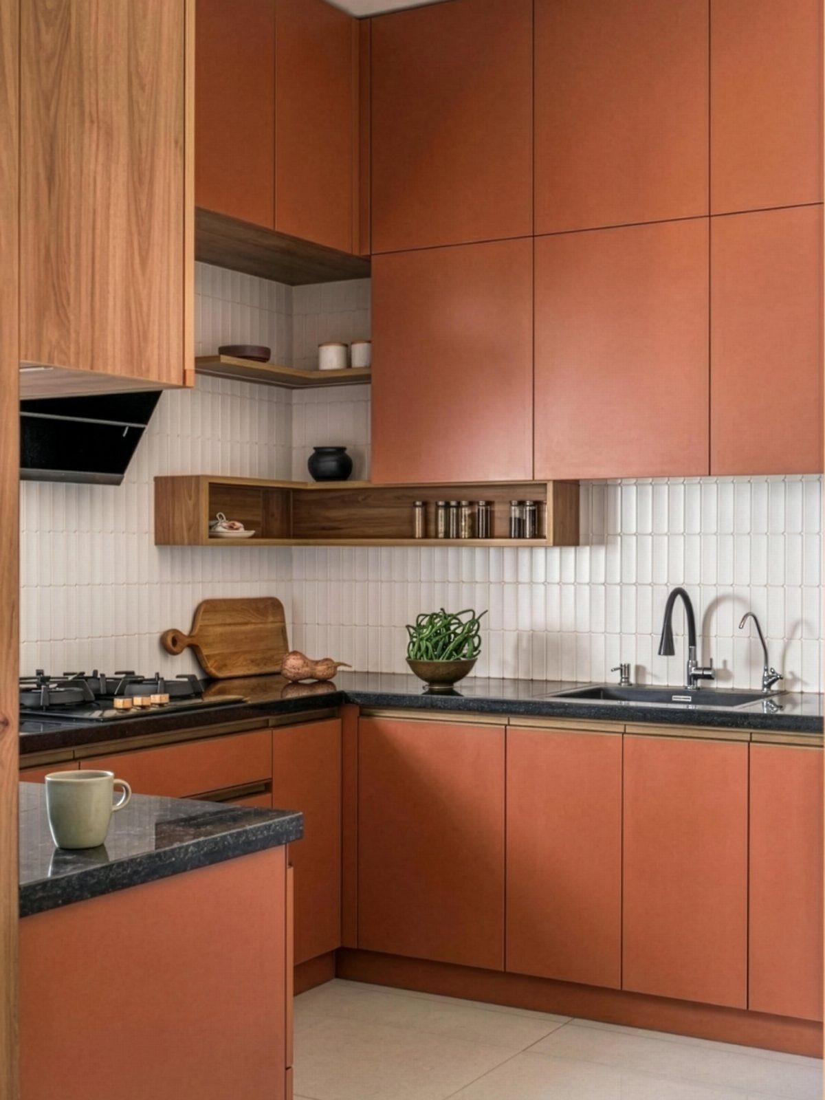
Terracotta cabinets bring rustic warmth to the room, and black countertops give that earthy orange-brown some weight. A white tiled backsplash keeps the pairing from getting too dark.
Wooden accents, like a cutting board or open shelf, suit the color better than more painted surfaces.
Terracotta leans orange or brown depending on the light, so test a sample quart beside your countertop before committing to every door.
9. Butter Yellow Kitchen Cabinets
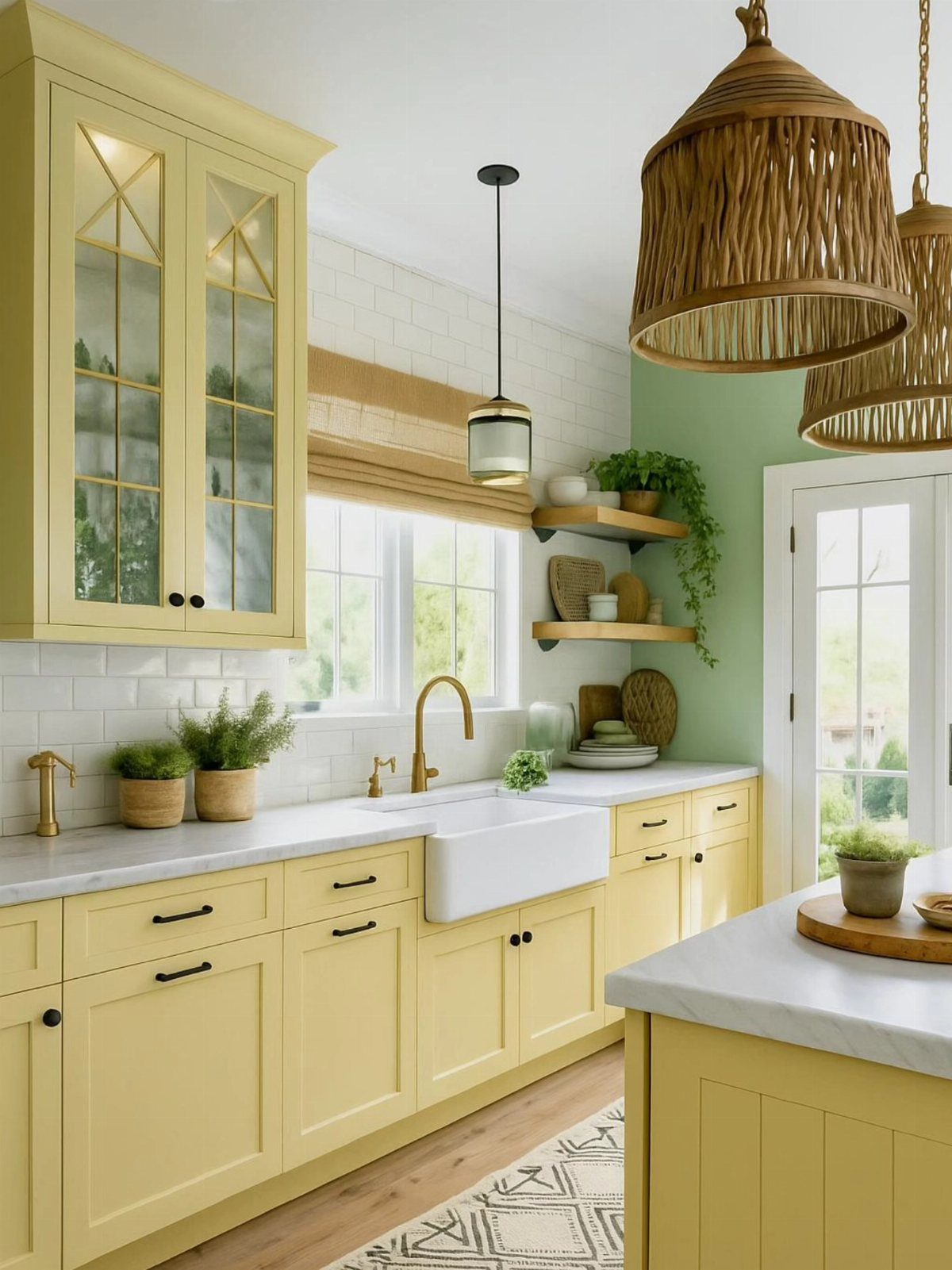
Butter yellow is a soft color with real saturation, and it reads cheerful without turning loud. White marble countertops keep it fresh, and gold hardware picks up the warmth in the yellow.
Woven pendant lights add texture, which stops a painted kitchen from looking flat. I prefer them to glass shades here.
Go for a creamy yellow rather than a lemony one.
10. Soft Matte Black Cabinets
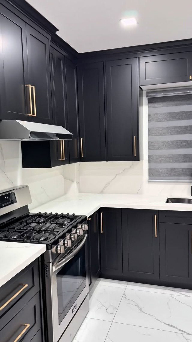
Matte black cabinets feel modern without the fingerprint-and-glare problem of a high-gloss finish. White marble on the counters and backsplash gives the dark doors a clean edge, and gold handles add warmth.
I’d choose gold over black hardware here, since black on black disappears.
Matte black hides fingerprints better than gloss does, though a soft damp cloth is still the right way to wipe it clean. Keep the finish on every door the same, or the sheen will vary.
11. Charcoal Gray Cabinets
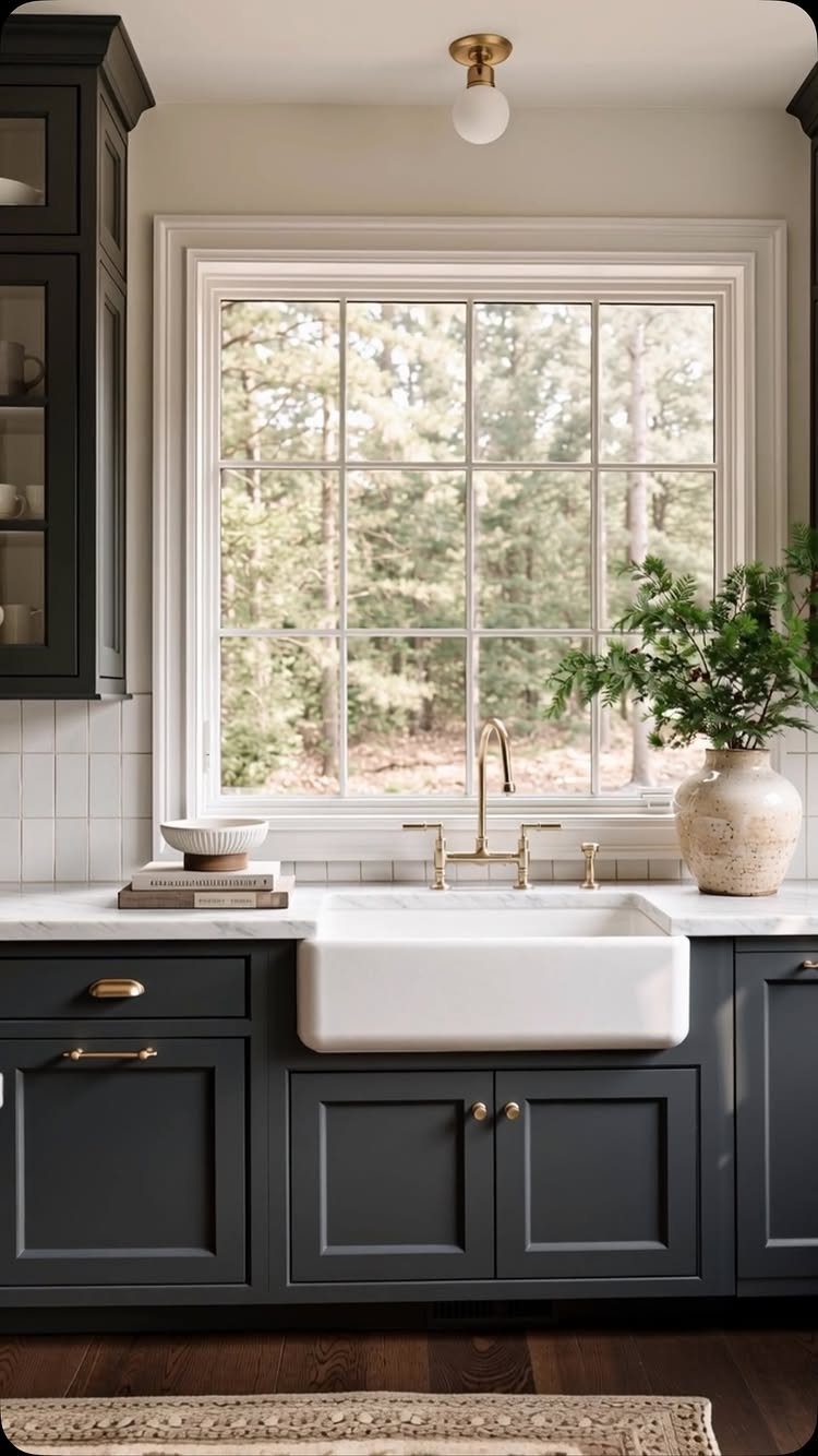
Charcoal gray gives a kitchen depth and a more grown-up feel than lighter grays, and it works on both upper and lower cabinets when there’s a window bringing in daylight. A white farmhouse sink breaks up the dark run.
Gold hardware stands out nicely against charcoal. Keep counters light, and a plant or a stack of books adds life.
Charcoal can look flat in a dim room, so sample it first and check it in the evening.
12. Greige Kitchen Cabinets
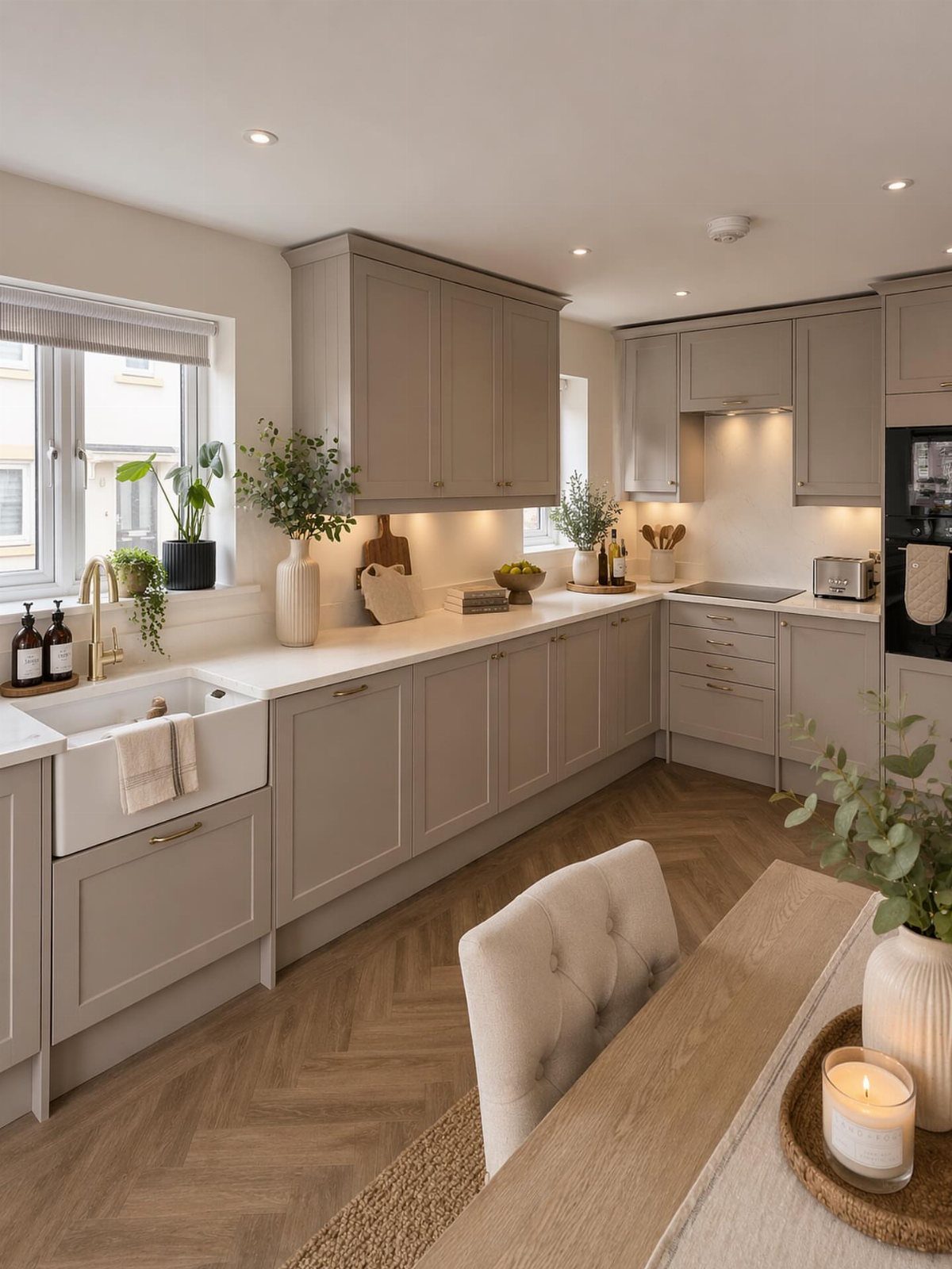
Greige is the compromise between gray and beige, which makes it forgiving next to white countertops and warm wood floors. Herringbone flooring adds pattern, so I’d keep the cabinet doors simple.
It’s a good pick if you can’t decide between cool and warm, but undertones vary a lot by brand. Hold a sample against your countertop and floor before you paint, since greige can lean gray or tan.
Choosing the Right Paint Finish
Kitchen paint takes grease, steam and constant wiping, so the finish matters as much as the color. Eggshell, satin (sometimes labeled pearl) and semi-gloss all resist moisture, grease and stains, and all three wipe clean.
Eggshell is the softest of the 3 and hides surface flaws best. Semi-gloss is the toughest to scrub but shows every dent and brush mark in a door.
Light changes how a finish and color read, so check the room’s exposure. A room that faces north does better with warm cabinet colors, and a south-facing one can carry cool tones without looking flat.
Paint large boards rather than small chips. Check samples at different times: early morning, midday, and after you turn the lights on at night.
Size and lifestyle count too.
Pale cabinets open up a tight room, and darker ones bring a large space down to a more comfortable scale. If you have young kids, a darker tone hides fingerprints and wear better.
If resale is coming in the next few years, a safe neutral will cost you less than repainting to undo a strong personal choice.
Creating a Cohesive Color Palette
Walls and cabinets should read as one plan, and there are three easy ways to get there. A monochromatic scheme uses shades of a single color.
A neutral room can take bold cabinets as the one loud element. A traditional kitchen looks sharper with off-white paired against black.
Choose one approach and stay with it. Mixing all 3 is how a kitchen ends up looking busy.
Two-tone cabinets are a good way to bring in more than one hue while keeping balance.
Benjamin Moore Advance Interior is what I use for cabinets when I want a durable finish that cures hard and comes in nearly any color the brand makes.
That makes it a solid choice for cabinet doors that get handled daily.
Sustainability in Color Choices
Natural wood cabinets are getting more attention than all-white or heavily painted kitchens. Oak, walnut and cherry tones bring organic warmth, and the look stays quiet and custom.
If you’re drawn to that, you don’t have to pick wood or paint.
Keep the wood in one tone family so it reads as deliberate, and let the paint color pull from the grain.
Frequently Asked Questions
What paint color is best for kitchen cabinets?
White, navy and a muted green like sage are the safest picks.
A soft, warm white keeps a dim kitchen from turning cold and gray, while navy brings depth and a bit of drama without the weight that black cabinets carry.
Before you commit a whole weekend to painting, brush a sample on one door, then look at it in morning light and again after dark.
What colors go with stainless steel?
Navy sits comfortably next to stainless steel, so you can keep the appliances you already own.
Black and warm neutrals like beige or greige also work, since the metal’s cool tone balances them. White countertops help a navy scheme stay open.
What are Sherwin-Williams’ kitchen cabinet color trends for 2026?
Sherwin-Williams points to warm neutrals and bolder colors drawn from nature.
Its cabinet picks include Needlepoint Navy SW 0032, Fleur de Sel SW 7666 and Stardew SW 9138. Treat any trend color as a starting point and test a sample in your own lighting first.
What are Studio McGee’s favorite paint colors?
Studio McGee’s favorites include Benjamin Moore Baby Fawn and Sherwin-Williams Peppercorn.
Both are muted shades: a soft warm neutral and a deep, dark one. Paint a large board of any color you like and look at it beside your countertop before committing.