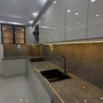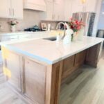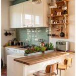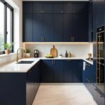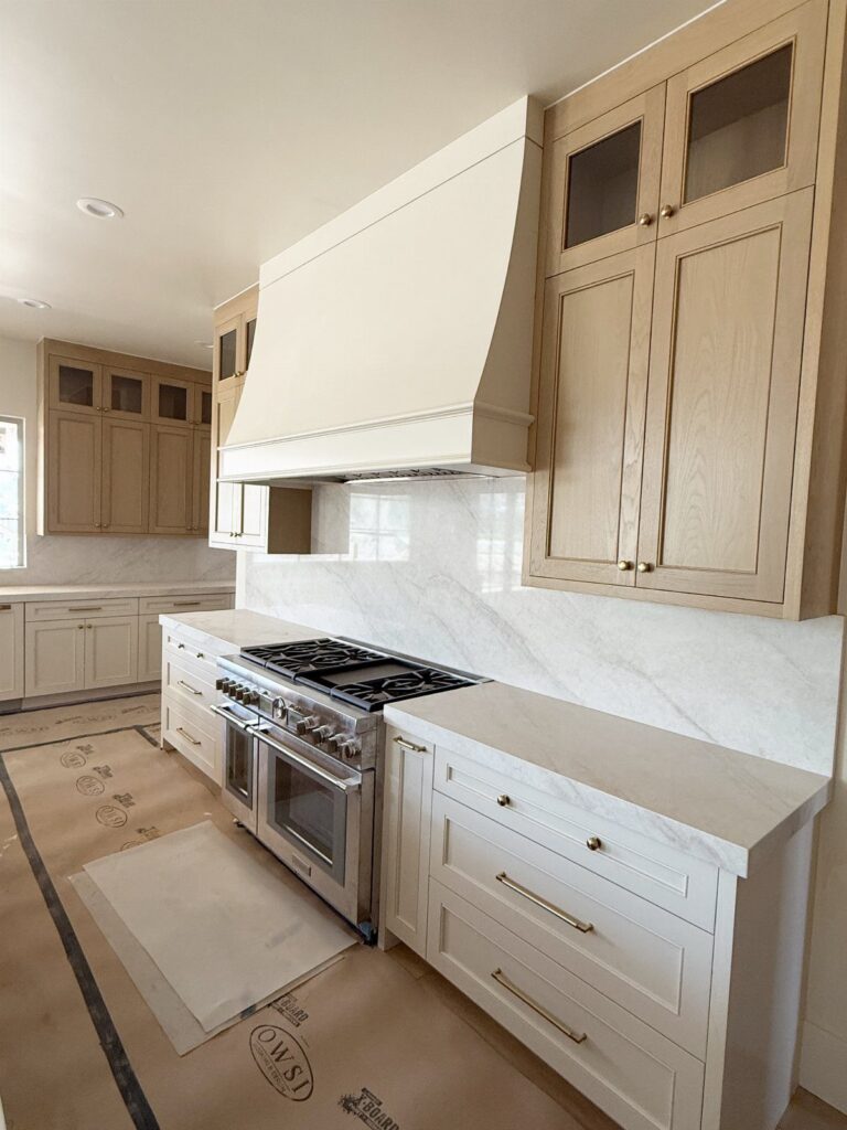
The color that suits your kitchen depends on how hard the room works: a cook who fights splatter every day is better off with a mid-dark shade like smoky blue or pewter gray, while a dark or small-budget kitchen can still make a case for white.
The list runs from white and cream through black, navy, eggplant, and sunny yellow, plus sage, olive, sea green, gray, and greige, and several of them can be done cheaply by painting only the lowers.
Before you open a can, a peel-and-stick sample from Samplize lets you test any of these shades right on your wall.
1. White Cabinetry
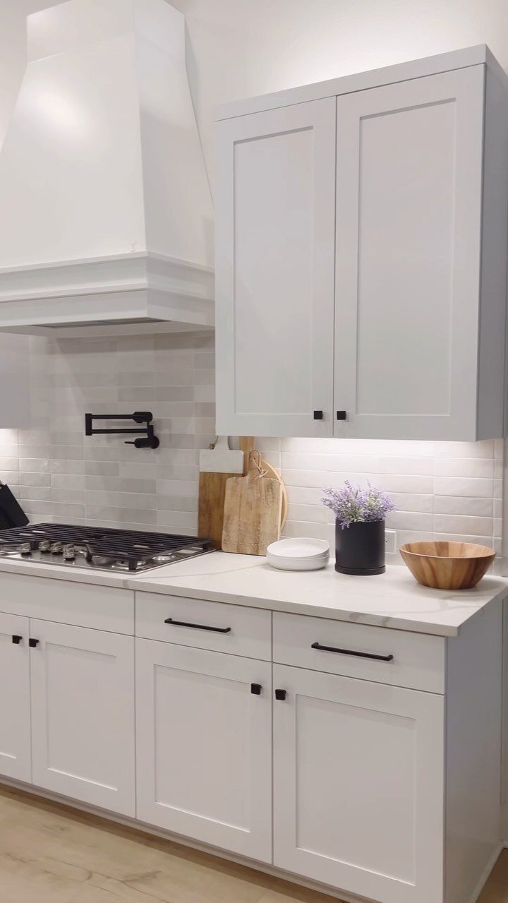
When the uppers, lowers, and hood all match, the cabinets stop looking like separate units and start reading as one continuous surface. Black handles are what keep it from going flat, so I would spend a little extra there.
A white subway tile backsplash and white countertop keep the palette quiet. Wood or a bunch of flowers on the counter then does the warming.
Pick a durable enamel or cabinet paint, since white shows every scuff.
2. Black Cabinets
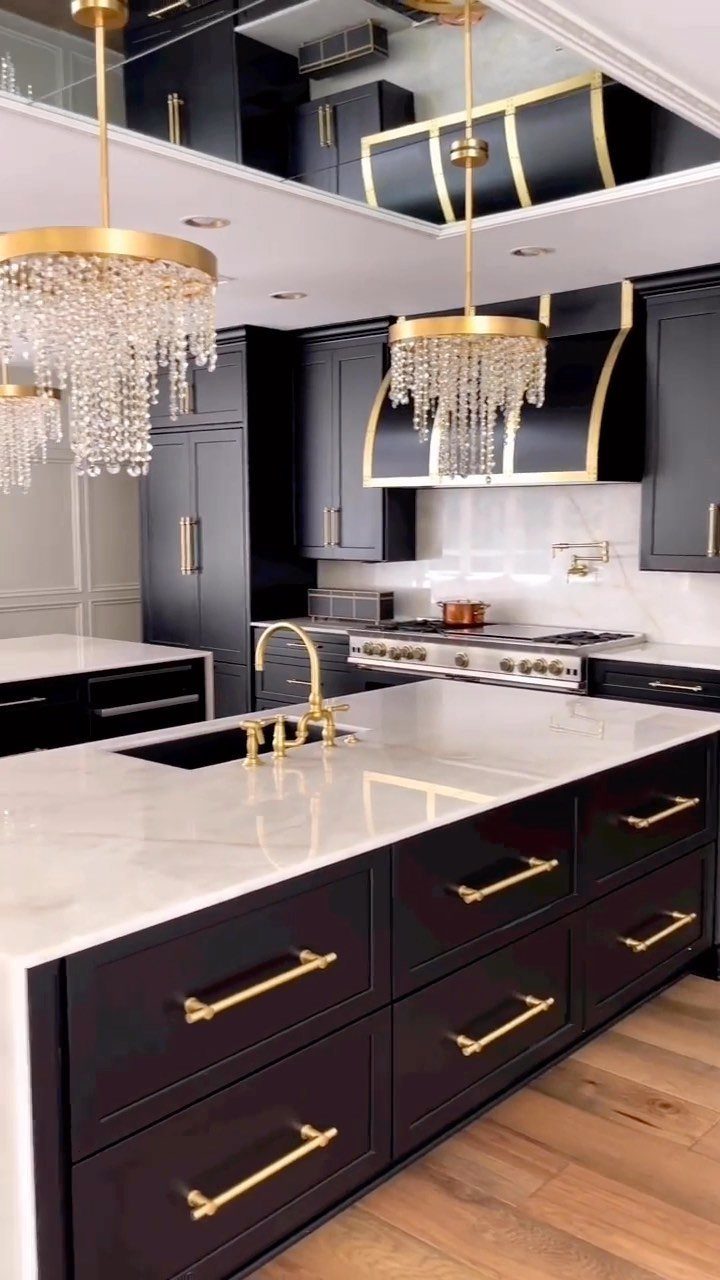
Black cabinets with gold hardware and white marble countertops give a kitchen real drama, and the contrast between dark doors and pale stone does most of the work.
I like gold pulls here more than black ones, because black on black disappears.
Keep the countertop light, as it is here, so the room doesn’t swallow itself. Black also shows dust and fingerprints, so a satin finish is easier to live with than a flat one.
A large island in black anchors the whole room.
3. Greige and White Cabinetry
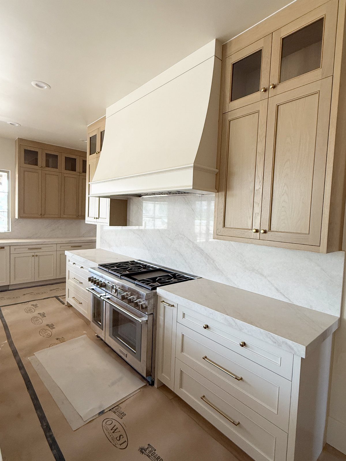
Greige uppers over white lowers add dimension without a full color commitment. The darker tone sits at eye level, while the white base keeps the floor area open and bright.
For a budget project, this also means painting less of the dark shade, so you buy less of it. Marble countertops tie the 2 tones together because they carry both warm gray and white in the veining.
Test the greige beside your counter before buying a full gallon, since greige leans warm or cool depending on the light.
“Sherwin-Williams’ City Loft and Benjamin Moore’s Natural Cream are beautiful classics that can be easily combined with other colors in the cook space,” she says, adding: “For a brighter look, have them mixed about 50 percent lighter.”
4. Deep Sage Green Cabinets
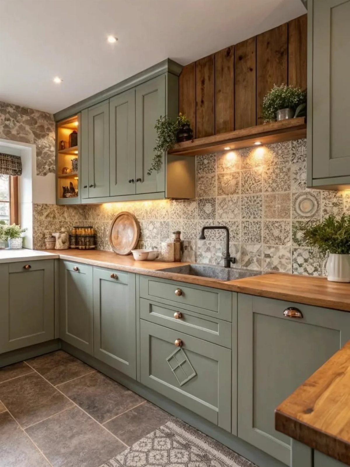
Deep sage green looks best with natural wood nearby, and wooden countertops with a wooden accent wall above the shelf do exactly that. The green reads as a neutral, not a statement.
A patterned tile backsplash can carry some color too, which is why I would keep the cabinet shade muted and let the tile do the talking.
Wood counters want sealing near the sink, so budget a little time for that before you paint.
5. Sunny Yellow Cabinets
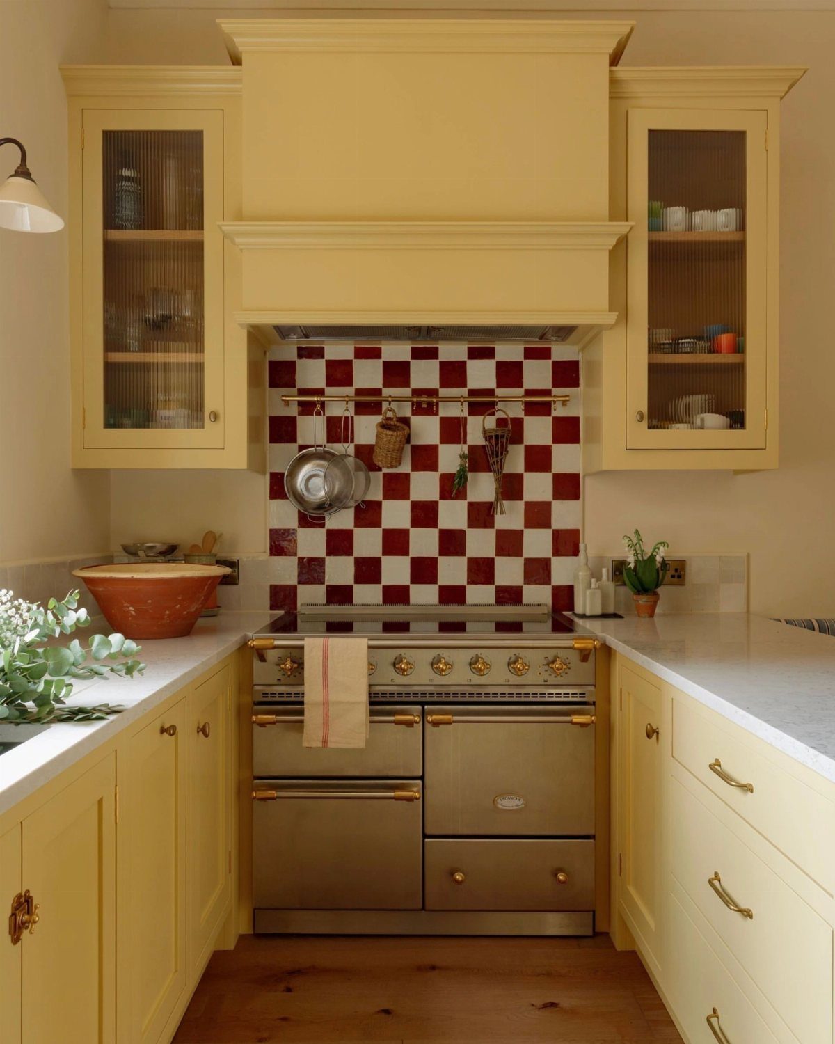
Sunny yellow cabinets set against a red and white checkered backsplash make a kitchen feel cheerful, a bit retro, and impossible to mistake for anyone else’s.
White countertops keep the color from overwhelming the room. The checkered tile is bold enough that I would skip other patterns entirely.
Yellow can look different at every hour, so brush out a sample board first and check it morning and evening.
6. Olive Green Cabinets
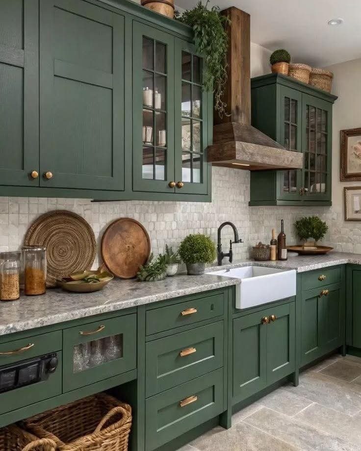
Olive green is the moodier cousin of sage: darker, earthier, and a good match for gold handles. Paired with white marble countertops, it looks rich without turning heavy.
I would choose a matte or satin finish to keep the color soft.
If your kitchen gets little daylight, test a sample first, since olive can go very dark.
7. Gray Cabinets
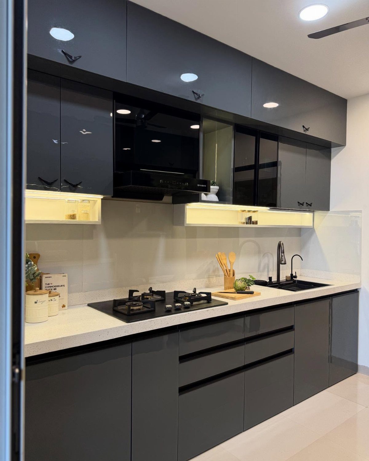
Dark gray doors with white countertops make one of the simplest pairings in a kitchen: two tones, no pattern, and nothing to argue with.
Black appliances and a black sink sit comfortably inside that palette, which keeps the whole room tidy.
I would pick a glossy finish only if you don’t mind wiping fingerprints. Satin hides them better.
Under-cabinet lighting is worth adding on a dark run, since it keeps the backsplash from sinking into shadow.
8. Deep Navy Blue Cabinets
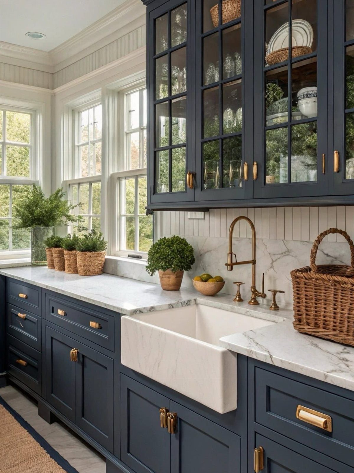
Deep navy with gold hardware and white marble countertops is a classic combination, and the gold is what makes the blue look rich instead of flat.
Glass-front uppers, as here, break up the color so a full wall of navy never feels heavy.
For a weekend project, I would paint the lowers navy and leave the rest light. Navy shifts toward black in dim rooms, so brush out a sample near your window first.
9. Muted Sea Green Cabinets
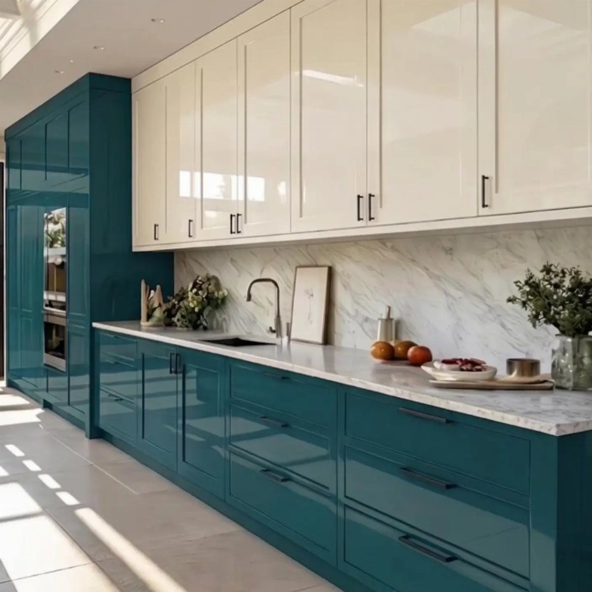
The white uppers keep things airy, while the green grounds the base.
A white marble backsplash and counter, like this one, lets the green stay the only color in play. I would choose a gray-leaning green over a minty one, since it ages better.
Glossy paint looks crisp but shows every brush mark, so sand lightly and take your time.
10. Eggplant Cabinets with Marble Countertops
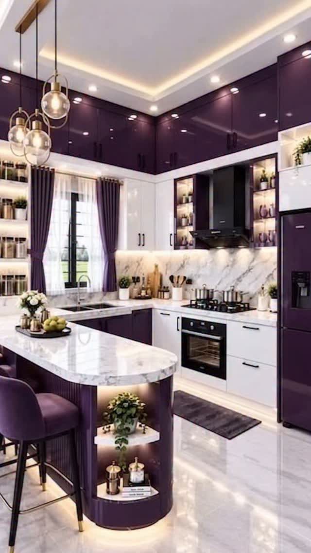
Eggplant is the boldest color here, and white marble countertops are what balance it. Pale stone gives the deep purple somewhere to rest, so the color reads as luxurious instead of loud.
Gold pendants over the island pick up warmth that purple lacks. If you want to try it cheaply, paint only the island and leave the perimeter cabinets neutral.
Buy a sample quart first. Purple can lean red or blue depending on the light.
11. Cream Cabinets
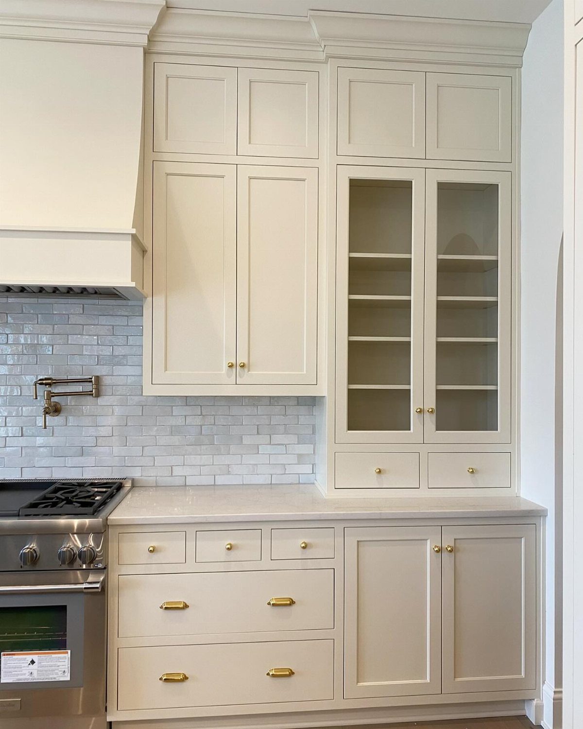
Cream is softer than white, and it forgives more. Where bright white shows every shadow and scuff, a warm cream looks relaxed and a little lived-in, especially with gold handles.
I would hold a swatch against the tile and your countertop before buying, since creams vary a lot in undertone.
Stainless appliances sit well with it, so nothing else needs replacing.
Choosing Colors That Hide Stains
If you cook often, the color you pick will decide whether spills and splatter disappear or announce themselves. Mid-dark shades like smoky blue or pewter gray hide splashes and smears far better than anything light.
Ultra bright white is the worst offender. It shows literally everything, so if you cook daily or have kids around, I would steer away from it.
Stained wood hides cooking accidents even better than paint does. If you are painting, though, a darker, slightly muted shade is the safest bet for a hard-working room.
White still has a case when the kitchen is dark or the budget is small.
White cabinets can pull light into a dark kitchen and make an older layout feel current without tearing anything out. Just accept that you will be wiping it down more often.
Pairing with Wood Elements
Natural wood in a floor, countertop, or hutch should shape your paint choice before anything else. The shade has to suit the wood species and its stain, or the two will fight.
Walnut looks great with deeper hues: black, navy, and dark green. White oak is pickier, so avoid anything with a yellow undertone, which means yellow, orange, and most reds.
A mixed look also works well.
Try painted uppers over natural wood lowers, or the reverse with wood uppers and colorful lowers. The blend of textures and tones adds depth, and it means you paint less.
If you’re painting over existing wood, the species affects how the paint holds up over time. Birch is a good base for paint because it takes the dents and abrasion a kitchen hands out.
Testing Paint Colors
Small swatches and photos rarely show a color’s true nature. Get a sample pot, paint a section of one cabinet, and watch how it looks from morning through evening.
A peel-and-stick sample is an easier option. Samplize sells swatches in shades from Benjamin Moore, Farrow & Ball, PPG, and Sherwin Williams, so you can order several colors and stick them up without opening a can.
Then give it time.
Live with the samples for a few days and notice which ones still feel right. The color you keep glancing at is usually the one to buy.
Frequently Asked Questions
What kitchen cabinet colors are trending now?
Sage green, deep blue, and warm yellow are the colors showing up most.
Navy paired with brass pulls and marble counters looks expensive, while sage settles in next to wood tones without competing. Yellow is the boldest of the three, so it does best with white countertops and one pattern at most.
What are most kitchen cabinets painted with?
White, gray, and shades of green are the most common colors.
White brightens a dated layout and skips the cost of walls coming down, but fingerprints show up fast. Gray and green hide wear better, and a satin finish keeps fingerprints and brush marks less obvious than gloss.
What are the most popular Benjamin Moore kitchen cabinet colors in 2026?
I can’t name specific Benjamin Moore shades with confidence, but the popular directions are deep green, navy, charcoal gray, and warm white.
Whatever brand you choose, brush out a sample first and check it in morning and evening light, since green, navy, and gray all shift with the room.
Peel-and-stick swatches from Samplize include Benjamin Moore shades, so you can compare several without opening a can.
What kitchen cabinet colors hide stains best?
Slate blue and charcoal gray don’t broadcast every fingerprint the way lighter finishes do. Bright white telegraphs every mark, so if the stove sees daily use or small hands touch the doors, choose something darker.
Stick with white only if you’re willing to clean it regularly and commit to a hard-wearing paint made for cabinets.
How do I test paint colors before painting kitchen cabinets?
Brush a sample onto one door and check it at different times of day before you buy gallons. Adhesive color cards let you test several options side by side without opening paint cans.