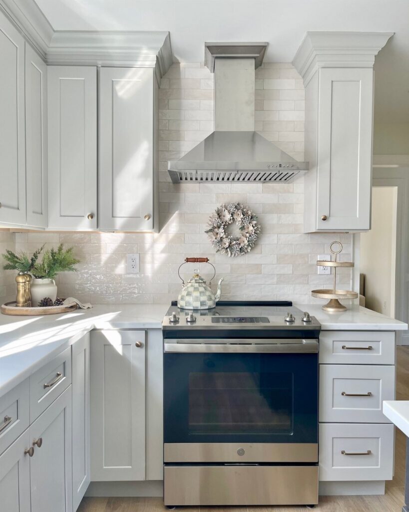
Since white cabinets pair with almost any tile, the backsplash mainly has to match whatever stays put: the counters, the flooring, the wall paint and any appliances you’re keeping.
The options here run from quiet white picket tile and cream arched tile to a colorful floral wall, and my rule is simple: if the counter has heavy veining, keep the tile plain, and if the counter is plain, the wall can take the pattern.
1. Marble Backsplash
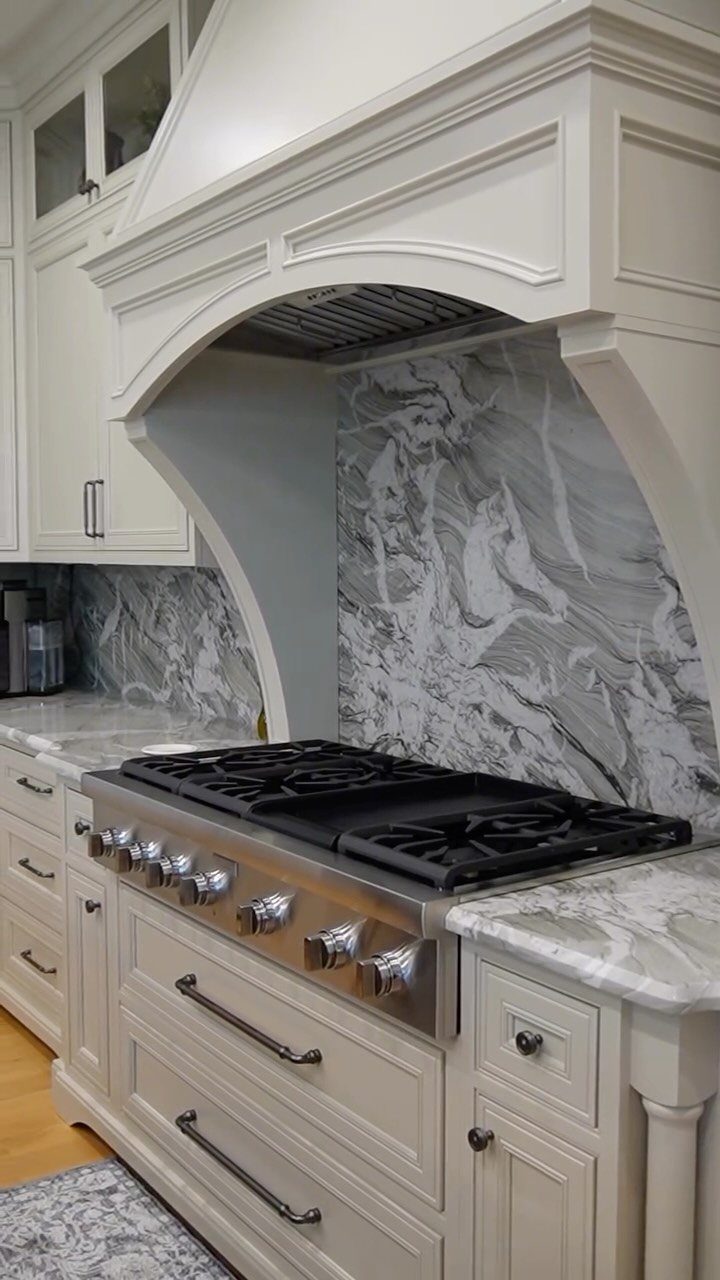
White marble with grey veining behind a range gives white cabinets some depth without adding a color. The veining breaks up all that flat white, so the wall reads as a feature even in a plain kitchen.
Marble costs more than ceramic, so on a tight budget I would keep it to the strip behind the stove or look for a marble-look tile.
Pick a slab or tile with grey veining that matches your countertop, and the two surfaces will look like one plan.
2. Handcrafted Zellige Tiles
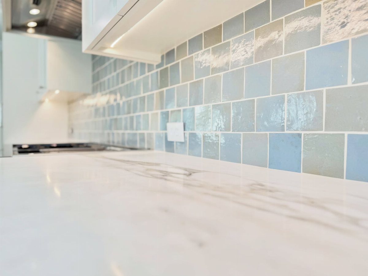
Zellige tiles are handmade, so each one has slightly uneven edges and a glaze that pools differently. That is the appeal, and a light blue version against white cabinets and marble countertops looks soft rather than loud.
I would choose this for a kitchen that feels too flat or too new. Expect the surface to look wavy and varied, not perfectly even; if you want crisp, identical lines, pick a machine-made tile instead.
3. Chevron Tile Backsplash
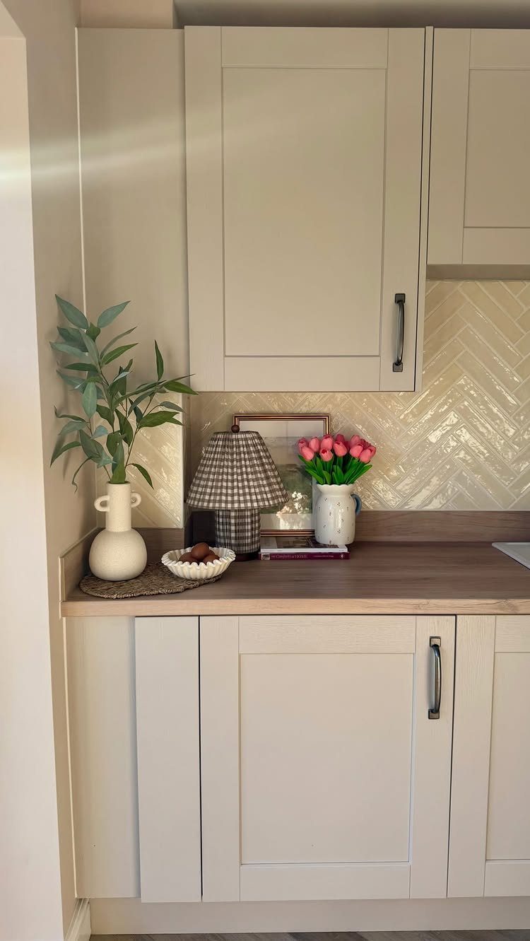
Chevron tile in white sends its zigzag up the wall, and the angled lines add movement while the color stays calm. Between white cabinets and a light wood countertop, the pattern is the only busy thing in the room.
I like it in a compact kitchen where a bold color would feel heavy. Keep the grout close to the tile color so the pattern shows as shape and not as a grid of dark lines.
4. Geometric Pattern Backsplash
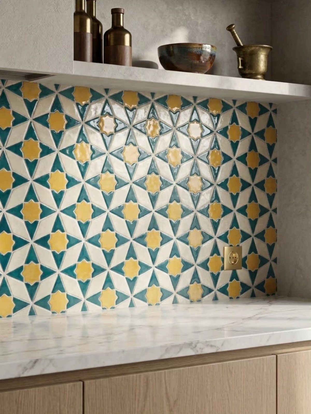
A geometric star pattern in teal and yellow turns the backsplash into the main color moment of the kitchen. Against a white marble countertop and light wood cabinets, it reads as bright without fighting anything.
If the room already has pottery, art or other decor, pick two or three shades from those and repeat them in the tile. One patterned wall is plenty; keep everything around it quiet.
5. Herringbone Backsplash Tiles
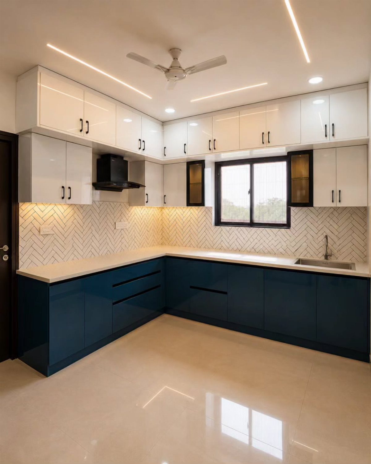
Herringbone tile in white is the easiest way to add pattern between two-tone cabinets, like white uppers over navy lowers. The tile stays neutral, so the cabinets keep the color and the zigzag adds texture.
I would pick a plain white tile in a rectangle shape and let the layout do the work. It suits a kitchen that already has a strong cabinet color and needs something to tie the 2 halves together.
6. Wood Backsplash
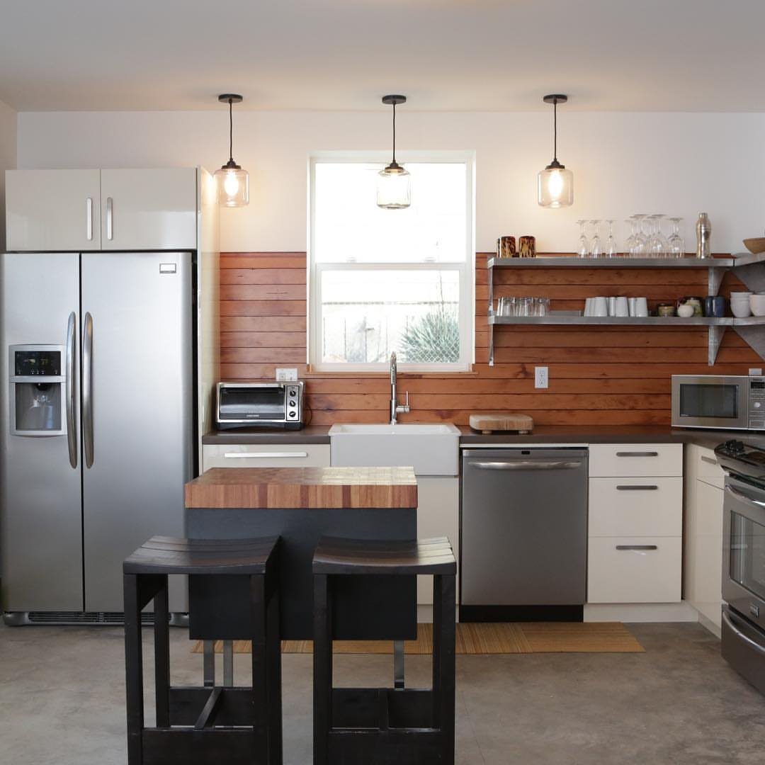
Wood planks on the backsplash bring warmth to a kitchen full of white cabinets and stainless steel. The grain softens all that cool, hard surface, and it pairs well with a white farmhouse sink.
I would use it on the wall where splashes are lightest, away from the stove, and wipe it down regularly. A plank look is also a good choice if you want a rustic feel without tile.
7. Penny Round Mosaic
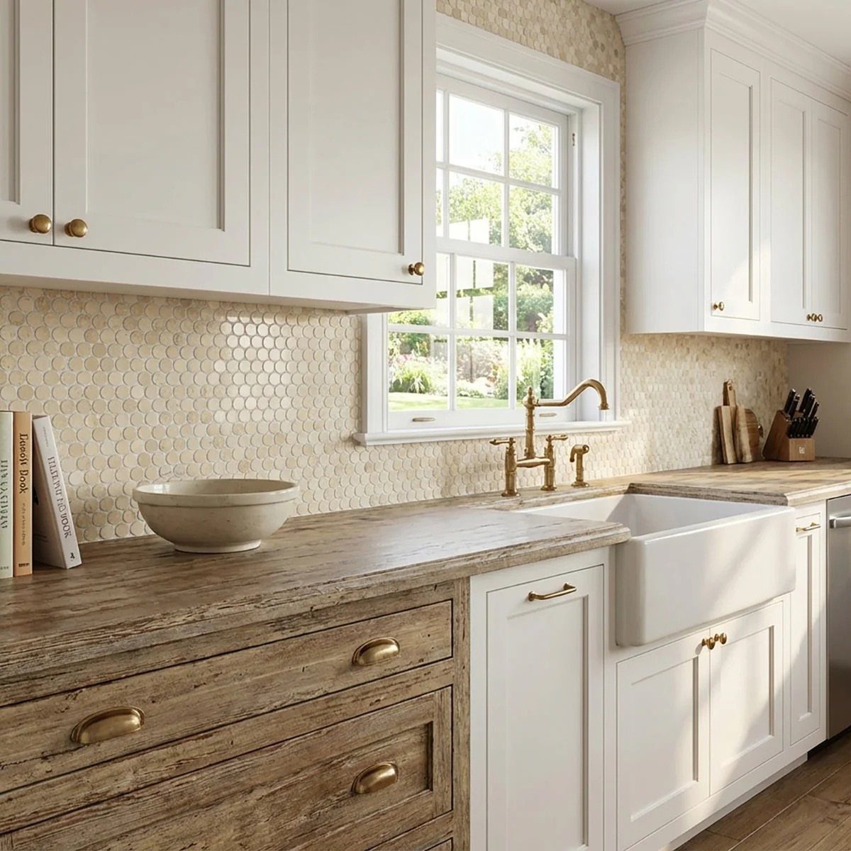
Penny rounds bring a retro feel to white cabinets, and the small circles add texture that flat white tile can’t. Against a wood countertop and a white farmhouse sink, the wall looks old-fashioned in a friendly way.
I would pick this for a kitchen that feels too plain. Grout shows more in a mosaic because there are so many joints, so choose a color close to the tile if you want a quiet wall.
8. Cool Blue Backsplash
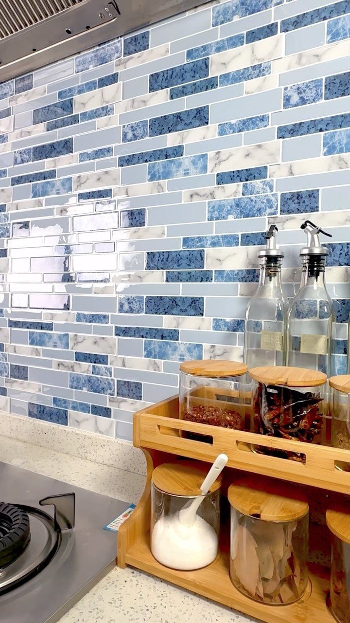
Blue and white marbled tile gives white cabinets a cool backdrop with movement in it, since the veining keeps the color from looking flat. Rectangular tiles keep the layout calm, so the pattern lives in the tile itself.
I would choose this if you like blues and greens and want color that stays soft. Wood accents, like a spice rack, warm it up nicely.
9. White Gloss Ceramic Picket Tile
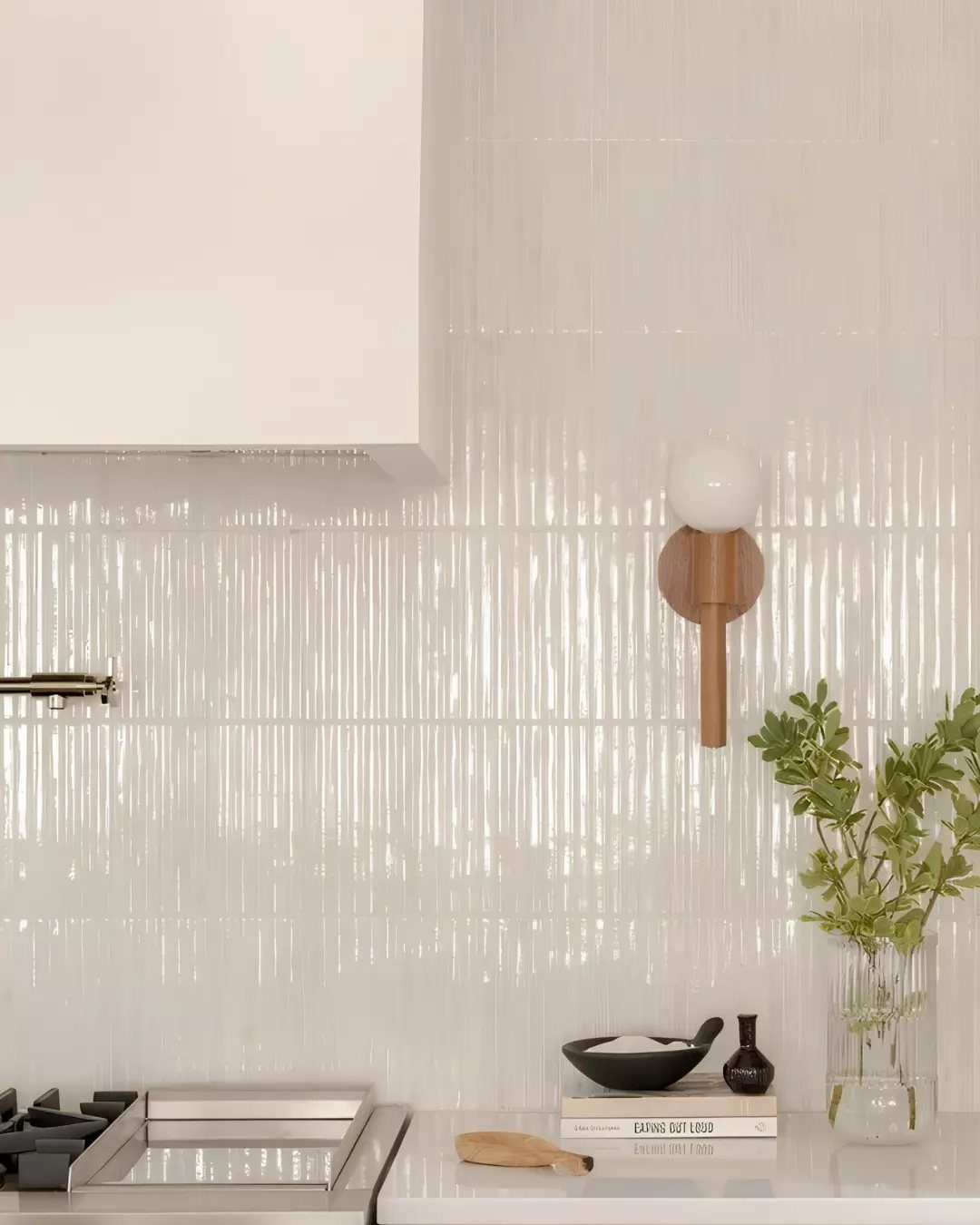
White gloss picket tile is my pick when subway feels too familiar.
Picket tile is a stretched, narrow shape, so it adds more texture behind white cabinets than a plain square would, and its glossy glaze spreads light across the wall.
Keep the grout white or close to it so the shape stays the star. If you want the wall to look quiet but not boring, this does it.
10. Grey Backsplash
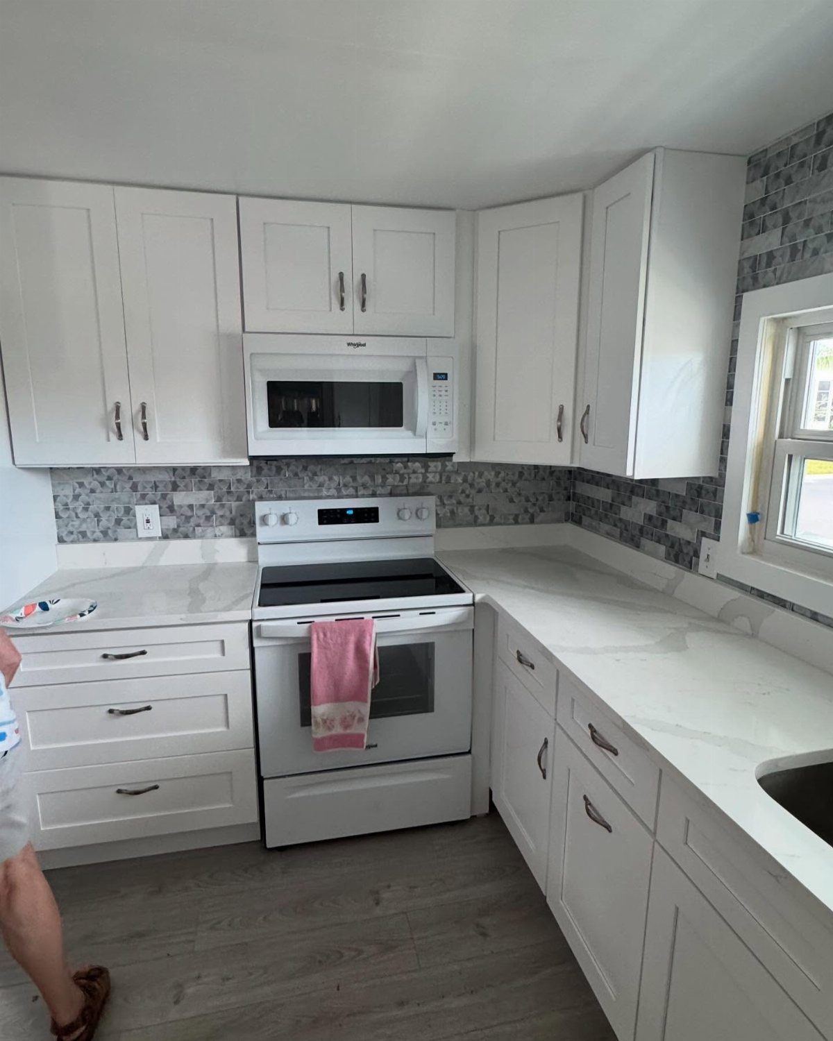
Grey and white together look elegant almost by default, and a grey mosaic behind white cabinets and white countertops adds depth without bringing in a new color.
It also works with white appliances, which matters in a kitchen you are not replacing.
I would pull the grey from the lightest tones in the tile so the room stays soft. A mix of grey and white pieces looks more interesting than one flat shade.
11. Hexagon Backsplash Tiles
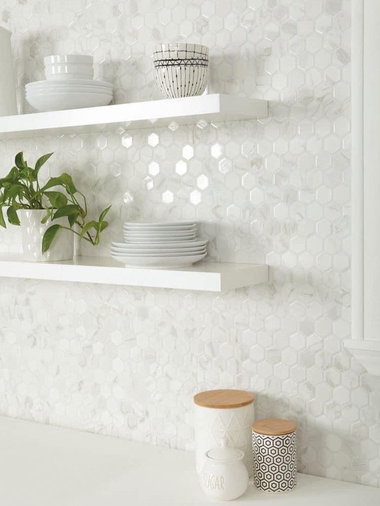
A hexagon backsplash reads as a honeycomb pattern, which feels bolder than standard squares or subway rectangles but still looks current. In white, the shape does the work, so the wall adds interest while the color stays neutral.
Sheets of mosaic hexagons are easier to set than single tiles, though the many joints mean more grout to clean.
12. Fish Scale Tiles
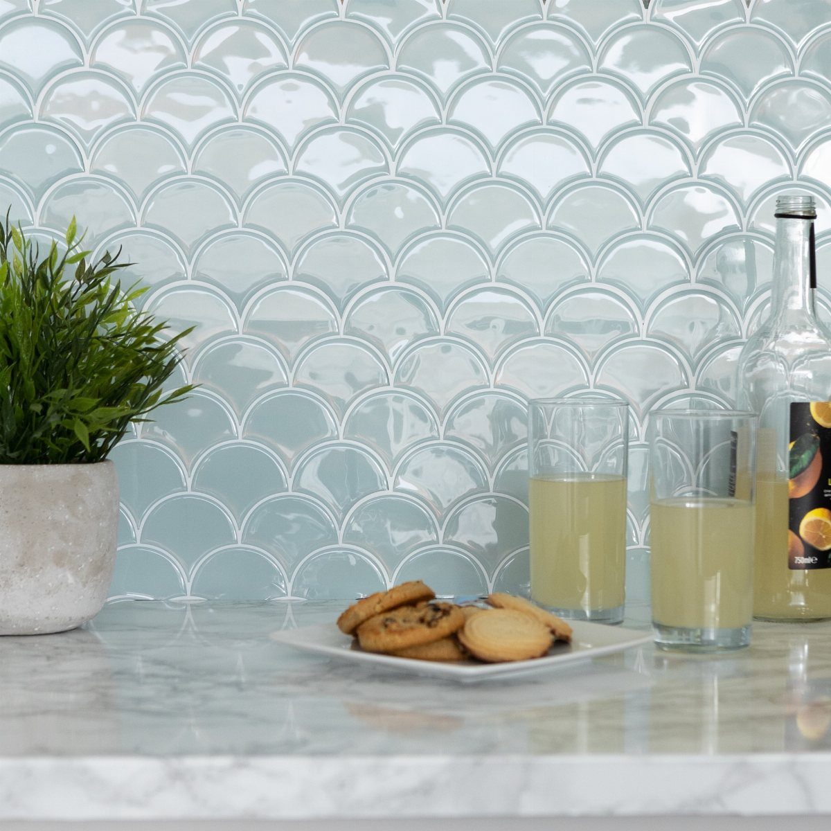
Fish scale tile curves each piece into a scallop, which makes the wall playful in a way straight tile never is. In light blue behind a marble countertop, the shape feels whimsical but still soft.
I would use it on one short wall, not a whole kitchen. Keep the cabinets and counters simple so the scales are the only surprise.
13. Terracotta Tile Backsplash
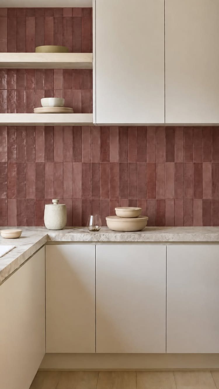
Terracotta tile set vertically stretches the wall upward, and the warm reddish-brown gives bright white cabinets a grounded, earthy partner. With light countertops in between, the color reads as an accent and never as a heavy block.
Stacking the tile vertically is my pick for a kitchen with a low ceiling. A few ceramic bowls and a jar in similar tones on the counter carry the color out into the room without any extra paint.
14. Colorful Floral Patterned Backsplash
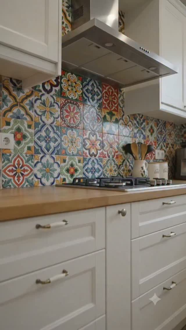
Red, yellow and blue floral tile makes the backsplash the loudest thing in an otherwise white kitchen.
A floral backsplash works best with calm companions: wood countertops and plain silver handles give the eye somewhere to rest, so the pattern stays the one loud thing in the room.
Pull one or two of the tile colors into small items, like a dish towel or a bowl, and stop there.
Keep the walls and everything else quiet, since a pattern this busy needs space around it. It suits someone who wants personality in a kitchen with plain white cabinets.
15. Cream Arched Tile Backsplash
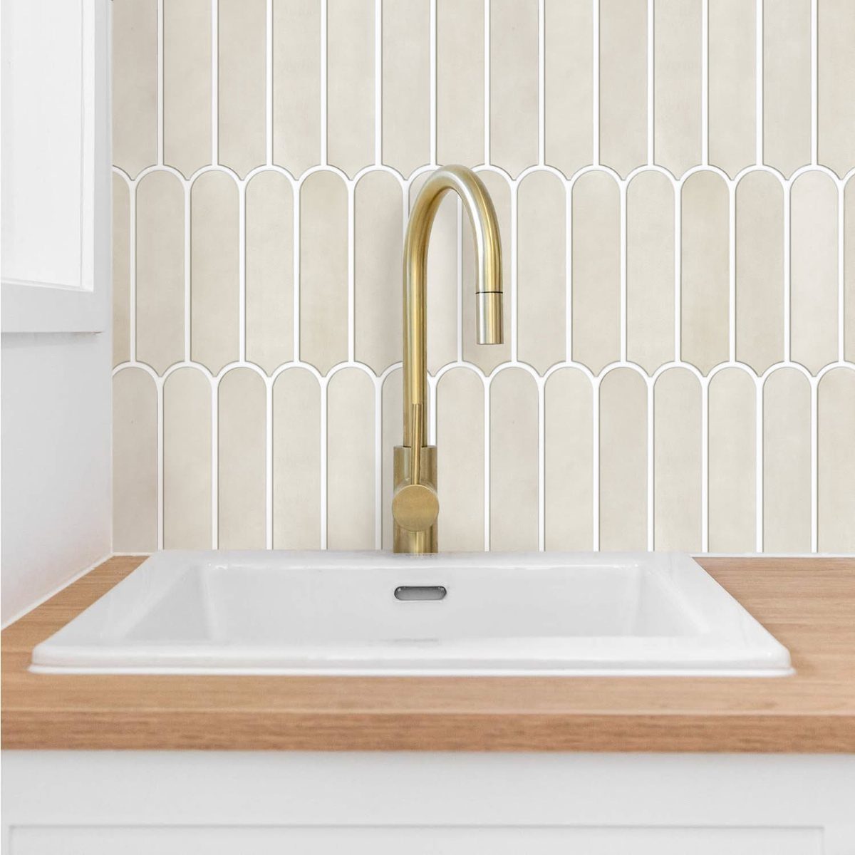
An embossed arch pattern in cream tile adds shadow and shape to a wall without adding a bolder color. Behind a white sink with a gold faucet, the soft cream warms the white and the metal together.
I like cream here over stark white because it sits comfortably next to a light wood countertop. Wipe the grooves of the embossing when you clean, since grease and splashes can settle in the relief.
16. Vertical Multi-Toned Tile Backsplash
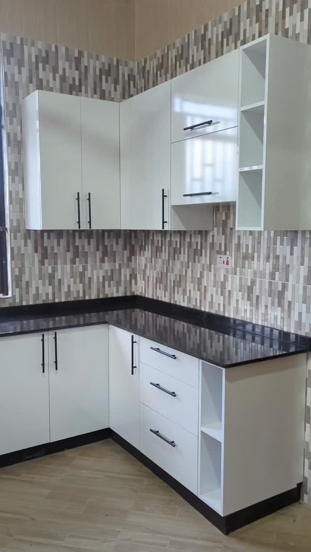
Small vertical rectangles in mixed neutral tones give white cabinets and black countertops a middle ground. The grey shades soften the jump from white to black, and the upright layout draws the eye up.
Choose tiles with a few tones that run from light to mid grey, so the wall feels layered and not blotchy.
Matching the grout to the tile, or going one shade darker, blurs the seams between pieces so the mix of tones reads as one textured surface, not a checkerboard of lines.
Choosing the Right Color
Start with the colors already in the room: countertop, floor, walls, and any appliance that is staying. White cabinets will go with nearly anything, so the backsplash only has to agree with those other surfaces.
Decide first whether you want a quiet neutral wall in white, grey, and beige, or a bold color against a calm background.
A neutral wall suits a kitchen you may redo later, and a bold one gives you the most personality for the money.
Style matters as much as color. Sleek, modern tile and rustic, homey tile can share the same cabinets and look like different rooms.
Maintenance Tips
Glazed ceramic, porcelain, and glass wipe clean with little effort, so they are the safest picks for the wall behind a stove or sink.
High-gloss versions are especially easy to maintain, and the shine bounces light around a small or dim kitchen.
Textured tile needs a bit more attention around raised details.
Be honest about how often you cook and how much upkeep you will actually do. If the answer is "not much," choose a smooth, glazed surface and skip the sealer.
Design Balance
If the counter carries pattern, the backsplash should stay simple. Heavy veining already gives the room movement, so I pair it with plain subway tile, a low-contrast 3D profile, or a glass mosaic in one color family.
In an all-white kitchen, subtle geometry adds interest without noise. Herringbone, hexagons, or gently embossed shapes in white or neutral tones give texture and keep the look cohesive.
Set the samples next to each other and step back a few feet. A tile that reads quiet in your hand can dominate once it covers the wall.
Frequently Asked Questions
Should a kitchen backsplash be lighter or darker than the countertop?
Neither is a rule. Look at the countertop, the floor, the wall color and any appliance you’re keeping, and pick a tile that sits comfortably beside all of them.
Pattern is a good tiebreaker: a counter with heavy veining calls for quiet tile like plain subway, a low-relief 3D shape, or a single-color glass mosaic. A plain counter can handle a busier wall.
What is the most popular kitchen backsplash right now?
Subway tile and marble remain the top choices, and patterned shapes like hexagon, herringbone, chevron and penny round are the popular step up.
White versions of those shapes keep the color neutral while the layout adds interest. I would still pick the one you can live with for years, since a trend is a poor reason to tile a wall.
What backsplash goes well with a white kitchen?
Almost anything works, since white cabinets agree with nearly every color. Marble with grey veining, white subway or picket tile, glass, and patterned tile all suit them.
What kind of backsplash is easiest to keep clean behind a stove or sink?
Glazed ceramic, porcelain and glass clean up with a quick wipe, which makes them my picks behind a stove or sink. Mosaics and embossed tile take more effort, because the extra grout joints and raised grooves collect grease and splashes.