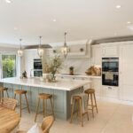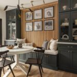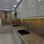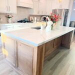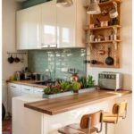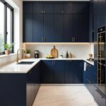
Which one suits you depends on what stays in the room, since a countertop, floor and backsplash you can’t change will decide whether a color looks right.
1. Creamy Whites Kitchen Cabinet Colors
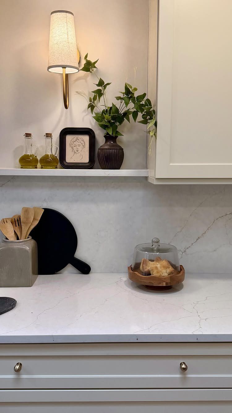
Cream reads softer than stark white and warmer than gray, which is why it sits so well beside white marble and gold hardware.
Pick your paint swatch next to the countertop, because marble’s cool veining can make a yellow-leaning cream look dingy.
Test a sample on a cabinet door in both morning and evening light before you commit to a full gallon. Cream shifts more than white does.
Brass or gold pulls are the easy upgrade on creamy white, and swapping hardware is a one-afternoon job with a screwdriver.
2. White Oak Kitchen Cabinets
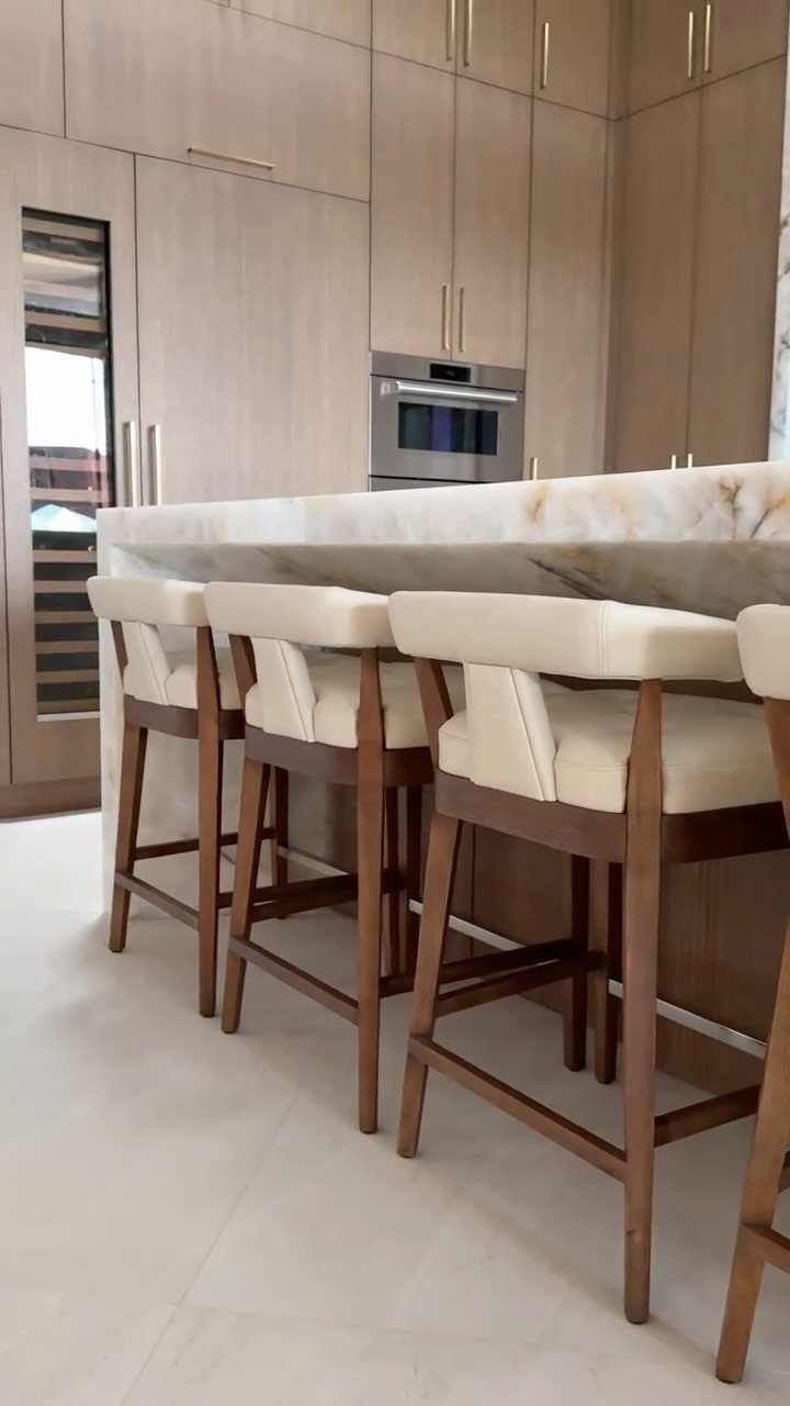
Light white oak brings wood grain into a kitchen without the weight of a dark stain. Paired with a marble island and cream stools, white oak keeps the room calm and a little warm.
Real oak cabinetry costs far more than a renter or first-time owner usually wants to spend. On a tight budget, I’d look at oak-look veneer or peel-and-stick wood-grain film on existing doors instead.
Keep the rest of the palette quiet: one wood, one stone, one soft upholstery color.
3. Sage Green Kitchen Cabinets
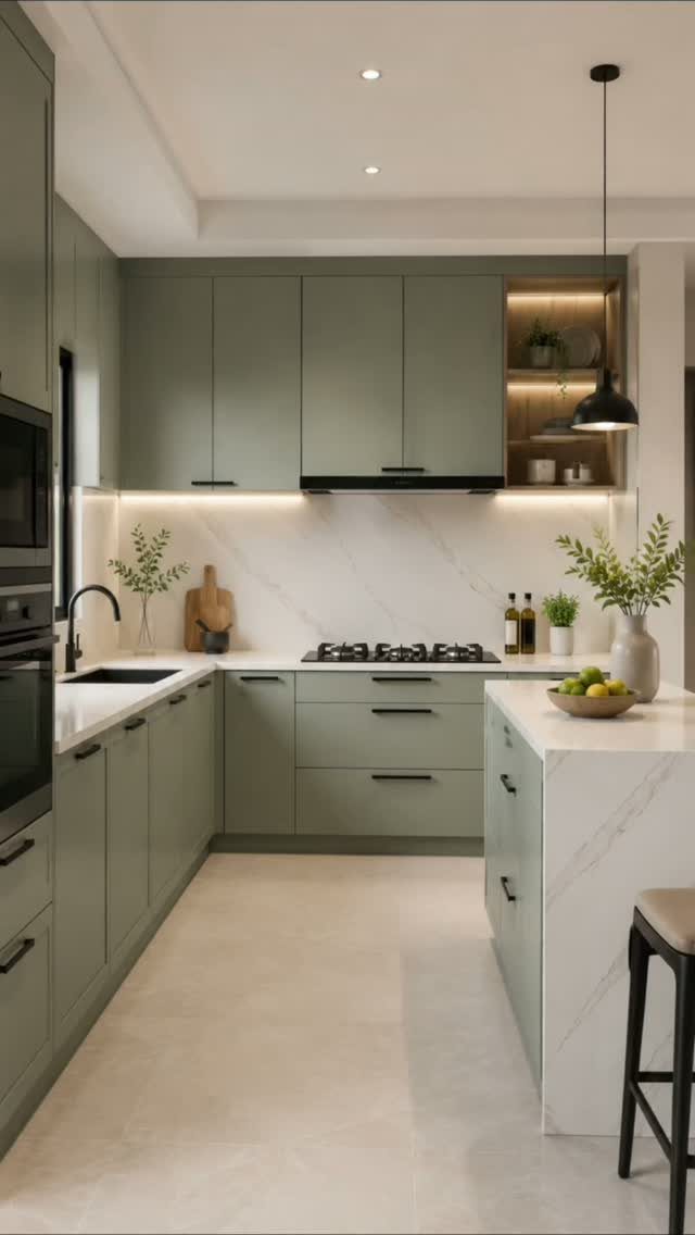
A sage green kitchen feels gentler than a bold green, because the gray in the color mutes it. White marble countertops and backsplash give it a clean, fresh edge.
Painting is the budget route: degrease the cabinets, sand lightly, prime, then roll 2 thin coats of cabinet-grade paint. That’s a long weekend, with drying time between coats.
If the island matches the perimeter, the room reads as one calm block. Painting only the island a shade deeper is the safer first step if you’re unsure.
4. Two-tone Kitchen Cabinetry
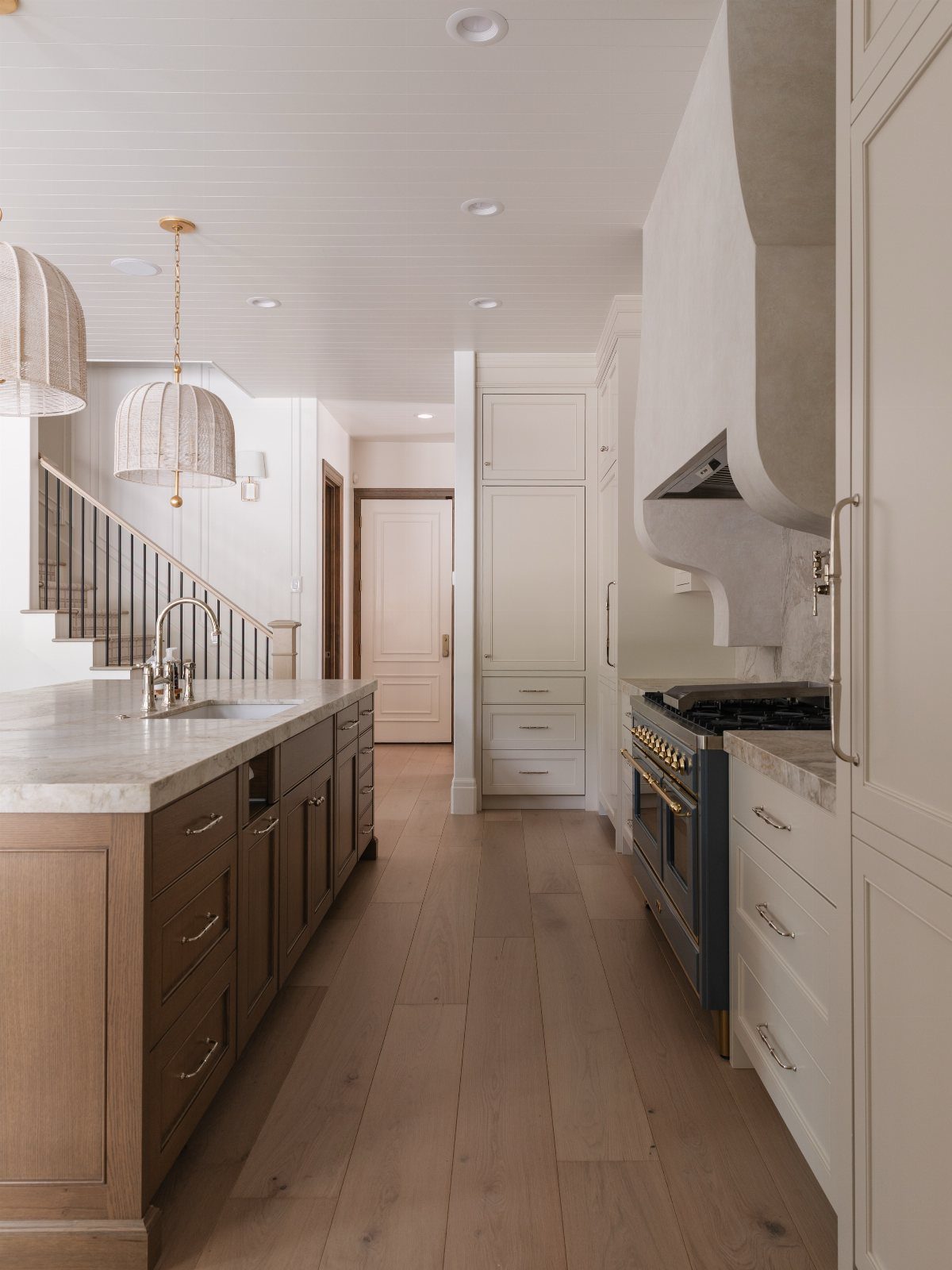
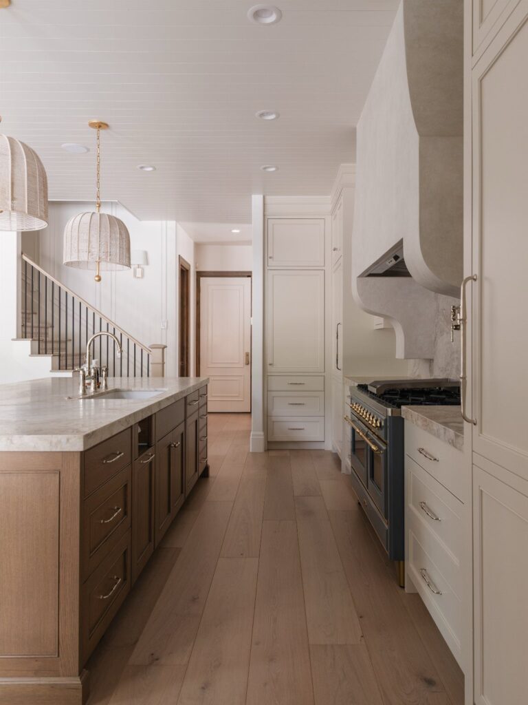
Brown wood on the island with white cabinets around the walls gives you contrast without committing the whole kitchen to a bold color. The island becomes the focal point, and the white keeps the room bright.
Two-tone also lets you test a second finish at low risk, since you only paint or restain one piece. I’d pick a wood tone that echoes the light floors rather than fighting them.
Keep the range hood white so the eye lands on the island.
5. Indigo and Midnight Blues
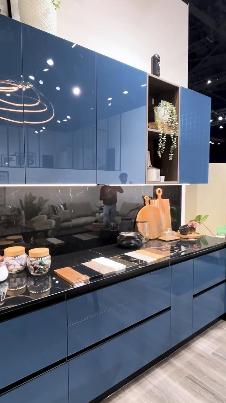
Deep indigo in a high gloss, paired with black counters and a black backsplash, makes a moody kitchen that feels dressed up. Gloss bounces light around, which helps a dark palette from swallowing the room.
Gloss also shows every brush mark and fingerprint, so I’d sand between coats and use a good foam roller. Expect to wipe doors often.
Without them, the look can turn cold.
6. Soft Yellow Kitchen Cabinet Colors
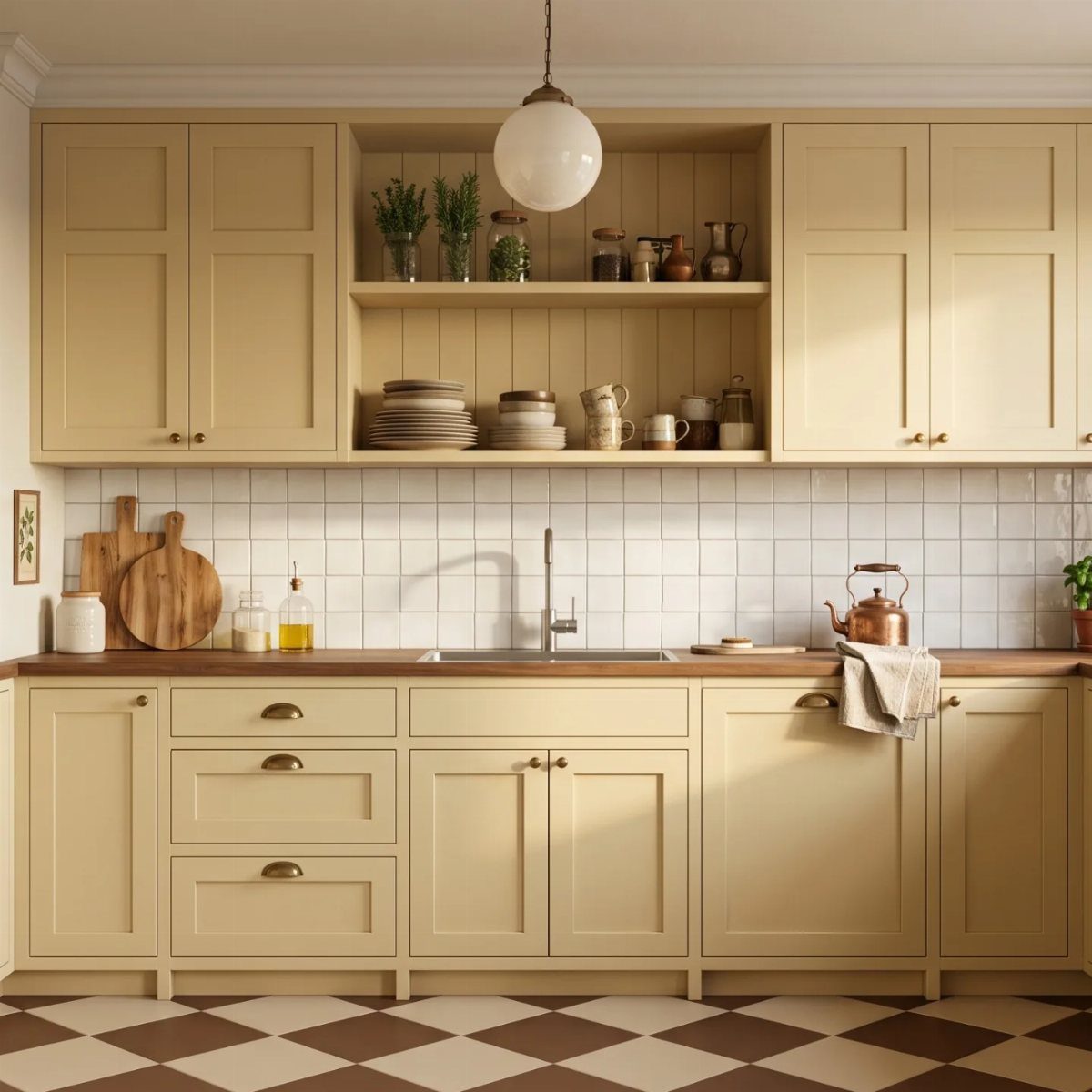
Soft yellow is the cheerful outlier among cabinet colors, and it works because the shade is buttery rather than bright. Wood countertops and a white tiled backsplash keep yellow cabinets grounded.
A checkered floor adds a lot of pattern, so I’d keep everything else plain. Peel-and-stick checkered tile gives a rental a checkered floor without touching the original.
Paint a small test patch first. Yellow looks stronger on a full wall of cabinets than it does on a swatch.
Choosing Cabinet Colors
Judge a cabinet color against the room it will live in, not against a trend. 4 things decide it: natural light, the finishes already staying put, room size, and how hard you use the kitchen.
A kitchen that faces north gets cooler, dimmer light, so I lean toward warmer cabinet colors there; a room flooded with sun can handle something deeper.
In a small kitchen, pale cabinets keep the walls from closing in, while a bigger layout can use a darker shade to give the room some structure.
Hold your sample against the actual flooring, countertop, backsplash, and any wood trim nearby. A color combination that looks perfect in a showroom can read very differently next to your own countertop, floor, and walls.
Look at it in morning, midday, and evening light, then again under your kitchen lights at night. The undertone shifts at each of those times.
Timeless Vs. Trendy Colors
Spend your color risks on the parts that are cheap to redo, and keep the pricey parts in the safest shade.
Base and wall cabinets around the room should last 15–25 years, so a warm neutral or a natural wood tone is the smarter pick for them.
Bolder color has better homes.
Hardware is the cheapest swap and changes the whole read of the room. Wall paint is easier still, and most people repaint every 5–7 years anyway.
A single island in deep green, plum, or navy is the fourth option, and it lets you try a strong color without committing the whole kitchen.
Choose what feels personal and works for how you cook. Nobody has to follow a trend all the way.
2027 kitchen trends are less focused on restraint and obsessing over what is considered most timeless or adds resale value, and the emphasis is purely on creating a kitchen you actually enjoy spending time in.
Mixing Metals
Matching every metal is going out of style. A kitchen reads as more collected when finishes differ, so polished nickel plumbing can sit beside aged brass hardware, or stainless appliances beside something warmer and more patinated.
Warm metals are getting darker: oil-rubbed bronze, aged brass, and other antiqued finishes add depth. Cool metals look better with some texture, such as brushed or matte finishes, than the flat, shiny chrome that used to be common.
Place each finish on purpose. Carry a metal through at least 2 spots, say hardware and a light fixture, so it looks chosen rather than accidental.
Don’t chase perfection, though. If everything matches exactly, the room can look as if it was all bought in one trip.
On a budget, start with pulls and a light fixture, since both are easy to swap.
Frequently Asked Questions
What is the current popular color for kitchen cabinets?
Warm neutrals, greens, and natural wood tones lead right now. One manufacturer’s survey put light wood stain at the top, followed by off-white and then white.
If a full kitchen of color feels like a lot, a soft sage green is an easy way in, since the gray in it mutes the shade.
What are the top colors for kitchens in 2026?
Green, blue, and brown are the top families, alongside light natural wood and off-white.
The last few paint colors of the year included a warm khaki, a muted jade green, deep espresso brown, and a blue with an indigo base. Each one leans warm and natural instead of cool gray or bright white.