The colors here run from classic white and butter yellow to black, charcoal and espresso, and the finishes include paint, stain and two-tone combinations.
The fixed surfaces decide which cabinet color works: a dark floor or backsplash calls for lighter cabinets, a white countertop opens the door to navy or black.
1. Classic White Cabinets
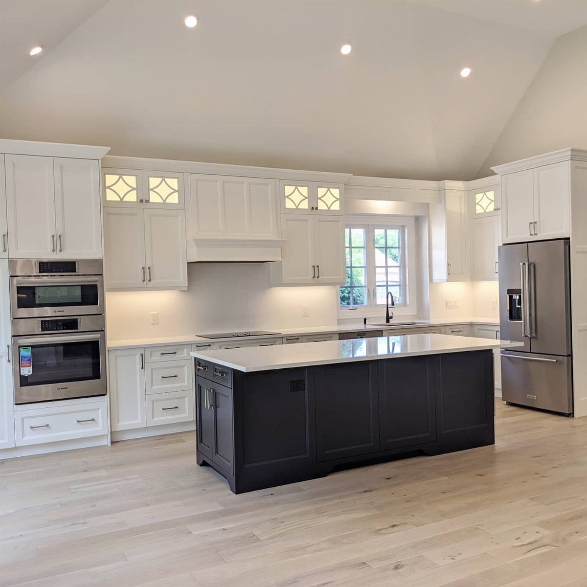
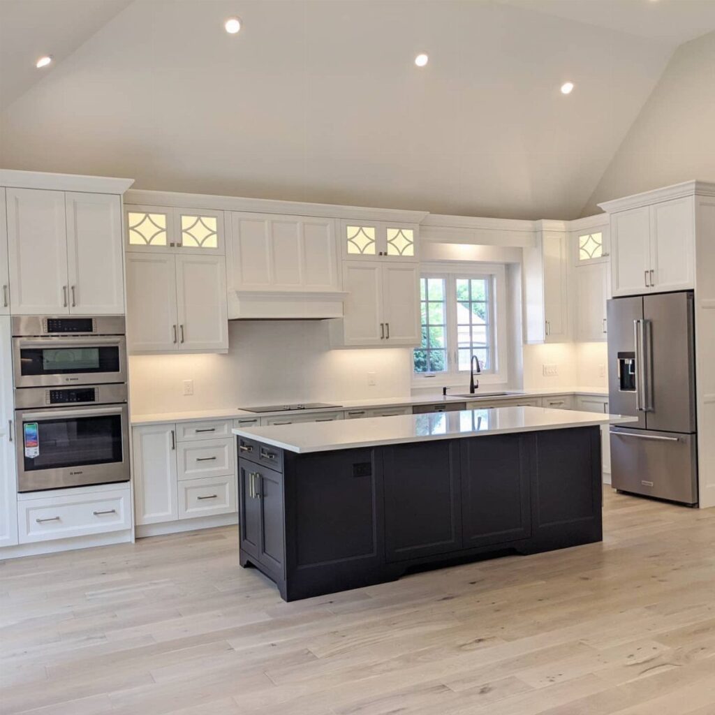
White uppers and lowers give a kitchen its brightest baseline, and that’s why I’d pick them when a room needs to feel larger.
Because white is so neutral, it takes color elsewhere without a fight. A navy island is one way to add contrast to white cabinets, and paint on the island alone is a weekend-sized job.
Stainless appliances and light hardwood floors sit comfortably against white, so you rarely have to replace anything to make it work.
A. Whites and off-whites are by far the most popular kitchen cabinet colours; Benjamin Moore colour experts love Cloud Cover OC-25, Simply White OC-117, and Silver Satin OC-26.
2. Navy Blue
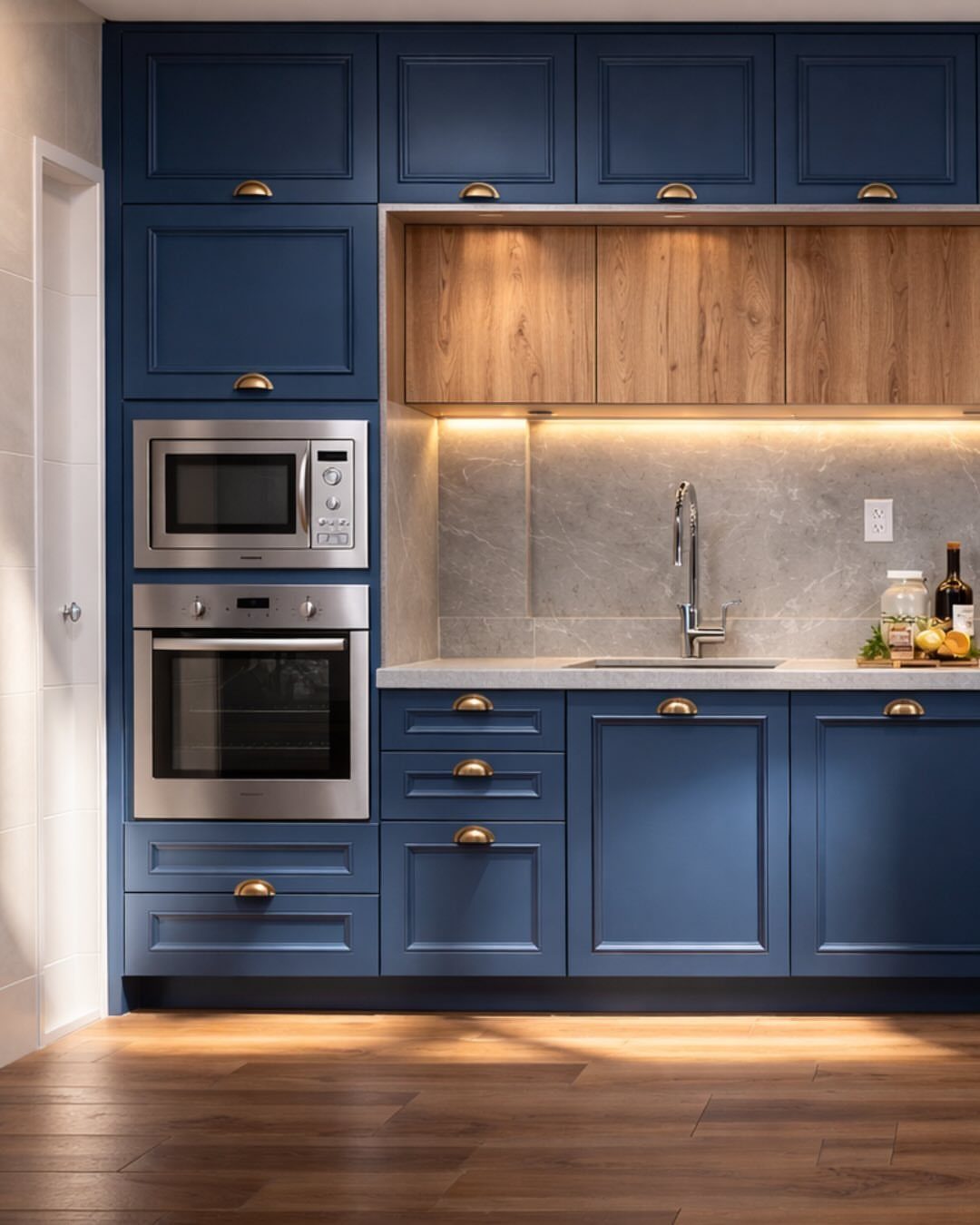
Navy shaker doors with gold hardware look dressed up without costing much more than plain knobs would. Swapping pulls is the cheapest piece of this look, and it’s a few screws per door.
I like the wood upper accents here, because they warm up a color that can run cold. A stone backsplash in gray keeps the palette calm, so the navy stays the star.
Pick a navy with a hint of softness if your light is dim, since the darkest shades can swallow a compact kitchen.
3. Sage Green Cabinets
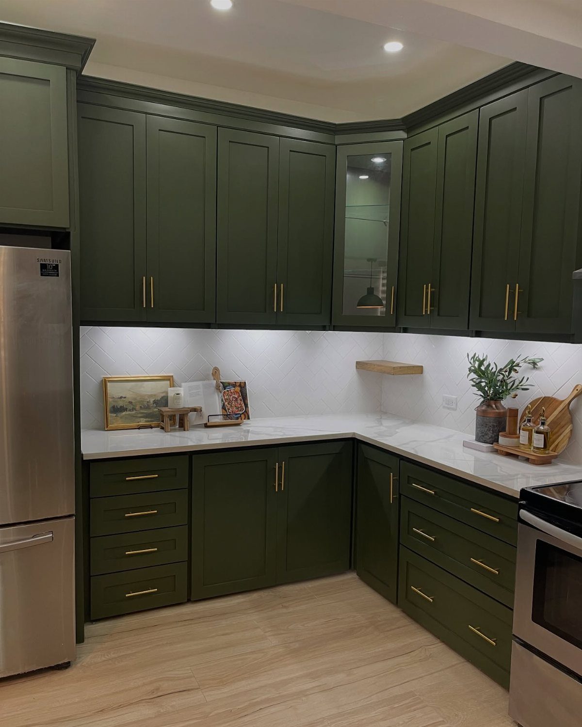
Dark sage green reads more serious than the pale versions, closer to a deep gray-green that holds its own beside gold hardware.
White countertops and a white tiled backsplash lighten the look of sage cabinets, and I’d copy that pairing exactly.
Test a large sample on the door itself and look at it morning and evening. Green shifts a lot with light, and a swatch under store bulbs tells you little.
Stainless appliances sit well against it without any extra effort.
4. Stained Wood
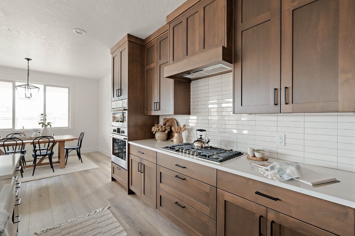
Medium-brown stain lets the wood grain do the decorating, so you skip the flat look that paint gives.
Stain only works if the wood underneath is worth seeing, so I’d check the grain before committing. Refinishing means sanding, then stain, then a protective topcoat, and it takes patience more than skill.
If your doors are a mix of woods or veneers, paint is the safer route.
5. Dusty Blue Cabinets
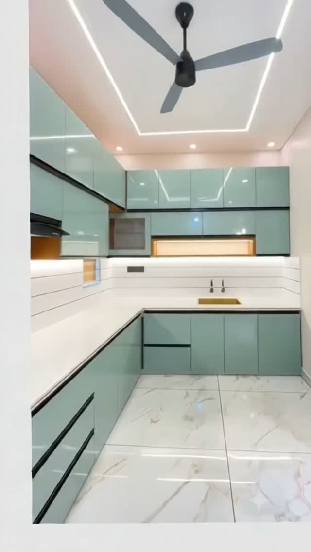
Dusty blue with a pale blue-green tint is softer than navy and livelier than gray, which makes it an easy first step into color. A glossy finish bounces light around, a real help in a kitchen with few windows.
Gloss also shows fingerprints and brush marks, so I’d roll thin coats and sand lightly between them. White countertops keep the color clean and fresh.
If you worry about glare, choose satin over gloss; the color stays true and the sheen is much softer.
6. Greige Cabinets
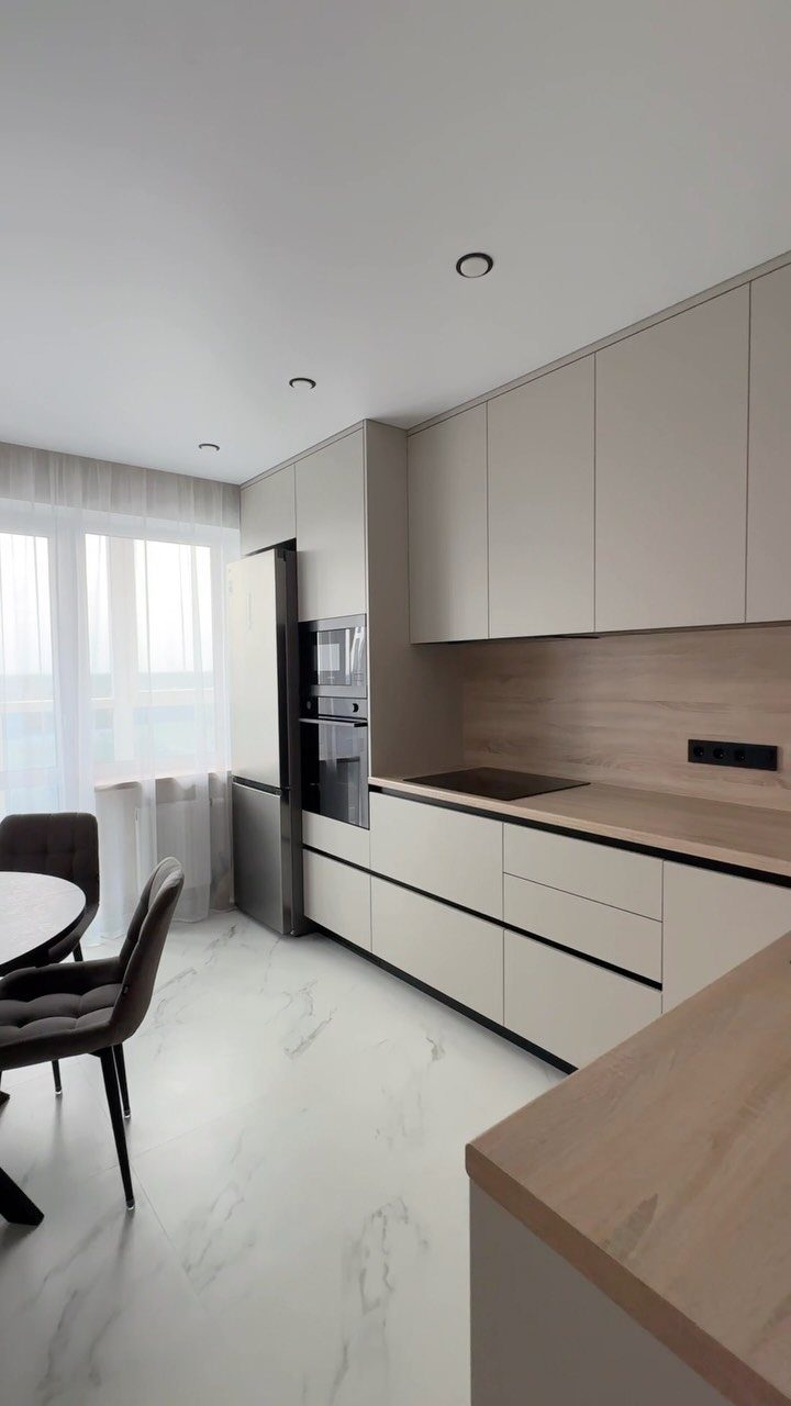
Greige splits the difference between gray and beige, so it works when you can’t decide which way your room leans. Light wood countertops warm it up, and a stainless refrigerator keeps the look crisp.
I’d choose greige over stark white when you want something calm that hides daily smudges better.
Always hold your sample next to the countertop and floor before buying paint, because greige can pull pink or green depending on what surrounds it.
Pair it with simple hardware and let the texture of the wood carry the interest.
7. Two-Tone Cabinets
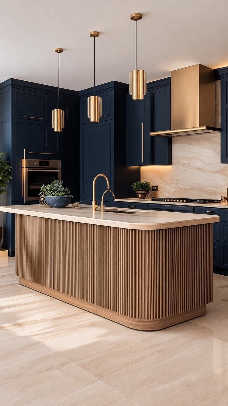
Two colors on one set of cabinets let each one do a different job. Navy on the perimeter run keeps the kitchen grounded, while a light wood slatted island base brings in warmth and texture.
I’d keep the split simple: one deep color, one wood tone, and gold repeated in the pendants and hood so the pairing feels planned. Painting only the island or only the lowers is the cheapest way to try it.
8. Butter Yellow Cabinets
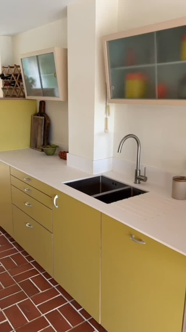
Butter yellow lower cabinets under cream uppers feel sunny without tipping into loud. Keeping the top run pale lets the yellow sit low and stay soft.
White countertops stop the color from getting heavy.
A warm floor like red brick tile suits this palette, so I’d match the yellow to what’s underfoot before choosing paint. Hold a sample against the floor in daylight first.
9. Dramatic Black
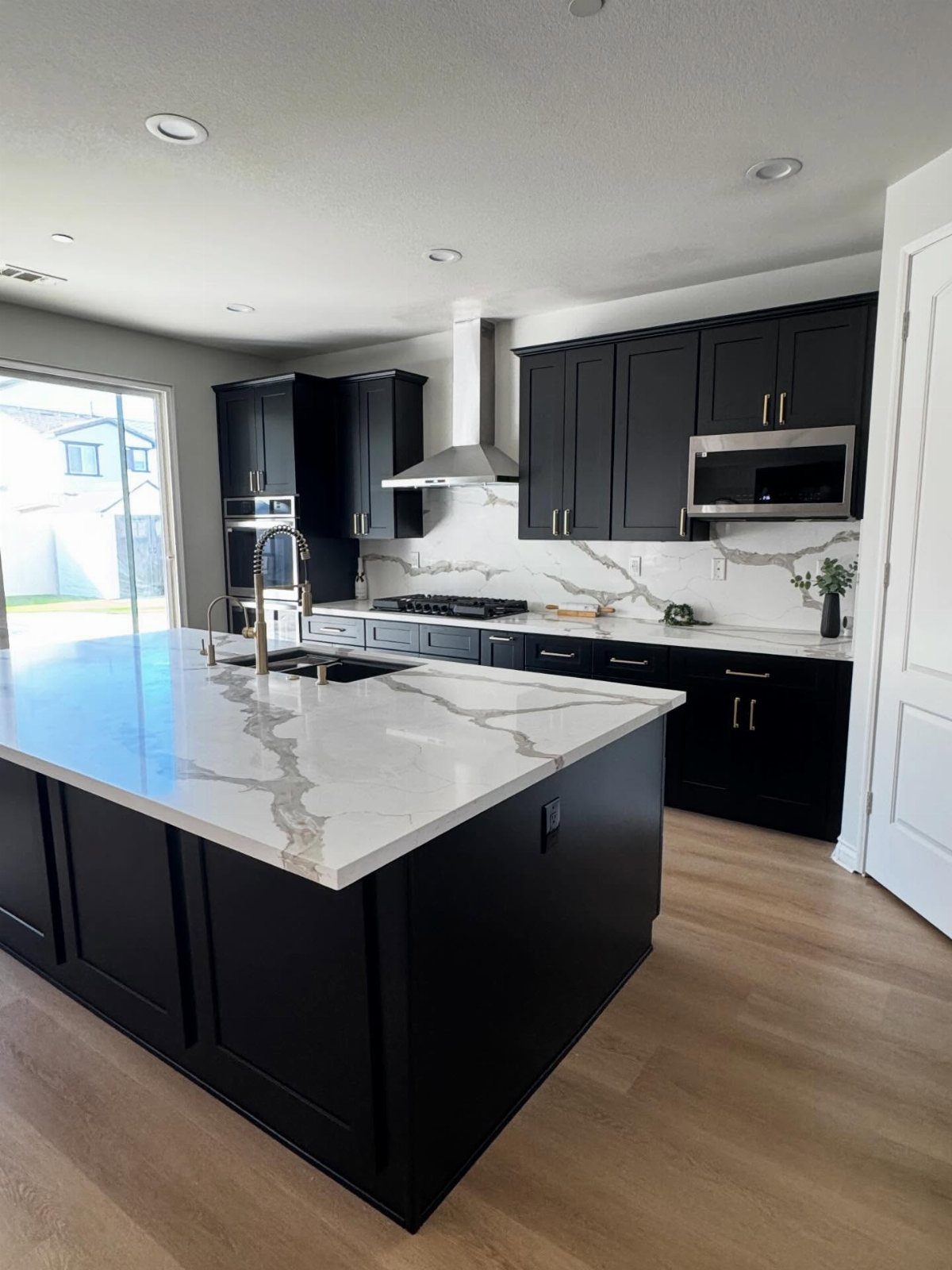
Black cabinets look sharpest when something light sits right beside them. White marble countertops and a marble backsplash give the dark doors crisp edges, and light wood flooring keeps the room from feeling closed in.
I’d choose black for a large island with a sink, where the surface has room to carry the weight. Matte hides less than you’d hope, so wipe it down often.
If the room is tight on square footage, I’d limit black to the lowers.
10. Charcoal Cabinets
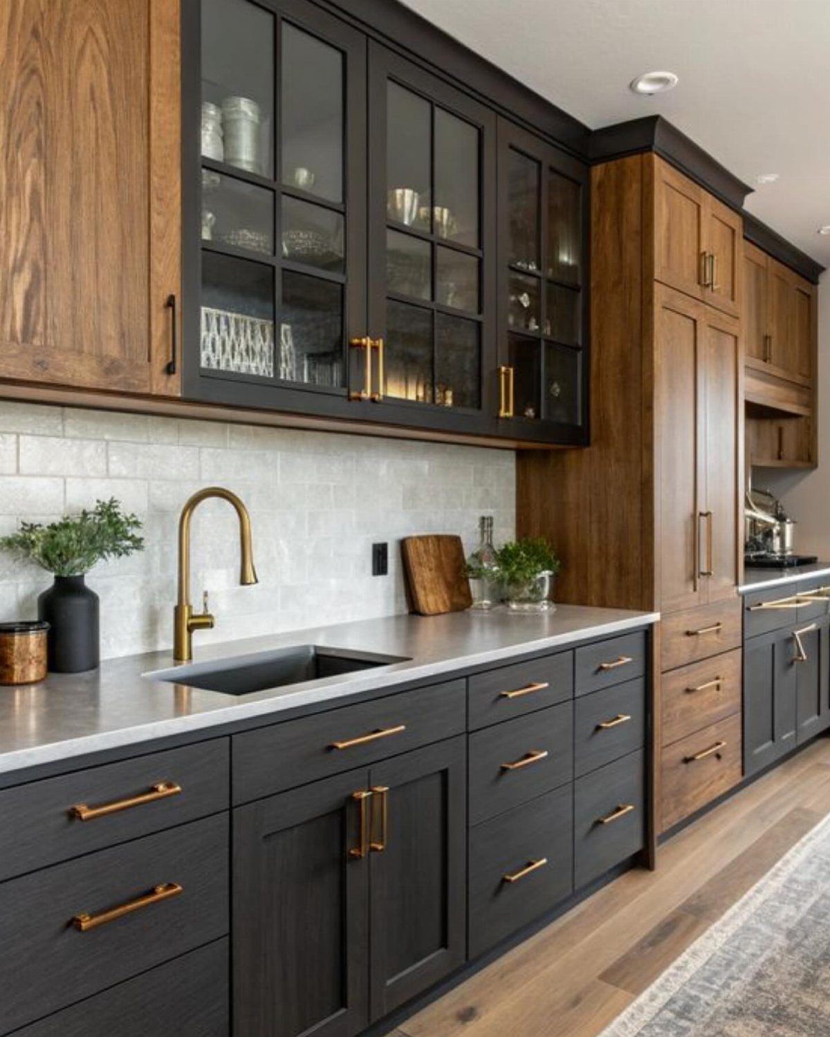
The wood stops the color from reading flat.
Gold hardware and a gold faucet suit charcoal well, and swapping them is a cheap upgrade: a screwdriver and an afternoon. A gray countertop keeps the palette quiet.
I’d pick charcoal over black if you want depth with a little less severity.
11. Bright Teal
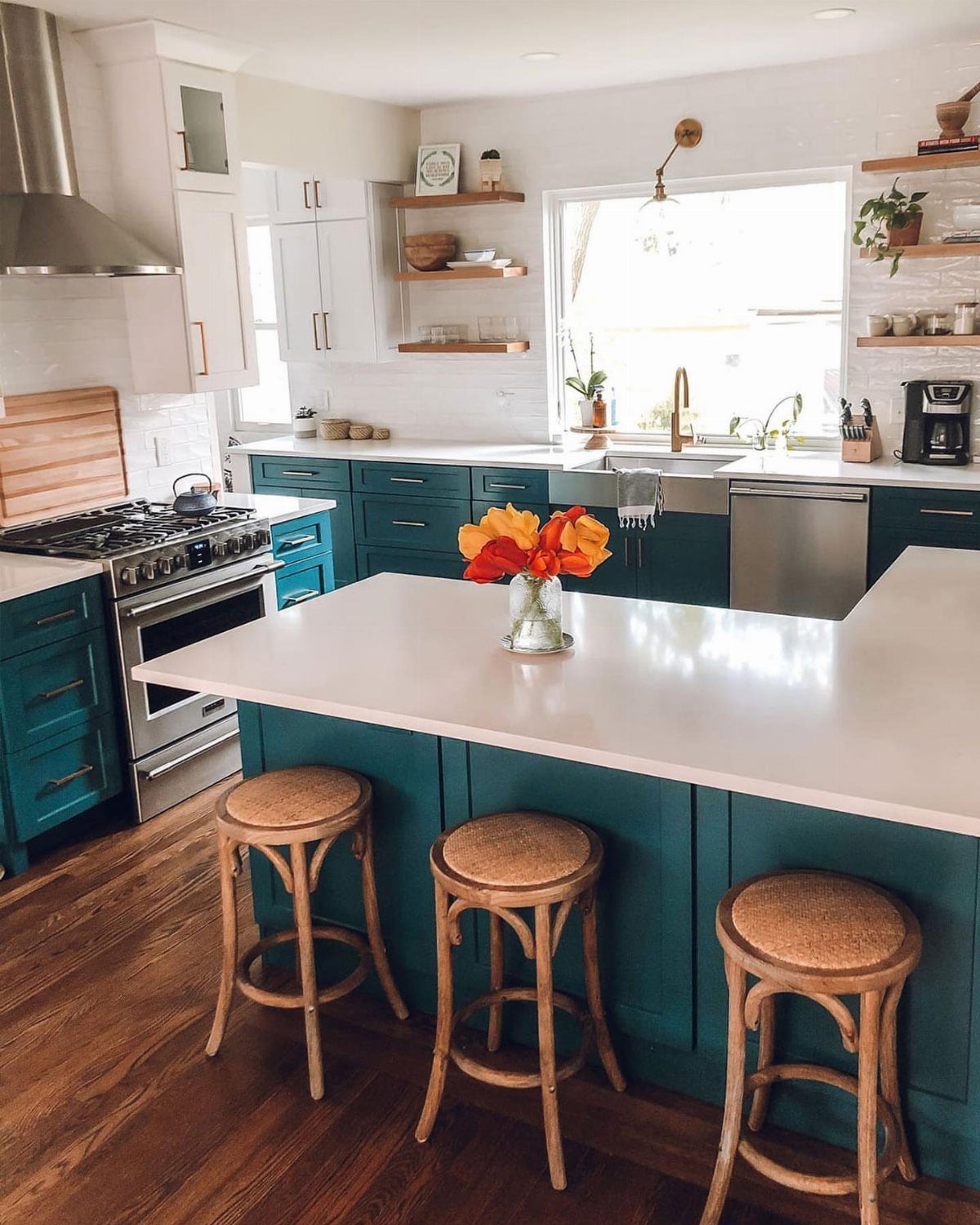
Teal is the pick for a cook who wants the kitchen to have personality. Painting just the lower cabinets and island, with white uppers and white countertops, gives you the color without surrounding yourself with it.
I’d test a large sample near the window above the sink, since teal shifts between blue and green as daylight changes.
If you’re nervous, paint only the island first.
12. Terracotta Cabinets
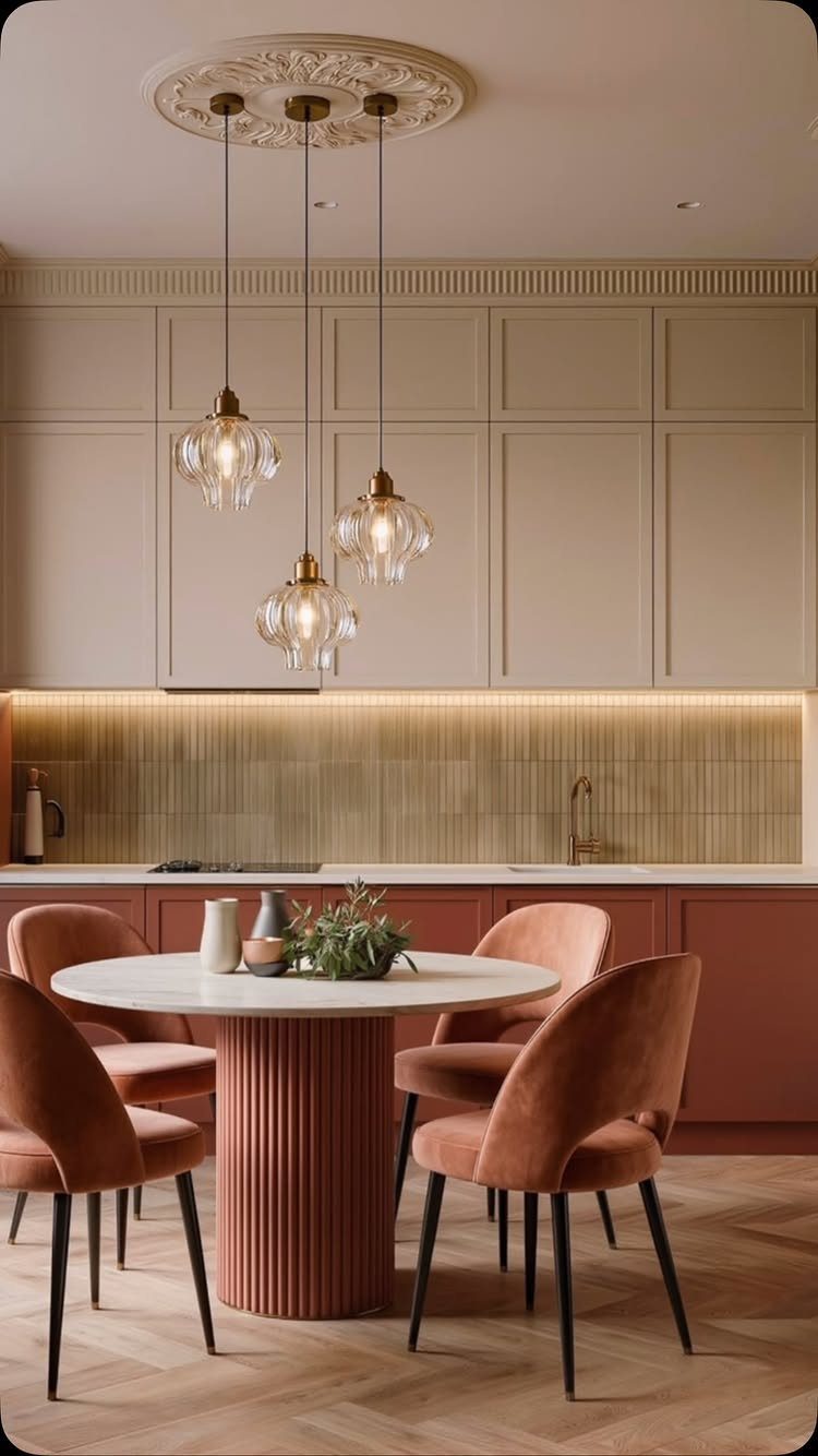
Terracotta lowers with cream uppers give a kitchen an earthy, sun-baked feel that white alone can’t. Cream keeps the top half light, so the clay tone reads warm instead of heavy.
I like carrying terracotta past the cabinets and into the dining area, with chairs in the same color around a white round table. That repetition ties the spaces together for the price of paint.
Check samples at night too; warm lighting pushes terracotta toward orange.
13. Espresso Brown
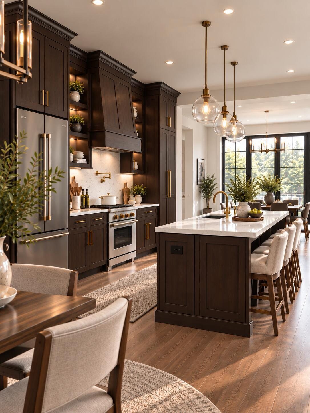
Espresso brown is the darkest warm neutral in the palette, and against a white marble island it looks rich instead of heavy.
Gold hardware and gold pendants repeat the warmth, so the brown reads as a choice rather than a default.
I’d keep the island light, as it is here, because brown on every surface makes a kitchen feel like a cave. Dark doors show dust and water spots, so plan on wiping them down regularly.
If the room is small, try espresso on the lowers only and leave the uppers pale.
Choosing the Right Color
Start with the surfaces that are staying put: countertops, backsplash, flooring and wall color. Dark surfaces need lighter cabinet paint beside them, so let what you can’t change set the limits before you look at a single chip.
Mood comes next. Earthy greens and soft blues calm a room, while warmer tones like terracotta and yellow add energy.
Think about how hard the room works, too. Mid-tones and textured finishes hide dirt, fingerprints and scuffs better than stark white, which matters if you cook daily.
Size and light decide how bold you can go.
Finish and Durability
Semi-gloss is the most durable finish and the easiest to clean, which is why I’d choose it for a busy kitchen. Its sheen runs about 35–70%, and the cost is that it shows every imperfection underneath.
Satin sits at 25–35% sheen. It still holds up well, looks softer, and hides flaws better, though it’s slightly harder to clean.
Eggshell, at 10–25%, has an elegant, subtle glow but wears less well, so I’d skip it on cabinets.
The paint matters as much as the sheen. A cabinet-specific product such as Benjamin Moore Advance or Sherwin-Williams Emerald Urethane Trim Enamel levels out brush marks and dries to a hard finish.
Mixing Colors and Materials
You can split the color between the island and the perimeter instead of upper and lower cabinets. You can also give a feature island its own color while the perimeter stays one shade.
Whatever you pick, buy sample pots of both colors and paint them side by side on a door. Colors that look fine apart can fight when they meet.
Frequently Asked Questions
What are the most popular colors for kitchen cabinets?
White is still the most popular, at about 40% of choices, followed by gray at about 25% and then natural wood tones.
Popular whites include Benjamin Moore White Dove and Simply White, and Sherwin-Williams Alabaster. White also works as a neutral base, so it takes a colored island or bold hardware without a fight.
What kitchen cabinet color is outdated?
Stark, cool whites and icy grays are the ones now reading as dated, with warmer tones taking their place.
Off-white and light-stained wood now rank above plain white in one cabinet manufacturer’s survey. You don’t have to repaint a white kitchen, though: a warm wood tone or a colored island updates it.
Which cabinet finish is best for a busy kitchen?
Semi-gloss holds up better than any other finish in a working kitchen, and its 35–70% sheen wipes down without showing streaks.
The cost is that it shows every flaw underneath, so satin (25–35%) is the softer option that hides imperfections better. I’d skip eggshell on cabinets because it wears less well.
Should I paint cabinets white or gray?
White brightens a room and has broad resale appeal, while gray looks modern and hides wear better.
In a kitchen where you cook daily, gray shows fewer fingerprints. Hold paint chips against your countertops and flooring in the actual light the room gets, not just the store.